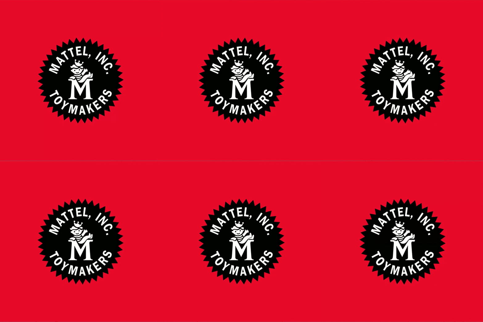
Mattel® has always understood the power of a character—not just Barbie® and Hot Wheels® (Barbie® and Hot Wheels® are registered trademarks of Mattel, Inc.), but literal brand mascots too. Back in the 1950s, Matty and Sister Belle were Mattel’s cheerful spokes-characters, with Matty appearing in the serrated seal logo (often as a little crowned kid waving from a giant “M”) and both showing up as toy dolls and in the company’s early TV era, including Matty’s Funday Funnies.
“King of Toys” MATTY MATTEL®, the 1950s boy mascot for Mattel, Inc. Toymakers.
That sense of personality-first branding is baked into the company’s DNA, which is why it made perfect sense that Mattel decided to develop a custom typeface that evoked character and charm as well as clarity and consistency. To achieve that goal, they turned to Founder & Chief Creative Officer, Otis D. Gibson, and his team at GERTRUDE, INC., the Chicago-based brand development agency known for building bold, modern brand worlds that feel as smart as they are visually charged—especially for big, high-visibility brands that need coherence across complex portfolios.
When a company like Mattel comes knocking, it’s a distinct honor, says Gibson. It’s an opportunity to be part of a legacy, building on a brand’s foundation, and it’s an important job. After all, what else touches everything across a brand consistently other than typography.
Otis D. Gibson
The team at GERTRUDE knew that Mattel wasn’t looking for a “cute” typeface, they were asking for a system that could speak in different tones without ever sounding off-brand. And, while the inspirational language included words like creativity, innovation and playfulness, they felt sure they couldn’t lean too far into goofy. That was the tightrope. Mattel’s brand energy is playful, yes—but it’s also enormous, iconic, and global. There was no room for typography that winks so hard it falls off the page.
The outcome? Mattel’s new bespoke sans serif MATTY Mattel® , combined with BELLE Mattel® , a collection of special characters and glyphs, is clean, clear, and extremely usable—but still unmistakably playful.
Above: MATTY MATTEL® Sans Bold; Below: BELLE MATTEL® a collection of characters and glyphs
A typeface for a portfolio this massive has to work across packaging, campaigns, screens, and storytelling, and it has to speak not only to kids but also to young adults, parents, and collectors who want their nostalgia with a side of design credibility. MATTY Mattel® pulls that off by pairing confident, sturdy forms with warm, friendly details—expressive without becoming a caricature, energetic without losing legibility. It also smartly leans into the logo, which is why it feels inevitable so quickly. You don’t need a full case study to get it—you see it and think: yup, that’s Mattel.
Integration of the Mattel seal logo with Mattel toy brands
MATTY Mattel® isn’t a novelty—it’s infrastructure, designed to carry Mattel’s core promise across the whole universe: creativity, innovation, playfulness. A typeface with the energy of a mascot, but the discipline of a system. That’s the sweet spot—and MATTY Mattel® sticks the landing.
When a brand’s voice needs to show up everywhere, typography is the one thing that quietly connects it all. What touches everything other than typography after all? Not much.
Images courtesy of GERTRUDE, INC. and Mattel®
The post A Typeface for a Toy Universe: MATTY & BELLE MATTEL® by GERTRUDE appeared first on PRINT Magazine.

