Last week I challenged readers to name the designer of the following brochure for geriatric medications, hinting that this person had also created the company’s logo, featured on the verso side of the title page. Created by Paul Rand in 1945, the design was one of his earliest corporate marks. And the reference is very curious.
My interpretation is of an abstract Caduceus, two snakes that I always thought were symbolic of medicine in the U.S. But the Caduceus is actually not what it seems, owing to a historical error by the U.S. Army Medical Corps, which employs a winged staff entwined by two snakes. This symbolizes Mercury, the Greek and Roman god of commerce and messengers. The symbol for medicine is actually the Rod of Asclepius (see above), which also takes its name from a Greek god.
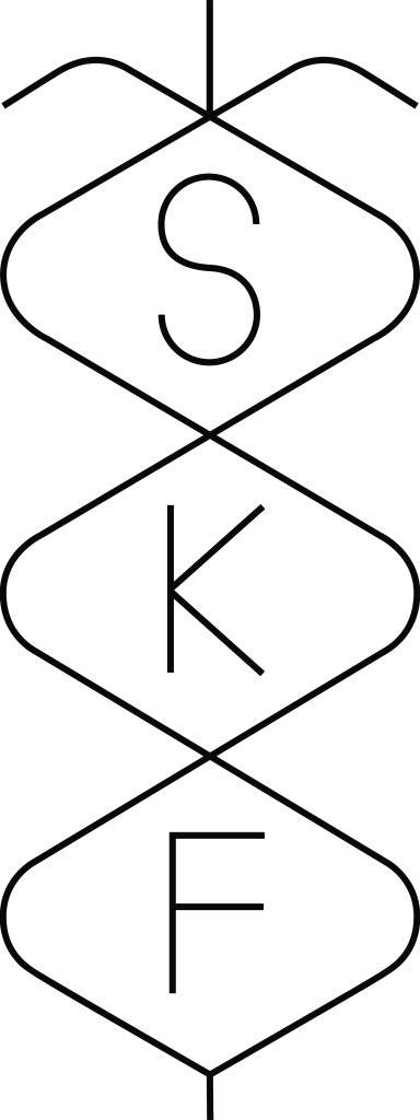
I’m certain that Rand designed SKF’s logo with the Caduceus in mind. The lines forming the voluminous shapes for the initials represent the snakes, and the initials, SKF, suggest the pole. The ribbon-like ends of the intersecting lines abstractly suggest the wings. If the Caduceus was incorrectly used as the medic’s symbol during World War II, by 1945 the mistake was probably accepted as proper. And Rand, always interested in creating symbols and marks that had multiple interpretations, would have taken the Caduceus on faith and seen it as appropriate for a major drug company—and perfectly suited for framing the three initials.
I had many conversations with Rand about his various marks, but SKF was not one of them, although I am confident he designed the logo that was in use from 1945–1960. Therefore, this is but a theory that I developed before someone knowledgeably pointed out that the Caduceus (which is one of my favorite words) is not The Rod of Asclepius. But if Rand knew that, there would never have been such a well-balanced logo.
The post The Daily Heller: The Mystery of the Abstract Caduceus appeared first on PRINT Magazine.