When done well, design becomes inseparable from the message itself— and that’s what makes these reports so rewarding to create.
Erin Grandmaison, Senior Graphic Designer at Bruce Power
With the 2026 PRINT Awards in full swing, we’re continuing to check in on former PRINT Award winners to shed light on the work they’ve been a part of since their big wins. This week we’re revisiting graphic designer Erin Grandmaison of the nuclear energy company Bruce Power in Ontario, who’s a multi-year PRINT Award winner. Grandmaison and her team were awarded third place in the In-House Design category in 2023, third place in the Annual Report category in 2024, and then first place once again in the Annual Report category in 2025.
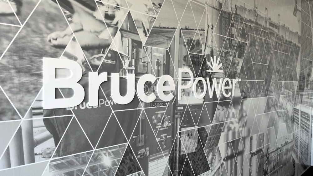
At Bruce Power, Grandmaison has helped develop a cohesive visual language for the expansive company across its many touch-points, both internal and external, and has become somewhat of a master of Annual Report design. We chat with her below about the specific challenges she faces as a designer in the nuclear energy sector and in designing Annual Reports, as well as what she’s proudest of with what she’s been a part of building at Bruce Power.
Felix and Stacey Sani at the Bruce Power Visitors’ Centre November 2021
Visitors’ Centre No. 2022, Ed Daniel
What are some of the highlight projects you’ve worked on at Bruce Power since being honored with PRINT Awards in 2023, 2024, and 2025?
Since receiving the PRINT Awards, Bruce Power’s In-house Creative Strategy team continues to work on a wide range of internal and external initiatives. We manage everything from publications and digital platforms to advertising, environmental graphics, exhibits, campaigns, and experiential design. A consistent focus across all projects has been elevating Bruce Power’s brand to reflect its evolution as a modern, innovative, and nationally significant organization.
The design of the annual report has scaled across a dedicated website, social media graphics, video content, commercials, presentations, conference booths, graphics, and branded swag— creating a cohesive system that lives seamlessly across physical and digital environments.
Additional highlights include province-wide commercial campaigns, and internal and external brand initiatives such as Know Nuclear., Love Nuclear., and Canadian at Our Core. Collectively, these projects reflect how design can scale, adapt, and consistently reinforce a strong, trusted brand.
What are the unique challenges you face as a designer working for such a large company in the nuclear energy industry, specifically?
One of the biggest challenges of designing in the nuclear energy sector is perception. Public understanding of nuclear energy is often shaped by fear, outdated assumptions, or a lack of accessible information. As an in-house creative team, our role is to help bridge that gap— working closely with communications and editorial partners to translate a highly technical, complex industry into stories that feel human, clear, and engaging.
Design becomes a tool for education and trust-building. We’re not just communicating facts; we’re shaping how people feel about the work, the organization, and its role in society. At Bruce Power, there is immense pride in the impact of the work being done— from supplying clean electricity to the province of Ontario, to producing cancer-fighting medical isotopes used around the world. Capturing that pride authentically is both a responsibility and a source of inspiration for our design and storytelling.
Because of the scale and importance of the industry, tone matters. Every visual and narrative decision must balance confidence with care, authority with approachability. Success as a creative team depends on trust between designers, writers, leadership, and subject-matter experts, and on building a strong, consistent brand presence that people can rely on.
To do this well, designers must deeply understand the industry they’re representing. The more fluently we understand the science, the people, and the current landscape, the better equipped we are to create work that is accurate, respectful, and impactful. When design and storytelling align, they create clarity, confidence, and connection especially in an industry where understanding truly matters.
You’ve won two Print Awards in the Professional Annual Reports category— what are your favorite things about designing these reports, and what considerations matter most in great report design?
From day one, our creative team approaches the annual report as a branded artifact— not simply a document. It has to stand alone as a statement piece, while also functioning as the foundation for a broader design system that can extend across channels, including social media, advertising, trade show environments, video, and internal communications.
At its best, the annual report becomes a recognizable expression of the brand. For Bruce Power, this has meant using design to help nuclear energy show up in spaces where it previously did not, with confidence and clarity. Every touchpoint draws from the same cohesive system of color, typography, tone, and imagery, creating a consistent and trusted presence. We build a modular brand toolkit from the report itself— a shared language of graphics, layout conventions, visual cues, and tone of voice that can be deployed across the organization’s communications.
A key part of the process is refining editorial structure, visuals, and material choices together, rather than in isolation. Each decision is tested against a simple question: Does this make the story clearer, more human, and more meaningful for the reader? That lens keeps the work grounded and purposeful.
Durability and craftsmanship are also central considerations. We explore tactile materials, finishing techniques, and iconographic systems that elevate the experience while unifying the visual tone. Having leadership that trusts the creative vision has been essential to pushing the work further each year. When done well, design becomes inseparable from the message itself— and that’s what makes these reports so rewarding to create.
Outside of these annual reports, what are the main things you get to work on design-wise for Bruce Power?
Beyond the annual reports, my work at Bruce Power spans a wide range of design disciplines, allowing the brand to show up consistently and thoughtfully across both physical and digital spaces. A significant part of my role involves environmental graphics, including signage and way-finding systems that support clarity, accessibility, and a strong sense of place across sites and public-facing environments.
I also work extensively in experiential and exhibit design— creating immersive spaces that translate complex ideas into engaging, approachable experiences. This includes conference exhibits, visitor center installations, and interactive environments that invite exploration and understanding. On the digital side, I contribute to social media content, video production, and photography, ensuring that the visual language remains cohesive across platforms while adapting to different audiences and formats.
Advertising campaigns, both internal and external, are another key focus, alongside internal communications and campaigns that connect employees to the broader brand story. What makes the work especially rewarding is the variety— each project presents a new challenge, scale, and audience, but all are grounded in the same goal: Using thoughtful, strategic design to build trust, tell meaningful stories, and strengthen the Bruce Power brand at every touchpoint.
What have you accomplished at Bruce Power that you’re proudest of?
One of the accomplishments I’m proudest of at Bruce Power is seeing the tangible impact of the annual report and proving that a well-designed document can do far more than simply inform. When design is intentional, it becomes an experience; one that resonates emotionally, travels beyond its immediate audience, and connects a small local community to major cities and stakeholders on a national and even global scale.
A well-designed document can do far more than simply inform.
This project reinforced my belief that in-house design teams are uniquely positioned to create meaningful, authentic brand experiences. Being embedded within the organization allows designers to deeply understand the story, values, and nuances of the brand, resulting in creative solutions that feel cohesive, purposeful, and genuinely reflective of the organization.
I often think of Paul Rand’s quote, “Design is the silent ambassador of your brand.” It perfectly captures the role design plays across all industries— not just as a visual layer, but as a strategic foundation that shapes how a brand is perceived and remembered. At Bruce Power, design has been a powerful storytelling tool, helping translate complex ideas into narratives that feel human, confident, and accessible.
It’s been especially rewarding to witness a growing recognition among large organizations of the value of design and the importance of investing in strong in-house creative teams. At the same time, I’m inspired by the resurgence of print. The craft, materiality, and attention to detail involved in print design matter. Thoughtfully designed pieces signal care, intention, and authenticity— and when done well, they create experiences that feel real, lasting, and meaningful.
Visitors Centre – Chandan Sharma, Neha Kallen and son – Chandan is a Nuclear Operator at Bruce A.
Feeling inspired? Apply to the 2026 Print Awards now!
The post Checking in on PRINT Award Winner Erin Grandmaison of Bruce Power appeared first on PRINT Magazine.