How A 20-Square-Metre Extension Made This 70s Home ‘Just Right’
Architecture
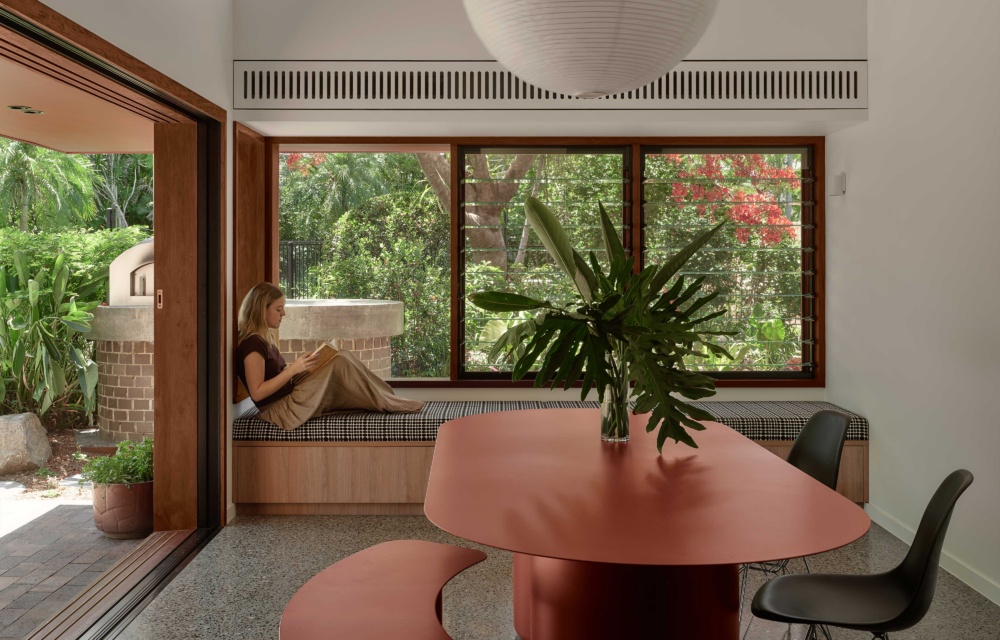
Goldilocks Haus is a renovated 1970s Brisbane house that’s now ‘just right’ after being updated by Maytree Studios. Coco Flip Sequence Oval Dining Table Indoor & Stool from Cult.
Sliding doors open the dining room to the outdoors. Rice Paper Shade Large by HAY.
The extension features a sloping roof for increased natural light and breeze. Coco Flip Sequence Oval Dining Table Indoor & Stool from Cult. Eames Eiffel chair. Rice Paper Shade Large by HAY.
The client also reworked the kitchen to include a striking green island bench and splashback. Bentwood stools by Thonet. Vitoria Regia stone from SNB Stone.
The changing roof heights mark the threshold between old and new. Artwork by Dylan Bolger.
The character of the original brick homes has been preserved at the front. Butterfly Chairs from Angelucci.
An arched entryway.
The end of the home becomes its own ‘room’ with a brick courtyard extending the space for living and entertaining.
An entertainer’s dream.
Red metal cladding was selected to distinguish the addition from the original brick and tiled forms.
Palissade Lounge Chair by HAY.
The house now engages with its leafy backyard.
While the story of Goldilocks And The Three Bears tells of a fussy girl who has to try three different beds, chairs, and breakfasts before finding her perfect match, this Brisbane renovation only needed one change to make the house ‘just right’.
The owners engaged architects Maytree Studios with a clear vision: to design a new ‘room in the garden’ for their late 1970s house, originally designed by G. Eric. Parups.
‘The home combines load-bearing brick construction with courtyard-based planning,’ Maytree Studios architect and creative director Rebecca Caldwell says.
‘Orthogonal house forms are deliberately offset by curved brick walls, which set up a home that was interior facing rather than outwardly connected to its yard.’
This observation set the architects’ focus on removing the existing small dining room at the edge of the garden, and replacing it with a 20-square-metre extension, to strengthen the house’s connection with its backyard.
Taking cues from the original cellular floor plan and strong roof forms, Maytree Studios introduced a new volume clad in standing-seam metal sheets, in a deep red hue.
‘Contemporary materials distinguish the addition without imitation, allowing old and new to sit confidently alongside one another,’ Rebecca adds.
Large windows and sliding glass doors deliberately draw the leafy landscape deep into the interior, as the elongated dining space now opens fully to the garden, pool, and piazza beyond.
Inside, the sloping roofline and void helped harness natural light and breeze, which also benefits the adjoining reworked kitchen.
‘Rather than increasing overall scale, the project focuses on proportion, light and connection to achieve a sense of generosity,’ Rebecca says, noting many other character-filled residences like this could also be transformed with a similarly restrained approach.
The renovation has successfully created a new beating heart of the house that caters to the owner’s daily rituals of cooking, entertaining, and relaxing outdoors.
In other words, a ‘fairytale ending’.