Reading is a quiet collaboration between reader and page—a sustained immersion where typography either supports the experience or subtly fractures it. It’s surprising how quickly a typeface can tip that balance: a too-sharp italic, a brittle serif, a headline that shouts over the prose. Ensaio enters this conversation not as a singular stylistic gesture, but as a system built around the layered realities of reading itself.
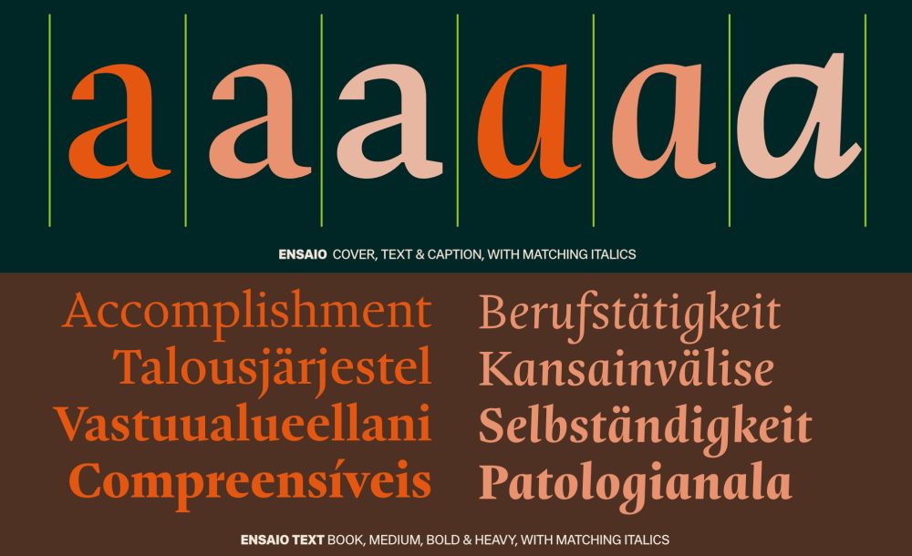
From DSType Foundry, designed by Dino dos Santos in 2025, Ensaio feels like a modular system for book design. Rather than having one set of forms stretch across every application, it’s built into four purpose-built variants: Text, Cover, Caption, and Capitals—acknowledging that the typographic needs of a novel’s body copy are fundamentally different from those of a cover or a footnote.
Ensaio Text is more durable than showy. Its medium contrast and near-upright italics aim to minimize distraction during long reading sessions. It’s a restrained approach, prioritizing steadiness on the page rather than stylistic signature.
Cover is the opposite. With amplified contrast and assertive swishes, it leans into display conventions, engineered for scale and impact. Where Text recedes, Cover projects.
Caption is the most utilitarian of the four and useful for small sizes. It relies on sturdier shapes and reduced contrast to maintain legibility in dense typographic environments—footnotes, annotations, and other marginal zones that often expose weaknesses in more decorative designs.
Capitals operates as an outlier, introducing a more ceremonial register for chapter openers and ornamental use. Its presence underscores the family’s ambition to cover every layer of the book ecosystem, from infrastructure to embellishment.
Driven by the demands of digital platforms, web interfaces, and evolving UI systems, typography has transformed. It has moved beyond static, one-size-fits-all designs into dynamic, responsive systems that adapt and perform across contexts.
Today, designers are not simply selecting a typeface for a single purpose—they are shaping how typography lives, moves, and responds in every environment it inhabits. Ensaio embodies this shift. It is a purposeful expression of modern typographic thinking, designed to adapt seamlessly and enhance real-time engagement across every moment of the reading experience.
The post Where Type Shapes the Reading Experience: Ensaio from DSType Foundry appeared first on PRINT Magazine.