When a heavy hitter in the art world gets a fresh new rebrand, it’s going to make a splash. Such is the case for the Getty (The J. Paul Getty Trust), which unveiled a forward-thinking look earlier this month. Their new visual approach “seeks to define and symbolize what makes it unlike any other arts institution,” they state on their website, “capturing the breadth and complexity of its work.”
“This new design reflects Getty’s personality and where we are headed,” says Katherine E. Fleming, Getty president and CEO. “It gives visual form to a more connected, outward-looking Getty, one that is investing in ambitious ideas, supporting visionary work across the arts and expanding access to art and knowledge around the world. As we look ahead, this identity helps us tell a more unified story about who we are and the impact we hope to have.”
As such, the Getty team sought out to create a system that accurately reflected the breadth of the Getty’s offerings as it’s evolved over the years, partnering with design agency Fred & Farid New York to do so.
“Getty’s range of programs and offerings shaped the strategic foundation for the rebrand,” says Farid Mokart, creative chairman at Fred & Farid New York. “We defined together a single, enduring ambition rooted in Getty’s founding purpose: expanding access to art and cultural heritage worldwide. This ambition anchors the new brand identity and is expressed through the tagline ‘ALL FOR ART.’”
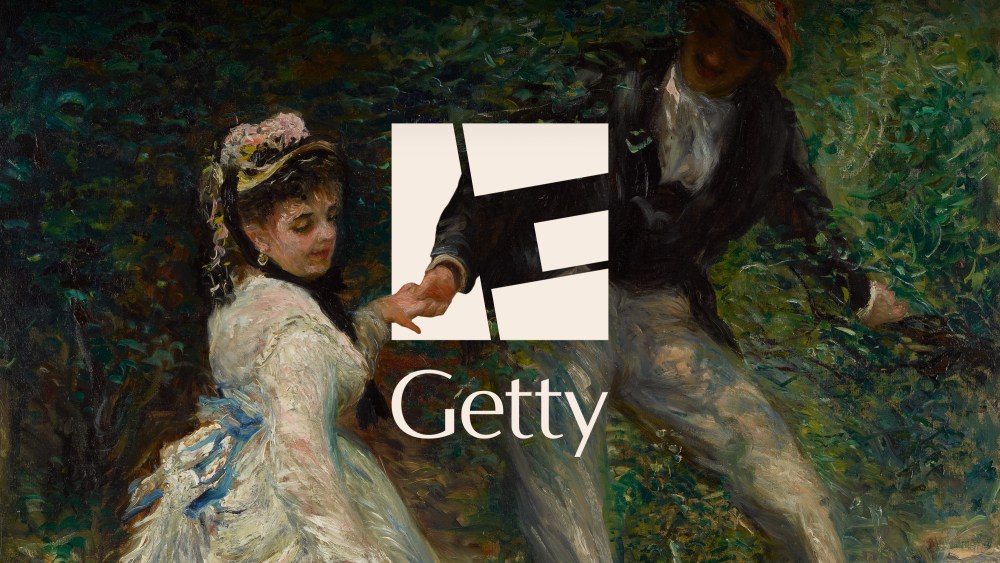
Central to what Mokart and company created is a reimagined “G” icon that serves as a strong visual signifier and eye-catching framing device across platforms. The “G” forms a square block that alludes to the travertine blocks of the Getty Center, with its four mosaic-inspired pieces drawn from artworks at the Getty Villa. These pieces simultaneously represent Getty’s four core programs: the Museum, Foundation, Conservation Institute and Research Institute.
The flexibility of the “G” allows for easy integration with other imagery such as collection objects, archival materials, architectural details, and contemporary visuals. “The “G” can be blown up, rearranged and reinterpreted, unlocking endless iterations that reflect the open access to art that Getty offers its audiences,” they write on their site. The “G” also seamlessly lends itself to movement and animation for use across digital platforms that’s just as successful as it is static.
This fluid, malleability of the “G” encompasses Getty’s next chapter. It reflects Getty’s commitment to making art accessible to all through free admission, free programs, free digital research and resources, and global philanthropy.
“We needed a visual identity that was uniquely Getty and distinct enough to unify how we show up globally,” adds Yasmine Vatere, assistant director of brand management and marketing for Getty. “Working with Fred & Farid New York, we iterated relentlessly, moving from concept to real-world use cases early and refining until every element, including the tagline, could scale across the institution consistently. This system gives Getty one clear, own-able expression in support of the work we do around the world.”
Getty will continue to integrate the new brand across touch points over the coming months, including a new color palette anchored by Getty’s signature blue and accented by colors taken from its collections, architecture and gardens. New merchandise and promotional materials will also accompany the rollout.
The post Getty Gets a Punchy Modern Rebrand Anchored by Geometric “G” Motif appeared first on PRINT Magazine.