This 1940s Brick Duplex Renovation Is Bursting With Bold Colours
Architecture
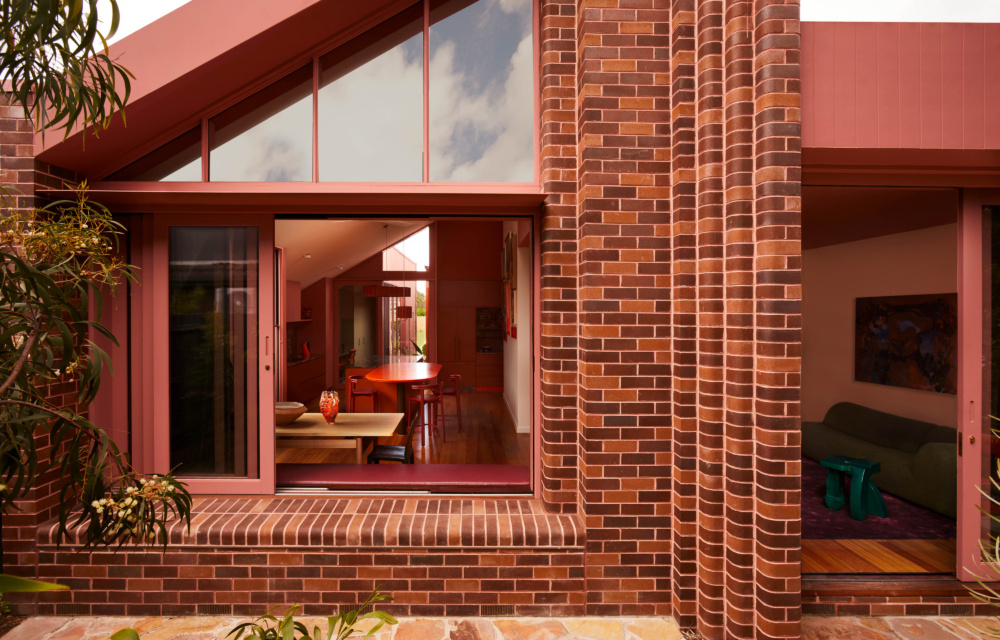
A large sliding window opens out to the small backyard.
Stiletto stool by Sean Brickhill. Landscaping by Loam Landscapes.
Flat Stanley chair by Sean Brickhill. Friend of Dorothy stool by Drew Abrahamson. Flos Luminator floor lamp from Euroluce. Antique rug from Halcyon Lake. 1977 Sofa by King Living. Totenpass by Adam Lee from Station Gallery.
Tributaries (Brine) by Isadora Vaughan from Station Gallery. Ceramics by Laura Veleff and Tessy King from Pépite.
The living room pairs clicker brick with crisp white walls.
Large LED pendant in burnt orange by Acustico Lighting. Ceramic vase by Mali Taylor from Pépite.
The colourful renovation reflects the clients’ wish to avoid ‘anything too sterile’.
Ceramics from Pépite.
The joinery varies colour throughout the space.
Ceramic vase by Jennifer Oh from Pépite. Lulu Bin in black gloss by Special Studio.
Art by Rebecca James. Ceramic by Mali Taylor from Pépite. Uzbekistani Suzani Tapestry from Cadrys.
The 1940s clinker brick duplex has been extended outwards to maximise space.
No WOWOWA project is complete without a splash of colour — or several — and their recent renovation of a brick duplex in St Kilda East might just be a masterclass.
‘This home radiates personality,’ explains Monique Woodward, co-director of WOWOWA. ‘So the palette had to sing!’
Colour in this home is choreographed with rhythm, contrast and pockets of delight. It crescendos in areas of activity — like the kitchen, where the island bench combines emerald green stone and vibrant orange, against a backdrop of pink and red cabinetry — while the ceilings and walls feature terracotta and blush tones.
‘This many colours in one spot may sound chaotic on paper, but they are carefully chosen to sit in harmony,’ says Monique. ‘It’s all about balancing boldness with breathing room.’
Indeed, while rich purples, earthy reds, bright orange and dusty pinks take centre stage, these radiant hues are softened by gentle eucalyptus green and — ‘very out of character for WOWOWA’ — neutral white walls (albeit filled with colourful art).
Together these operatic hues work with WOWOWA’s vision to amplify the home’s original quirky charm, while weaving in new forms that feel respectful and ‘delightfully unexpected’.
When the Melbourne architecture firm took on the project in 2021, the 1940s clinker brick duplex came with the usual runsheet: solid bones, rich character, but ‘pretty much at capacity’. In short, it needed a clever rework to realise its full potential.
With no space in the backyard to extend behind the property, WOWOWA designed a renovation that expanded the home outwards, utilising the untapped space in the side yard.
‘Navigating tight site constraints was a puzzle,’ says Monique. ‘The rear was maxed out, and the side yard wasn’t working hard enough. The solution was to relocate the entry to the side, turn the front garden into a social oasis, and create flow where there was none.’
Where the side yard once was now sits a new corridor wing, complete with stacked laundry and a study nook that opens up into a new dramatic double-height living, dining and kitchen space, with large rear windows that lead to the small backyard.
The bedrooms remain in the original part of the house, each having undergone a WOWOWA-style spruce.
In keeping with the era of the home, the extension is a seamless continuation of warm red brick from the client’s grandfather’s brick factory — the perfect precursor to the bold hues within.
At the rear of the house, new pleated brickwork plays off the home’s deco lineage, taking its traditional stepped form and reinterpreting it with a contemporary, sculptural twist.
‘The new geometry is slender, respectful and playfully precise,’ says Monique. ‘Sitting like an elegant extension and mirror of what was always there, only dreamier.
‘The entire project is a dialogue between then and now.’
Nothing in this home is placed, painted or designed without meaning. Elements of the old home, like the original timber subfloor and leftover terrazzo tiles from a previous bathroom project, have found new life in the renovation, while the colour palette cheerfully reflects the client’s aversion for anything too sterile or closed off.
‘Small homes can be mighty!’ says Monique. ‘You don’t need massive square footage to create a space that’s joyful, generous and packed with personality.’
An edited version of this story originally appeared in The Design Files Magazine Issue 03. Subscribe to our print magazine here.