Hero image credit: Nike
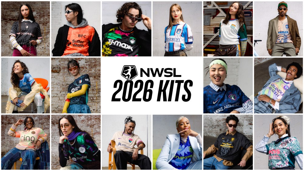
The 2026 NWSL season finally kicks off this weekend, with some of our favorite professional soccer players back in action. Hallelujah! But more than the likes Marta and Trinity Rodman retaking the field, we’ll see the latest batch of NWSL team kits worn for the very first time. Each season we get a new crop of kits from each of the 16 NWSL franchises, and Nike officially announced the 2026 jerseys at the end of February. As always, some are drippy while others are drab— and I’m never one to sugar-coat it. So let’s get into it!
The Best NWSL Kits of 2026
Washington Spirit
The Spirit in Bloom kit is my clear favorite of the bunch, incorporating a graphic cherry blossom design motif in homage to D.C.’s beloved signature flower. Apparently this is something Washington Spirit’s star Trinity Rodman has been asking for for five years! The pop of bright fuchsia tempered by the delicacy of the light pink in the blossoms is nicely grounded by the rich teal green of the background pattern and hem details. It’s always a bit challenging to fluidly incorporate the team’s corporate sponsor’s logo into a soccer jersey design, but making the “CVS Pharmacy” wordmark that same fuchsia pink and white as the cherry blossoms behind it helps it all feel relatively cohesive.
Ultimately, this kit strikes that elusive balance of fun and bold yet classy and sophisticated. No notes!
Angel City FC
I have a bit of a bias when it comes to ACFC as an LA resident and ACFC fan myself, but if anything that makes me all the more discerning when it comes to what the franchise is doing. That said, I genuinely really like this year’s Flare kit, which sees sunbeam-style lines beating out from the crest in the middle of the chest. The thin lines pulsing outward create texture and energy, while alluding to optimism and the LA sunshine. I commend the way they’ve integrated the “Doordash” wordmark as well, putting it in the Sol Rosa pink that ties into the other design elements of the jersey and the wider ACFC brand. I’m not mad at this one bit! Now if only we could make playoffs this year…
San Diego Wave
I’m usually impressed by what the San Diego Wave does with their branding, and the Balboa Park kit is no exception. I love the team’s brand colors, and opting to use them sparingly in the patterned trim along the cuffs and collar of the shirts looks gorgeous. These patterns harken to the tiles used in the central fountain at Balboa Park, San Diego’s famed cultural institution.
Honorable Mention Kits
Orlando Pride
The Orland Pride’s Unity kit features swooping lines of pale pastels I almost really like, but remind me a bit too much of tooth paste branding. I still enjoy the organic shapes and unique color palette though, and the uniqueness of the design also deserves praise.
Portland Thorns
It’s unfortunate the Portland Thorns went with an “in bloom” theme with their kit the same year the Washington Spirit also did and knocked it out of the park. While the Electric Bloom kit features a fun, invigorating design using an eye-catching neon salmon color, the overall design just doesn’t have that same sophistication and je ne sais quoi as the Spirit in Bloom.
The Worst NWSL Kits of 2026
Chicago Stars
To put it bluntly: I really don’t like this jersey. Like, at all. The Chicago Star’s DNA kit is stale and boring, especially compared to the creativity on display in so many of the other teams’ kits above. You’re really just going to use vertical stripes and call it a day? This pattern is reminiscent of bed sheets you’d find at Pottery Barn for a little kid’s room. Where’s the fun? Where’s the whimsy? Where’s the sense of place? What about these tired stripes says Chicago? Better luck next year, Stars!
Gotham FC
I simply think it’s pretty gimmicky to use the Statue of Liberty in the design for a New York-based sports team. Can we not get a smidge more creative than that? Has Ellie the Elephant taught us nothing?! Not to mention the Lady Liberty kit is a bit of an eye soar with all of those vibrating multicolored lines used in an attempt to create a 3D look.
Denver Summit
The Denver Summit is one of the NWSL’s new teams this season, and I was hoping they’d start off with a bang in the jersey department. Alas they played it so safe with the Inaugural Evergreen kit that it’s totally forgettable and a complete yawn. Sure their green brand color is a nice shade, but you’re going to have to do more than a green jersey with lilac trim to make an impact in this league and get your fans excited. This design has absolutely no POV, and for a franchise that’s just starting out, that’s precisely what they need to establish.
The post The Drips and the Drabs of the 2026 NWSL Season Kit Drop appeared first on PRINT Magazine.