It’s hard to say something as ever-present butter is “having a moment,” but let’s be real: butter is having a moment. Butter has always been everywhere, but somehow it recently seems to be everywhere even more than ever. Not only in the kitchen, in cook books, at bakeries, and restaurants, but in the wider zeitgeist including on hats, totes and clutches, home decor, and beyond. Now, butter is getting the coffee table book treatment.
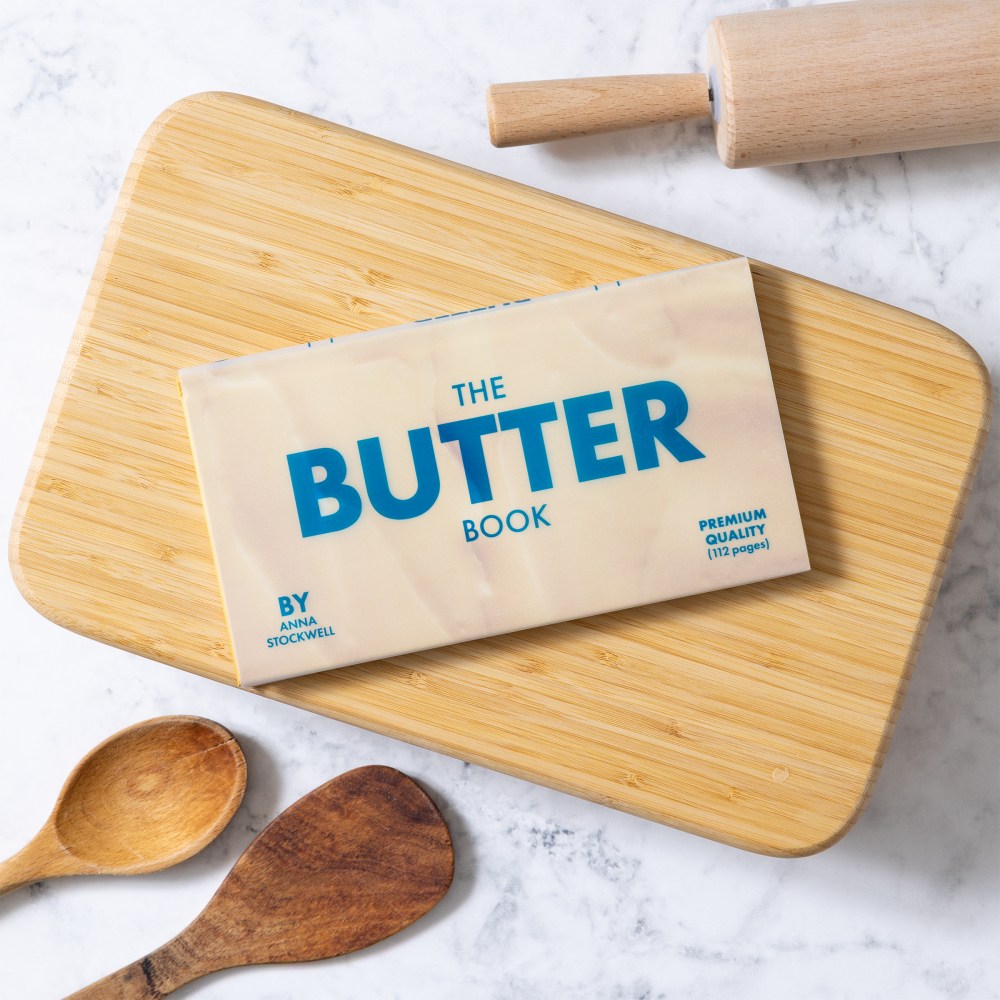
Today marks the official release of The Butter Book from Chronicle Books, written by Anna Stockwell and designed by Lizzie Vaughan. Stockwell (formerly of Bon Appétit and Epicurious) explores butter’s rich history, tools and accessories, how to make your own, plus compound butters and recipes, all within a thoughtfully crafted physical book object from Vaughan. The book has been painstakingly designed to replicate classic butter packaging, down to the materiality of the vellum book jacket. Vaughan dives into the details with us below.
What about this project excited you the most as a designer?
The Butter Book was an idea I pitched to my friend and colleague, Claire Gilhuly, an Editor at Chronicle Books. I was deep into a search for the perfect shortbread cookie recipe and had been buying and testing different brands of butter. After ten years of working in the publishing industry, all of my ideas are book ideas!
Chronicle gets a kick out of “things that look like other things.” We made a notepad called Pad of Butter that has been selling steadily since 2015. So, imaginations did not need to stretch when a butter-focused cookbook with a vellum jacket was proposed. It’s our “bread and butter,” so to speak. I feel fortunate to work for a place that encourages ideation and strives to make beautiful, fun objects. It’s important to find joy wherever you can these days and it’s hard to hate on butter.
It’s important to find joy wherever you can these days and it’s hard to hate on butter.
The project was really bolstered by the author Claire asked to write the book: Anna Stockwell. She brought romanticism and breadth to the topic— illuminating butter’s ancient history (its use predates written records!) and writing delicious butter-focused recipes. The number of vintage butter molds she brought to the photoshoot was an absolute treat. In working with Anna, I was excited to make a book she would be proud of.
What’s your own personal relationship to butter?
When I was young, I was shy about putting “too much” butter on my bread. I also grew up in a house that used margarine from a tub. It wasn’t until my grocery budget and confidence grew (and I was introduced to Kerrygold with a sprinkle of maldon salt on top), that I fully embraced its deliciousness and importance in the kitchen.
What were your main goals and considerations when designing The Butter Book?
It was important to keep the book playful and friendly. I would love to make a 1,000 page butter bible— a brick tome devoted to butter, drenched in yellow. But this smaller volume is lighthearted and approachable. The package doesn’t take itself too seriously and it’s not intimidating on a shelf or table. Which means it can bring more people a moment of delight!
The package doesn’t take itself too seriously and it’s not intimidating on a shelf or table. Which means it can bring more people a moment of delight!
My typical design process is to add-add-add and then subtract. But in this case, I did not subtract. More was a benefit. It was nice to relax into a design system that embraces lines and borders. The typography is condensed and clean to mimic the iconic all caps “BUTTER” so often seen on butter packaging. The paragraph text is fully-justified, with a short line length, to create perfectly long rectangles, referencing the shape of a stick of butter. I’ve always wanted to print a barcode extra large— I think they’re fascinating as a graphic system, but typically the directive is to make them incognito, to not overpower other content. Since the exterior of The Butter Book is meant to look like packaging, this was the chance. The barcode is three inches long and flipped vertical on the back cover.
I don’t think the design decisions for the book are unique, I think they are expected, and that’s what makes the object successful.
What was your research process like in terms of nailing the distinct look of butter and butter packaging for the book design?
I mostly looked in my fridge. I relied heavily on nostalgia and familiarity with the US standard of blue and red one-color printed wax wrappers. These wrappers are often so well designed: pure and utilitarian with simple tablespoon cut lines and the ability to rewrap a half-used stick with ease. I love that it’s a universally agreed-upon language, adopted by so many (though not all) brands, and presumably not owned by anyone: a commons. I feel like there’s a poetic connection I could draw between butter packaging, Americana, nostalgia, and the red and blue colors. Perhaps the inconsistency in color coding for salted and unsalted is a better reflection of the country we’re in: messy. But I’ll save it for the 1,000 page tome.
What were the biggest challenges you faced in bringing The Butter Book to life?
I stressed about picking the perfect yellow. I held cold sticks of butter up to a CMYK tint test with dozens of different shades, all with slight variations. It was a fool’s errand—every brand of butter is a different color. There wasn’t a “correct” answer. I landed on a color build inspired by Cabot butter: 28% yellow and 5% magenta. Rich and creamy, it doesn’t hide on the background of the page.
I stressed about picking the perfect yellow.
What was the production process like when trying to source and mass produce the materials that felt as accurate to butter and butter packaging as possible?
Chronicle has an incredible library of swatch books and a long history of publishing books with interesting materials and bells and whistles. Vellum jackets were already in our repertoire. It’s the adding laminations for durability in combination with legibility (which side of the jacket ink is printed on) that requires advance proofing and collaboration with the printers. Steve Kim and Tera Killip masterfully led the production of The Butter Book.
What aspect of your The Butter Book design and the process are you proudest of?
The collaboration. It takes a village to publish a book.
I especially enjoyed the photoshoot— Kate Jordan is an incredible photographer and Raina Kattelson has a flawless eye for props. Anna styled her recipes on set and made everything look delicious. I loved mood-boarding the whole thing and then watching it come to life with a team of smart and creative women.
Butter has been in the zeitgeist the past few years; from charcuterie-inspired butter boards, to homesteading videos on how to make it yourself, to themed goods in shops (like socks, greeting cards, wrapping paper, ornaments). Maybe it’s an ironic reaction to rising food prices or a collective desire to return to the basics. I’m happy to add to the visual conversation, with a book that celebrates something comforting and delicious.
The post ‘The Butter Book’ is Fresh Out the Kitchen and Ready for Your Coffee Table appeared first on PRINT Magazine.