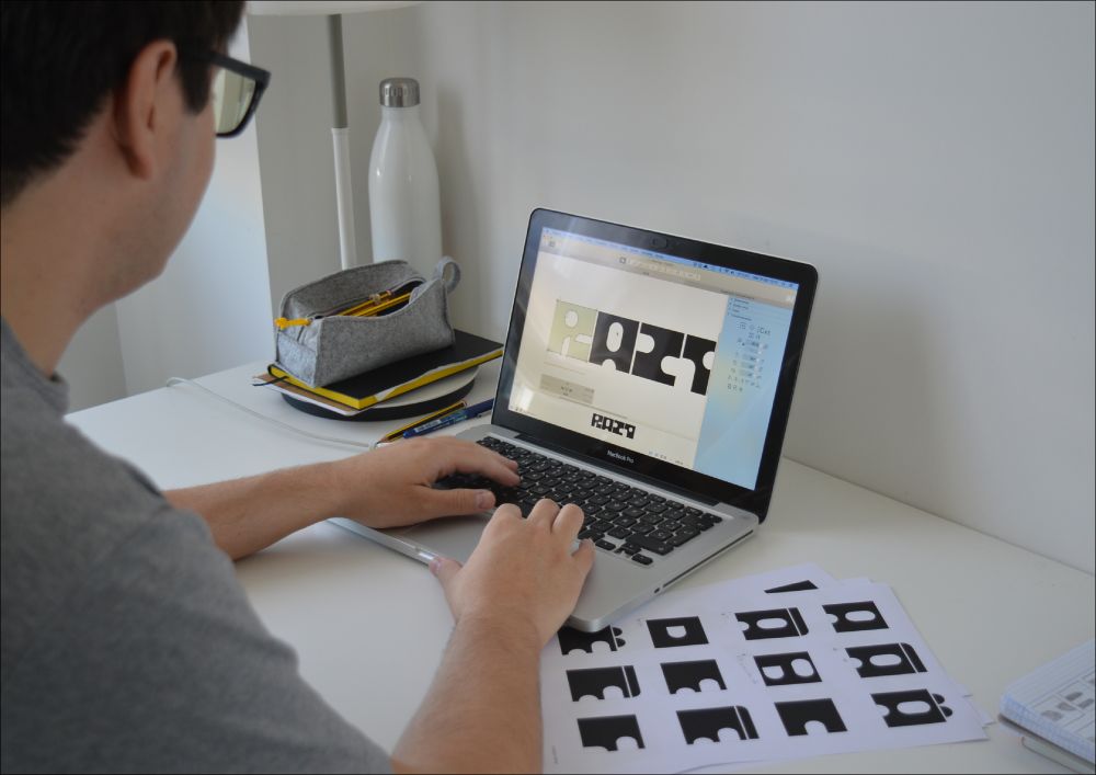
At the start of 2025, designer Alberto Molina set himself a rule that was simple to explain and hard to sustain: design a brand-new typeface every month for an entire year. The project, called FontMonth, wasn’t planned as a portfolio piece or a commercial release. It began as a way to understand typography from the inside out—by drawing, testing, breaking, and rebuilding letters over and over again.
I’m not a trained typographer. I created these typefaces because I wanted to understand how they are born, how they are built, and what the process involves. For many people, type is just a tool. For me, it’s also a space for experimentation and expression.
Alberto Molina
What followed became less a challenge and more a constantly running laboratory.
Some months leaned into technical constraints. Sira explored width variation as a structural system. Agulla was constructed from stencil logic, forcing every shape to work within cut-out limitations.
Other typefaces came from the simple pleasure of drawing: Frannie, Nowhere, and Halone grew more intuitively, without strict rules beyond the need to keep moving forward.
Unstop started with observation—Spanish road signage became the reference point for a typeface built from everyday visual language. With Evertimes, Molina looked backward, revisiting Times New Roman through a contemporary lens rather than treating it as something untouchable.
Some of the most meaningful designs were the most personal. Fina is based on handwritten recipes from Molina’s paternal grandmother, each letter carefully vectorized while preserving the irregular rhythm of the original writing.
Contextual alternates keep the text from feeling mechanical, allowing the digital version to retain the warmth of the source. For the final month, he moved away from the screen entirely. Rush began as marks made with a 7-centimeter paint roller on A3 black cardstock, turning physical texture into the foundation for a brush-style typeface.
Throughout the year, Molina documented the process in a monthly newsletter—sketches, failed attempts, revisions, and small discoveries that rarely make it into finished work.
What I enjoyed most was that it worked as a live lab. I sketched, developed, asked questions, shared with friends and colleagues. A second opinion always helped sharpen the details.
The project also reinforced something that often gets lost in discussions about type design: drawing letters isn’t only about consistency or technical precision. It’s also about voice.
By the end of the year, FontMonth had produced more than two thousand glyphs, but the real result was less measurable—a deeper understanding of how forms evolve, how constraints generate ideas, and how discipline and play can coexist.
The project found its home at Errea, the Pamplona studio where Alberto develops visual identities, custom typefaces, and brand strategy—continuing to explore type design with the same curiosity that fueled FontMonth from the start.
All images courtesy of Alberto Molina @albert1m
The post FontMonth: One Year, Twelve Typefaces, and a Personal Typographic Laboratory appeared first on PRINT Magazine.