Few agencies working today have demonstrated the kind of sustained precision and clarity that Koto brings to global brand systems. Over the past decade, the studio has built a reputation not for spectacle, but for structural thinking and design that distills complexity into cohesive, living frameworks. Their work consistently reveals a discipline beneath the aesthetic: identities that scale, adapt, and endure rather than simply attract attention. It is this rigor that makes their latest collaboration with GoFundMe less a refresh and more a study in how contemporary platforms can evolve without fracturing their core.
When platforms scale, their brands often splinter. What begins as a simple, focused identity can struggle to hold the weight of product expansion, acquisitions, new audiences, and shifting expectations. In that sense, Koto’s recent brand evolution for GoFundMe is less about reinvention and more about consolidation, about asking whether one idea can meaningfully stretch across an entire ecosystem without losing clarity.
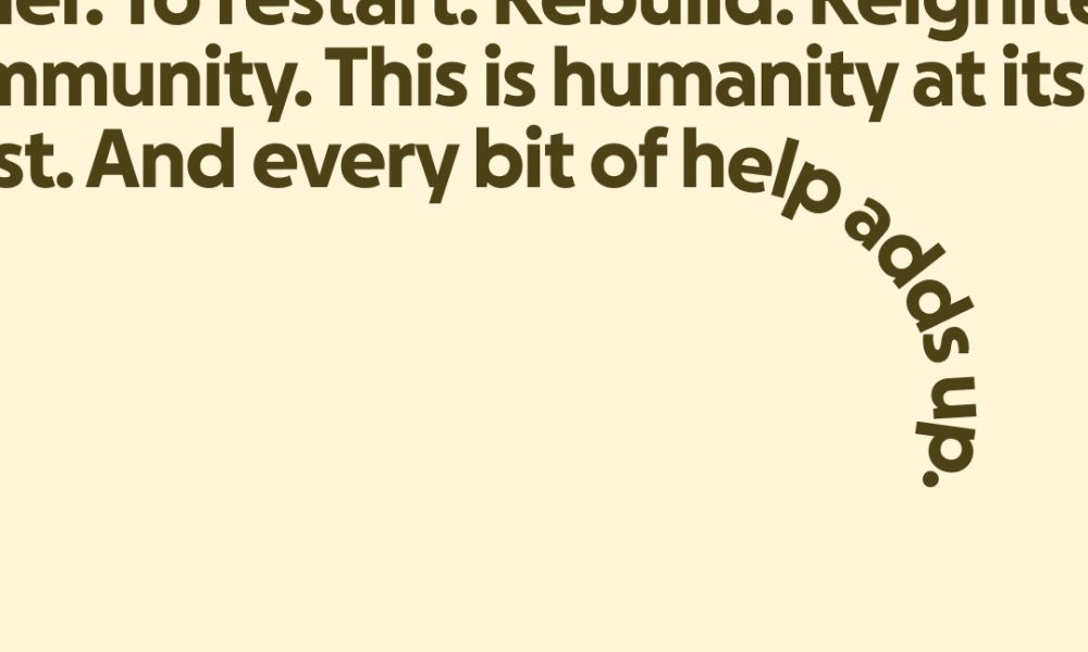
Following its acquisition of Classy — now GoFundMe Pro — the platform has grown beyond individual fundraising into a broader network spanning personal and nonprofit giving. With new offerings including Giving Funds, Profiles, and Intelligent Ask Amounts, the organization needed a brand system capable of showing up with versatility while maintaining cohesion across audiences and products. The solution Koto and GoFundMe arrived at centers on a deceptively simple premise: help adds up.
At the heart of the new system is the Progress Circle, a graphic device inspired by the fundraiser progress indicator that has been embedded in the platform since its earliest days. Historically, it functioned as a utilitarian UI component for visualizing monetary goals. In the evolved identity, it becomes something more symbolic. The circle is segmented to represent different parts of the GoFundMe community: fundraisers, supporters, nonprofits, moving the world forward incrementally, piece by piece. What’s compelling is not the introduction of a new icon, but the elevation of an existing one. Rather than inventing symbolism from scratch, the design extracts meaning from behavior that users already recognize.
Caroline Fox, Creative Director at Koto, describes the challenge succinctly: building an entire ecosystem around a single idea is one of the hardest tasks in brand design. Simplicity, in this context, is not reductive; it is structural. The Progress Circle now scales, frames, and shifts across applications, functioning as both marketing device and product language. It even informed product design exploration, creating continuity between what users see and what they experience. That integration between brand and interface signals a broader shift in how digital identities are built today. They are no longer wrappers around products; they are embedded systems.
The logo refinement follows the same logic. Rather than overhaul the mark, the team subtly uncovered the Progress Circle already latent within its ray, strengthening curves and reinforcing the connection between symbol and system. This approach reflects a certain design maturity: evolution through excavation rather than replacement. From the same wordmark, GoFundMe Pro was articulated, creating a clearer brand architecture that distinguishes audiences while maintaining familial consistency.
GoFundMe logo before
GoFundMe logo evolution
Color, too, was reconsidered without abandoning equity. The palette grows more vibrant while remaining rooted in green, nodding to the platform’s grassroots origins. Supporting hues expand into a hopeful spectrum, applied through a duotone approach that improves legibility and accessibility. A custom typeface, GoFundMe Sans, echoes the circular forms of the Progress Circle, embedding warmth and clarity into the typographic voice. None of these elements shout; they reinforce.
What makes this evolution noteworthy is how it navigates a particular tension inherent to community-driven platforms: scale versus intimacy. With more than 200 million people represented in its ecosystem and over $40 billion raised to date, GoFundMe operates at an extraordinary magnitude. Yet its cultural power lies in small, individual acts of help. The new system attempts to visualize that paradox — that massive impact accrues through incremental contributions.
Art direction and imagery are guided by humanity, community, and optimism, while the verbal identity differentiates between GoFundMe as Helpful Guide and GoFundMe Pro as Helpful Partner. The distinction is subtle but significant. It acknowledges that tone must flex alongside function, especially when speaking to individuals seeking personal support versus nonprofit organizations operating at an institutional scale.
Stepping back, the broader design question is whether one graphic device can truly hold an ecosystem this expansive. Historically, brands at similar scale have leaned toward modular complexity — multiple icons, patterns, or highly flexible design systems. Here, the bet is on concentration. Everything gravitates around momentum, around the idea that progress is cumulative. It is a disciplined choice in a moment when many digital brands opt for maximal expressiveness.
In the evolving landscape of platform branding, where acquisitions and product launches can fracture coherence, Koto’s work with GoFundMe suggests an alternative path: deepen the core rather than diversify the surface. It is a reminder that sometimes the most resilient brand moves are not about adding more, but about finding the one idea strong enough to carry what already exists.
The post Koto Rebrands GoFundMe Around a Simple Truth: Help Adds Up appeared first on PRINT Magazine.