Nebula—the digital astrology platform that quietly built a global following of horoscope readers, birth-chart obsessives, and late-night meaning-seekers—has unveiled a rebrand that reframes the company as something bigger than astrology, bigger than psychics, and definitely bigger than the typical wellness app. The new positioning: a full-scale Spiritual Guidance Space, wrapped in a design system that feels closer to a premium streaming service than a crystal shop.
Founded in 2019 as an astrology app, Nebula grew fast by giving users a way to map their personalities through charts, transits, and daily horoscopes. But as the audience expanded, the brand noticed something interesting: knowing your chart is one thing—knowing what to do with it is another.
That realization pushed Nebula beyond zodiac signs and into live psychic guidance, relationship readings, career insight sessions, and broader spiritual coaching. In other words, the platform evolved from a tool for interpretation into a place for conversation. And the design needed to catch up.
A Premium Look for a Very Personal Subject
To pull off the shift, Nebula partnered with Moving Brands, the agency known for work with Netflix and other global tech brands, to create an identity that could hold both mysticism and modernity without tipping into cliché.
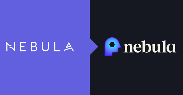
The result is a visual language that trades celestial clutter for restraint. The new logo centers on a side profile silhouette—a simple mark that doubles as a metaphor for introspection, self-study, and the idea that the real journey is inward. It’s spiritual, but not in a way that requires incense.
This is a bold, confident refresh of a product loved by many loyal users. We built an identity system celebrating exploration, intuition, and emotional depth, reflecting how users actually engage with Nebula as a trusted companion in navigating life’s questions.
Jordan Heber, Head of Strategy at Moving Brands
Minimal typography, softened gradients, and a flexible layout system push the brand into the same visual territory as meditation apps and premium lifestyle platforms, signaling that Nebula wants to be less fortune-telling hotline, more everyday ritual.
From Birth Charts to Breathwork
The rebrand arrives with a new tagline—“Awaken Here.” It’s a line that makes the strategy clear: Nebula isn’t just about predicting the future anymore. It’s about helping users feel like they can handle it.
The platform now includes psychic readings, guided video lessons, meditation tools, breathwork sessions, and sound-healing content alongside traditional astrology features. More than 1,500 advisors are available around the clock, turning the app into something closer to a spiritual streaming service than a horoscope generator.
Every great journey begins with a single question. For Nebula, that question was: What are people actually looking for? After seven years, we realized the answer wasn’t just clarity, but connection—to intuition, to meaning, and to ourselves. The rebrand is the natural evolution of that insight.
Max Lukominskiy, Nebula CMO
Designing for the Age of Searching-for-Meaning
What makes the Nebula refresh interesting from a design perspective isn’t just the polish—it’s the category shift. Spirituality apps have historically leaned into visual tropes: stars, moons, gradients, mystic serif fonts. Nebula’s new identity instead borrows from tech, streaming, and wellness brands, signaling credibility through restraint.
It reflects a broader trend: people still want guidance, but they want it packaged like software, not superstition.
In a world where everyone is looking for answers somewhere—therapy, tarot, podcasts, productivity apps—Nebula’s redesign positions the brand as a place where all those searches can live under one calm, carefully designed roof.
The post Spirituality, Rebranded: Nebula’s New Identity Turns Astrology Into a Full-Scale Guidance System appeared first on PRINT Magazine.