Award-winning branding agency WMH&I has unveiled a new identity for Natural Habitat, an environmental education charity focused on connecting communities through nature, sustainable land use, and biodiversity conservation. The rebrand transforms the organization from a grassroots initiative into a flexible, living brand system designed to grow alongside the landscapes and communities it supports.
Founded in 2023, Natural Habitat was created to bridge what it describes as a widening divide between people and the land. Working with farms, schools, specialists, community groups and local organizations, the charity delivers hands-on environmental education and conservation projects. However, despite strong work on the ground, the team struggled to communicate their purpose clearly, limiting wider engagement and fundraising opportunities.
To address this, WMH&I built the new identity around a simple but powerful idea inspired by Sir David Attenborough’s well-known observation: “No one will protect what they don’t care about, and no one will care about what they’ve never experienced.” The refreshed brand language and visuals aim to make the relationship between humans and land feel immediate, personal and tangible.
A Logo Shaped by the Land and People
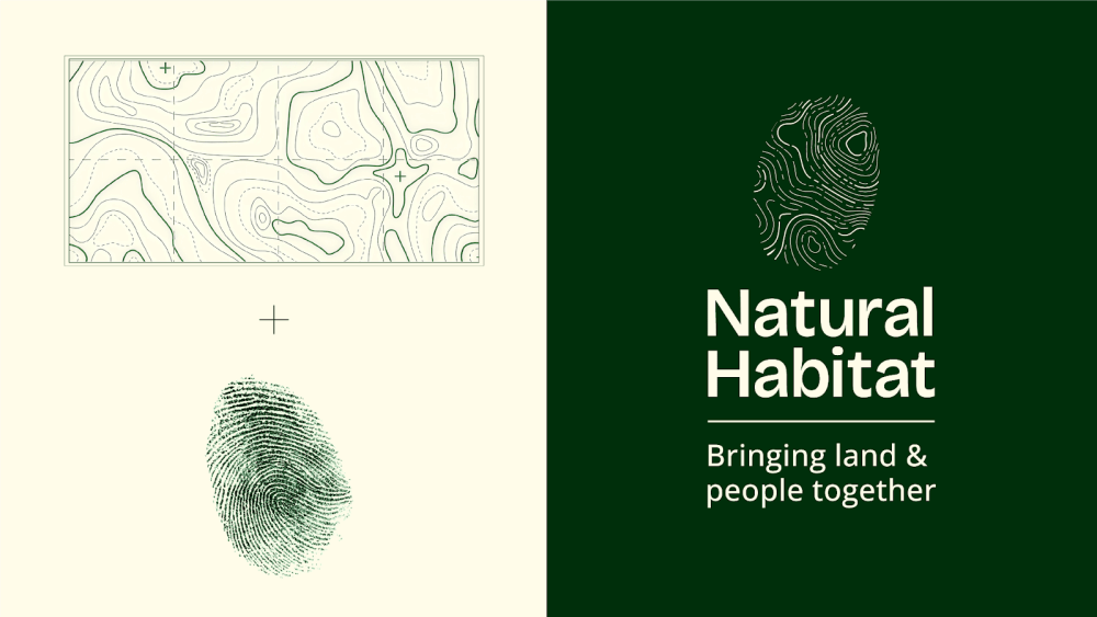
At the center of the new identity is a logo that merges a fingerprint with topographical contour lines, symbolizing the symbiotic relationship between human identity and landscape. Each Natural Habitat site features its own bespoke version of the mark, generated from the local terrain, reinforcing the charity’s place-based approach.
The system extends across every touchpoint, from educational trails and school workshops to signage, apparel and biodiversity installations. Importantly, the branding is designed to function as more than decoration. Many branded elements double as practical interventions—including bee hotels, wildlife habitats and learning tools—encouraging participation while directly supporting local ecosystems.
Mapping Flexibility
To support storytelling across physical and digital environments, WMH&I developed a flexible grid system based on topographical mapping. The structure allows the brand to adapt to different locations and formats while maintaining a consistent visual language.
The primary typeface, Bricolage, was selected for its warmth and accessibility, helping the organization speak in a more human and inclusive tone. Meanwhile, the color palette draws from seasonal change—fresh greens, bright florals, earthy rusts and crisp winter hues—creating a look that feels rooted in nature without relying on the muted visual clichés often associated with environmental branding.
From Abstract Mission to Human Message
Alongside the visual work, WMH&I helped Natural Habitat refine its core message. The new line, “Bringing Land and People Together,” reflects what the team describes as a wider cultural shift sometimes referred to as The Great Disconnect—the growing separation between communities and the natural environments around them.
Rather than relying on abstract language around climate change or biodiversity, the positioning focuses on lived experience: people losing access to land through inequality or ownership structures, and others becoming increasingly disconnected from nature through modern lifestyles. By reframing the issue in relatable terms, the charity hopes to make its mission feel personal—and, more importantly, actionable.
Our new identity has given us the emotional clarity we previously lacked, transforming us from a charity into a living ecosystem that people instinctively understand and want to be part of. Since our soft launch, we’ve seen stronger engagement and improved fundraising, and we’re now able to scale our activity and broaden our partnerships.
Carrie Phoenix, Founder and Executive Director, Natural Habitat
Our goal was to help Natural Habitat unlock the emotional power of its purpose and create a platform that could grow, adapt and regenerate over time. By making the connection between land and people more visible, the brand itself becomes an active part of community engagement and sustainable action.
Mark Nichols, Creative Director at WMH&I
As an identity designed to change with the landscapes it inhabits, Natural Habitat’s new brand shows how the power of design can go beyond messaging—sparking participation, rebuilding relationships with the natural world and helping drive the collective action needed to safeguard it for the future.
The post WMH&I Reimagines Natural Habitat With an Identity Rooted in Connection, Community, and Land appeared first on PRINT Magazine.