In the heart of Downtown Los Angeles, inside the City National building, SEGD—a global organization dedicated to advancing experiential and environmental design—hosted a day of speakers exploring the evolving role of branding in the built environment.
Closing the program, Ric Edwards, VP of Brand Design (Look of the Games) and Executive Design Director at LA28, offered a candid look at the immense undertaking of designing for the upcoming Olympic Games.
“I thought the Olympics had it all figured out,” he admitted. “It’s nothing like that.”
The lively discussion touched on what it means to design one of the world’s most visible brands, the Olympics! Far from a turnkey system passed from host city to host city, the Olympic Games operate more like a startup—rebuilt each cycle, shaped by new teams, new constraints, and a completely different cultural context.
For Los Angeles 2028, that context presents a unique challenge: how do you design a brand for a city that resists definition?
The Olympics as a Startup
There’s a persistent assumption that the Olympics function like a franchise—repeatable, predictable, refined over time. In reality, each organizing committee starts from scratch, navigating immense operational complexity while attempting to deliver a globally resonant experience.
“It’s a very startup situation,” Ric explained. “Every game is different.”
That reality fundamentally reshapes the role of design. Instead of applying an existing system, the LA28 team is building one—while pressure-testing it across an enormous range of brand and environmental touchpoints, from broadcast and digital platforms to stadium-scale environments.
Unlike most commercial timelines, this process includes a rare luxury: time. A multi-year research and development phase allows the team to study past Games, engage directly with athletes and communities, and evaluate ideas against real-world production constraints. Design becomes less about immediate output and more about sustained investigation.
The result is a challenge that is as much about infrastructure as it is about aesthetics.
Designing for a City Without One Story
If traditional branding aims to distill a single, clear idea, Los Angeles demands the opposite.
“There’s no one version of it,” Ric said. “You would do a disservice if you limited it to one story.”
Los Angeles is a city of contradictions—hyper-local yet globally influential, fragmented yet culturally dominant. Any attempt to reduce it into a singular identity risks flattening the very thing that makes it powerful. Rather than defining LA, the LA28 strategy reframes branding as a system capable of holding many narratives at once—an approach rooted not in simplification, but in expansion.
For those who know Southern California—like myself, that complexity is intuitive. Los Angeles is a city of ambition and contradiction, of glitz and grit, of quiet neighborhoods and global influence. It doesn’t resolve into a single note—and neither can its identity. With the Games extending across the greater Los Angeles region, the scale of that diversity only expands, reinforcing just how vast and layered the city truly is.
That sense of place extends beyond culture into the visual language itself—where color, light, and environment shape perception. The intensity of blue skies, the sprawl of greenery, the interplay of natural and busy urban landscapes—all contribute to a palette that feels distinctly Los Angeles.
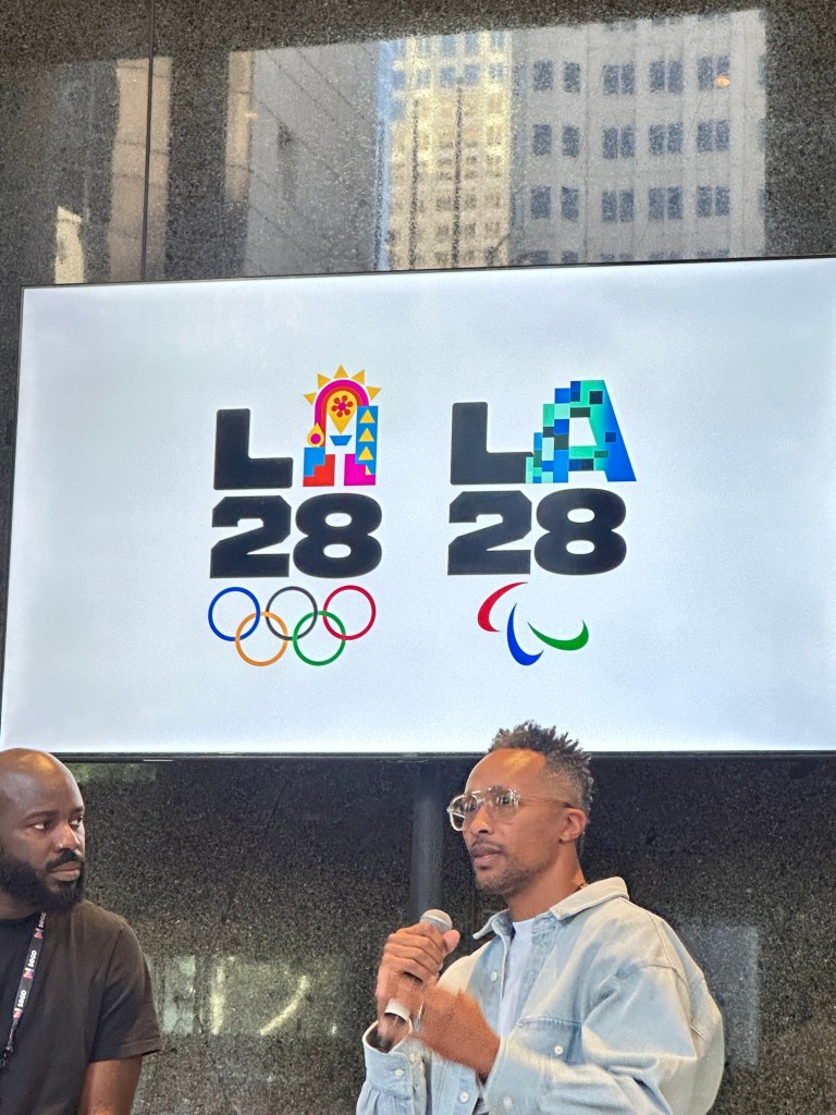
This philosophy takes shape in LA28’s dynamic emblem
Rather than a fixed identity, the emblem functions as a variable system. The “A” becomes a canvas, reinterpreted by athletes, artists, and cultural contributors, each iteration reflecting a different facet of Los Angeles. The “L, 2, and 8” are also different typefaces that represent the diverse city and its many facets. When driving around LA, you experience this firsthand.
“We’re trying to be a stage for all of those stories,” he said.
What sits beneath this system is not just authorship, but translation. The role of the designer shifts from creator to interpreter—translating culture into a form that can scale globally without losing its specificity.
Authorship, in turn, becomes distributed. Design decisions are informed not only by the creative team but also by athletes, community organizations, and cultural stakeholders. The brand is not imposed—it’s co-authored. This shift—from logo to platform—signals a broader evolution in design: moving from control to collaboration, from ownership to access. Of course, openness at this scale introduces complexity—lots of it. “Operationally, it’s a nightmare,” Ric admitted.
Behind every expression of the emblem sits a web of production constraints, legal approvals, and global brand governance. Each variation must function seamlessly across physical environments, digital platforms, merchandise, and broadcast—while remaining coherent within the broader system.
Unlike traditional branding processes, where production follows concept, LA28 integrates production thinking from the outset. Every idea is evaluated not only for its creative potential, but for its ability to exist in the real world.
It’s a reminder that ambitious design systems aren’t just conceptual—they are operational.
Designing for Memory, Not Just the Moment
While the Games themselves are fleeting, their visual language endures.
“You might not remember every record-breaking moment,” Ric noted. “But you remember how the Games looked.”
There is an inherent tension in Olympic design: it is both temporary and permanent. Built for a moment, yet remembered for decades.
LA28 leans into that duality—creating a system designed not only to perform in real time, but to embed itself in cultural memory. The goal is not just recognition, but emotional recall.
Because at its core, the Olympics are not just a sporting event—they are an emotional one. A global moment where audiences, regardless of their relationship to sport, connect through shared experience. What emerges from LA28 is not just a new Olympic identity, but a new model for branding at scale.
In a city like Los Angeles, that may be the only approach that works.
And as design continues to evolve—toward systems, participation, and cultural fluency—the implications extend far beyond the Olympics. Because the future of branding may not be about clarity alone. It may be about capacity.
The post Beyond the Logo: How LA28 Turns Branding into a Platform for Culture appeared first on PRINT Magazine.