Ghostly International, founded in 1999 in Ann Arbor, MI, is an ecosystem of recording, visual arts, street fashion and more. Their logo symbolizes the most contemporary dance and club music in the midst of Detroit’s avant-pop and indie rock scenes. Among its successes are long-running ambient series SMM and its dance imprint, Spectral Sound. The independent label has since expanded from its DIY days into an internationally recognized cabal of visual artists, designers and musicians.
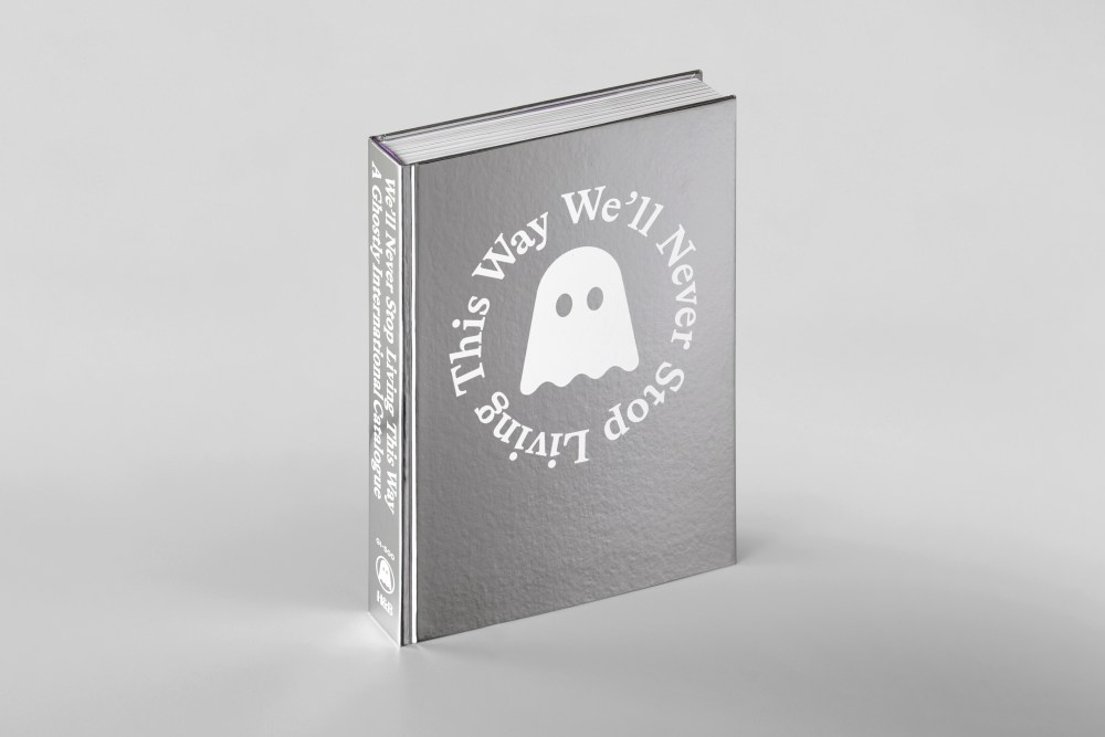
To celebrate its 25th anniversary, Hat and Beard Press has produced a limited-edition 488-page volume, Ghostly International — We’ll Never Stop Living This Way: A Ghostly International Catalogue, which opens up the label’s archives and history, featuring exclusive essays by critics Michaelangelo Matos and Philip Sherburne, as well as vintage photos, original interviews, and oral histories with both musical and visual artists from across the roster.
Co-edited by Sam Valenti IV, James Goggin and JC Gabel, the tome was designed by Goggin, co-founder of Practise, with a screenprint mirror-coated cover. I asked Goggin to revisit the conception and production of this impressive survey/record of what we can now label “Mid-Twenty-First Century” design. Here Goggin turns some pages and talks some talk about the project.
What inspired you to design and edit this Bible-esque catalog? Were you well-versed in their music legacy?
This was a project that slowly evolved. I’ve followed Ghostly for at least twenty years now, going back to the early to mid-2000s when I was based in London. I’d organically discovered a variety of Ghostly artists, mostly through the record covers. Musicians like Solvent, Lusine, Aeroc, Cepia, and Dabrye, among others, were all often in heavy rotation on the studio stereo at various points. I’d quickly pieced together that a remarkably diverse range of acts were all on this incredible, slightly mysterious, aesthetically pleasing, Detroit-adjacent label.
So I was pleasantly surprised when Sam Valenti IV DMed me out of the blue, some time around 2017, saying he’d been following our work. We met up for coffee in New York. The funny part of this is that, while I love designing books, and that’s a major proportion of our studio projects, I was excited to meet Sam because I wanted to design more record covers. Music has always been of huge importance in my life, I used to play drums, I play around with an OP-1 sampler/synthesizer now and then, and I’ve designed a small number of album covers over the years. I still buy vinyl and love record shops. This is perfect, I thought. I’d like a break from books and have a chance to design records. With a favourite label, no less. So Sam and I met up, and he said: “I’d like you to design a book.”
In terms of designing and editing the actual project, I was of course very happy to work on this important publication, even if it wasn’t a record. Well, it’s a different kind of record, as it turns out. A historical one. I came to the project as a fan, so I think that’s a big reason why—working with Sam, being in dialogue with Hat & Beard publisher JC Gabel—I wound up heavily involved in the editing too. I knew what I personally wanted to see and read in a book like this, and it was likely that other fans would too.
This led to its exhaustive qualities: let’s show every single album cover. Let’s consider both the musicians and designers as label artists: we should have interviews with both. Let’s have Sam’s running commentary, his recollections and stories, threaded throughout.
For a number of years Ghostly’s Twitter account had a provocative nocturnal alter ego, “Ghostly After Dark,” gently trolling their fans, riffing on memes, initiating nonsensical yet scholarly conspiracy theories (like experimental British electronic music auteurs Autechre actually being a front for Steve Jobs and Jony Ive). I proposed a secret zine full of GAD greatest hit tweet screenshots, stuffed into the back of the book, titled “Ghostly After Dark: Selected Ambien Works, 2017–21.” Sam also kindly humoured me with the many pun-based, music industry reference, and inside joke-filled captions and headings I peppered throughout the publication.
Tell me about your design principles. It is a very clean look to frame a lot of complex graphic design.
This was a tricky assignment. How do you design a good book that’s already filled with amazing graphic design? Filled with complex graphic design, as you say. I went through quite a few iterations at the beginning, gradually paring things back, taking the catalogue idea literally and allowing that to inform my approach.
My partner Shan James and I were actually working on a big catalogue raisonné project of the 20th century sculptor and architect Tony Smith for several years, in parallel with Ghostly. And I recognised that this project, Ghostly International, was essentially a catalogue raisonné of many artists, one label. I devised a grid that accommodated the predominantly square 12-inch album cover format, allowing some releases to run larger than others. But loose enough for the longer texts and other details not to feel too regimented. Something that hopefully lets the music and design do the talking, while still retaining its own identity, something musical, lyrical, and with very subtle humour.
The book is a catalogue of not just music but of designed objects. Ghostly is arguably equally known for its t-shirts, watches, sneakers, candles, and, er, blankets, as it is for records. Legendary British label Factory Records is inevitably mentioned a couple of times in the book, famous for allocating catalogue numbers not just to album releases, but to posters, places (FAC 51, their Haçienda nightclub), films, parties, even a lawsuit (FAC 61), not to mention the Haçienda’s office cat (FAC 191).
Like most record labels, the numerical catalogue order doesn’t exactly run chronologically, so we were more empirical than rational, sometimes deviating from the timeline to group a series of releases by a particular designer when it looked good. We have a “Catalogue Versus Chronology” note in the TOC, explaining how with Ghostly, for example, sometimes certain catalogue numbers are held back for a particular release at an earlier or later date, or even subsequently never used. The book itself is a case in point: as of this writing, end of March 2026, the current latest Ghostly release is GI-476, but we had already saved the landmark GI-500 number for the book, which came out towards the end of last year.
One important design principle for me is to always to listen. To the content, to the intentions of the subject (for this project, Sam and Ghostly), and in this particular case, to tons of music. This informed the book’s order, its typography, its minimal colour palette (mirror cover silkscreened white, black type, Ghostly Pantone purple highlights). As I got to know Sam better, I also came to better understand the subtle, wry, mischievous humour inherent to a lot of what Ghostly does. You’ll find this throughout the book, under its deceptively simple indexical surface.
I’m not familiar enough with electronic music and as I go through the book I realize I don’t know about many of the cover designers. Is there a community of Ghostly designers that are unique to the label?
There are indeed. All of the designers working for Ghostly also work for other clients, in different fields. But a number of them have definitely come to be graphic representatives of the label. None more so than Michael Cina, who is undoubtedly the most prolific cover designer for Ghostly. If anyone has shaped Ghostly’s aesthetic in a way comparable to, say, Vaughan Oliver’s 4AD, Designers Republic’s Warp, Peter Saville’s Factory, or Reid Miles’s Blue Note, it’s Mike.
But as a formal testament to Ghostly’s musical eclecticism, even Cina himself doesn’t have one single style. There’s a great variety in his output, and this runs alongside other notable multifaceted graphic contributors like Michael Segal, Will Calcutt, Sougwen Chung, Hassan Rahim, and Scott Hansen (ISO50) to name just a few.
I selfishly took on further editorial roles for the project in interviewing a number of these designers, as a nice excuse to get to know designers I’d long admired.
Did you work closely with Sam Valenti on the book? It appears that he has tight reins on the vision of Ghostly.
Very closely. We spent hours on Zoom calls, had a number of in-person meetings in New York, shared many emails, Dropbox files, alongside crucial support from Ghostly’s amazing art director and effective in-house archivist Molly Smith. “Tight reins” doesn’t sound right, though. Sam certainly has a clear vision and very distinct taste, that’s why Ghostly has been so successful. But his style is chill, instinctive, confident, generous.
He was very open to my ideas and my own particular conceptual, editorial, typographic, and aesthetic approaches, and I believe this combination of taste and trust is what has encouraged such a remarkable body of designed objects, not to mention the music. His role matches my own belief of what makes a good art director, or just a good manager: use your experience and taste to commission the right people for the right project, and then trust them to do their thing, while gently challenging and provoking them along the way.
Where does Spectral Sound intersect or differ with the look of Ghostly International?|
This is a good question, and I’m not sure if I have a confident answer. Valenti describes Ghostly as “genre-agnostic,” while Spectral was created as a more consciously dance floor-oriented counterpart. As such, I think Spectral’s look is generally more abstract, pattern-based, templated. More for the club, less for the average record shop in terms of any demands for clarity or exposition in its cover designs.
The covers are often more serialised, and while sometimes slightly generic, they’re only generic in the sense of Ghostly’s much better-designed, typographically refined versions of white label releases (the anonymous-looking records with literal white labels that have historically been sent out as test pressings or promo releases to DJs, only receiving actual artwork upon more commercial release if a track becomes a hit in the club).
Like everything they put out, Ghostly plays with convention, with even ostensible white label-level releases having artful typography, seductive colour schemes, and retina-burning patterns. I think of Will Calcutt’s amazing optical illusion graphics for Audion’s releases on Spectral as an archetypal case study. Pages 166 and 167, where I simply gathered a selection of his Hecatomb series covers, is one of my favorite spreads in the whole book.
I am impressed by the diversity and consistency of the designs, especially the abstraction of ISO50. Would you say that each designer or design studio contributes to a Ghostly house style or is the style simply the diversity?
I’d say both: each designer contributes to a Ghostly house style, and the resulting diversity is itself something that has become recognisable for the label. Like I mentioned with Michael Cina, the kinds of designers that Sam and Molly tend to commission are interesting, heterogeneous, often multidisciplinary artists, so there are in fact layers upon layers of formal diversity that somehow collectively, alchemically, just feel “Ghostly.”
A crucial part of this is that it all comes from the very specific taste and instinct of Sam and his crew. You couldn’t just go to some big agency and ask them to create a brand like this. It’s a project that’s needed time, sincerity, trust, and great music in order to evolve into something alive and in flux, something we hope to have captured in this book just for this particular moment, 25 years in.
It is a massive project dealing with all this work. Has the book met your expectations?|
It was indeed a massive, complicated project, so difficult to truly fit everything in. We gave it the time it needed, and during its process I went from teaching full-time at RISD and running the studio with Shan in the US, to then contending with the pandemic, moving to New Zealand, and now working from here. I ultimately travelled to Heyuan in China last year to make final cover tests and supervise the book being printed. For the cover, white UV ink was originally suggested by the printers, but it looked ever so slightly pearlescent on the mirror cover. It was a crucial detail for me both materially and conceptually that we silkscreen it, given the importance of that medium to independent music culture—think of band t-shirts, hand-printed flyers, DIY record covers.
I mentioned our catalogue raisonné work, an art historical term that more or less means “reasonable catalogue”: a comprehensive, annotated listing of all the known works of an artist, to the best of one’s knowledge. Within reason. For a deceased artist, it’s often impossible to track down every single work produced in a lifetime, and that was the case here too. Some great projects for Ghostly by people we love somehow didn’t make it into the book, completely unintentionally, partly because the longer we kept going, the more we were putting another “reasonable” parameter at risk: the impossibility of printing that many pages and selling the book at a vaguely reasonable price. Or being able to hold the book and read it without breaking your wrists.
Luckily, the ultimate fully comprehensive Ghostly catalogue has already been published, and it’s constantly being updated: the Ghostly website. But I’m very happy with where we got to. It’s a book that does the label and its artists, and Sam’s endeavours, justice. And ultimately, hopefully a book for the fans. That was our ultimate ambition. It’s why I even put them on the cover, reflecting their faces in the mirror. Spectrally speaking, it turns out that the true spirit of the label has always been its listeners. And now readers.
The post The Daily Heller: The Ghostly Physics of Designing an Incomparable Indie Label appeared first on PRINT Magazine.