Typography has long been positioned as a vessel for language, a neutral system for delivering words. But that framing has always been incomplete. Letterforms don’t only carry meaning; they shape it. They encode geography, power, migration, and memory. In an era of global sameness, where typographic systems flatten into frictionless defaults, the question isn’t just how we read, but what histories are being erased in the process.
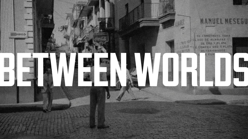
Between Worlds, a typographic project by Brooklyn-based designer Daniel Irizarry, Designer & Creative Director at Athletics, pushes back against that flattening. Built as a bilingual exploration of the Puerto Rican diaspora, the work treats type not as a stylistic layer, but as cultural infrastructure. Across three display typefaces, each rooted in a different facet of Puerto Rican and Puerto Rican–American experience, Irrizarry constructs a visual language that holds contradiction: island and mainland, pride and displacement, visibility and erasure.
What makes the project particularly resonant is its refusal to separate form from context. Here, typography actively participates in documenting culture. The letterforms become artifacts, shaped by street signage, military history, and commercial aesthetics, extending into physical objects and spatial expressions that mirror the lived realities they reference. In doing so, Between Worlds positions type design closer to anthropology than decoration: a method of preservation, interpretation, and, at times, quiet resistance.
That raises a broader question for the discipline. As design systems scale and standardize, what responsibility do type designers have in maintaining cultural specificity? And when language alone falls short, can form carry what words cannot?
To unpack these tensions, between personal archive and public narrative, commercial practice and cultural critique, I asked Irizarry about the making of Between Worlds, and how typography can function as both memory and message.
“Between Worlds” frames typography as cultural documentation rather than purely aesthetic craft. At what moment in this project did you realize the letterforms themselves — not the written words they spelled — were carrying the emotional weight of the diaspora experience?
The project started more as an opportunity to explore some of my own interests and cultural background. I was mainly trying to dig through historical references and archival imagery for any interesting typographic or design references. Also, I just love looking at those historical images and how things change over time. As I got deeper into the development of the three typefaces, I started making connections between the subject matter and my own personal background.
Borinqueneers, for instance, is rooted in a reference image or two that I had found early on, and as my interest in the project grew, I read more about the history of the unit. Creating the work and researching the references fed each other, and over time I saw more of myself in the work and also more macro stories about the relationship between Puerto Rico and the United States. I don’t want to claim that the work carries the emotional weight of the diaspora experience, but more so that it’s a reflection of my own identity and has elements or throughlines that can be drawn to a broader story and historical context within that relationship.
The Borinqueneers typeface took on a deeply personal dimension when you discovered three of your mother’s uncles served in the 65th Infantry Regiment. How did that discovery change the way you approached the design decisions for that typeface, and did it ever make the work feel too heavy to continue?
I had been working on the typeface and researching the unit more as an area of interest. Their story was not something I was super familiar with prior to this project, and the more I read about it the more I felt like it was a bit of a reflection of the relationship between those two countries and the tension that lives there. People who served honorably and represented their people but who weren’t always treated with the dignity and respect they deserved for putting their lives on the line. One day I was talking with my mom on the phone, just talking about the project and some of the books I was reading, and she mentioned that she had family who served in that unit. To me it wasn’t something that made me want to stop working on the project as much as something that helped keep me going, a feeling that I was maybe on the right track with my work. I think their story is an important one and my work is a small way of shining a light on our history and an opportunity for me to better understand my own.
You’ve built a career in branding at Athletics, and Piragua directly interrogates consumer culture and “storefront seduction.” How do you hold the tension between working within commercial systems you’re also critically examining, and does that contradiction make the work stronger or more complicated?
I love graphic design and I love being a designer. I think design has real power for meaningful change and is an important tool in communicating messages clearly and with impact. At the same time, we have to acknowledge our role in amplifying certain messages. I’ve been working in branding for several years now and at different times have volunteered my time off and on. Something that has always been a sore point for me is that the people with the most important messages and who are doing the most important work have the least amount of access to design. Design is very select and narrow as it stands today. Even in my own commercial work, I look for ways to expand the viewpoint of what is considered “good” design in the day to day. How can design be broader, represent more perspectives, and have a wider point of view?
In the end, design is often a commercial endeavor and we all have to make a living, but I try to bring my own point of view into that work where I can. One of the things I really admire about the partners and founders at Athletics is that their values are aligned with my own. There’s a line around the work we’re willing to take on and what we’re not, and for me that’s really important. Piragua and Between Worlds in general is really about exploring those tensions and acknowledging them, but it isn’t a judgement. The same tools that might fuel a harmful culture of consumerism also help support small businesses and give voice to movements. As designers trying to make a living, I think it’s about balance and sticking to your values.
Callejón was born from a desire to preserve everyday Puerto Rican vernacular phrases before they disappear. In an era of rapid cultural homogenization, do you believe type designers have a preservation responsibility that extends beyond aesthetics into something closer to linguistics or anthropology?
I don’t want to speak on behalf of all designers about their responsibility in their work, but personally I have a deep love for some of these turns of phrase and visual vernacular. They represent my family, my culture, and hold a special place in my heart. A lot of this project and my personal work comes from a love of the subject matter and the culture and just wanting to capture aspects of it for others to maybe see and enjoy. It’s also a snapshot of a moment that I want to hold onto for myself. A bit like a photograph that you can look back on and remember those moments fondly. I want to keep some of those ideas and personalities alive in my work. There are a lot of designers and artists doing this kind of work today and I really admire that. I want to explore my own ways to contribute and create work that matters to me and hopefully connects with others.
You’ve described Between Worlds as “ongoing”, simultaneously a personal archive and a public conversation. Where does a project like this actually end, and how do you know when typography has done everything language alone could not?
For me, this project was a labor of love, and aspects of it have been a motif or inspiration in my personal work for years. I’ve always had a love for different Puerto Rican sayings or turns of phrase and would make illustrations or art around that for years. This project was a bit about forcing myself to put pen to paper and to share the work, to work towards a milestone of some kind and publish it in some way to really hold myself accountable to actually making it. Now that I’ve developed these three typefaces wrapped in this project, it’s really a reflection of my own personal identity and motifs that I will always find inspiration in. So in many ways my work will forever be connected to these ideas, whether directly as part of this project or more broadly representing my own history and heritage.
Puerto Rican history is a bit of a blind spot in the United States outside of the Latine community. I think with artists like Bad Bunny there is more visibility than ever before, but there is a ton of history and story to surface and highlight. This project was a small attempt to do that in my own way. What I find really compelling about type design is that the visual form carries meaning alongside the words themselves. The letterforms give voice to the message in ways that language alone doesn’t always capture. Leveraging type design as a tool to document culture, not just the language that supports it, is powerful. And it provides others with those same tools to communicate their message with that underlying subtext. That’s something I’d like to continue exploring going forward.
The post How Letterforms Carry Culture appeared first on PRINT Magazine.