Every poster you notice, every logo you recognize instantly, and every interface you navigate effortlessly is the result of deliberate design decisions. Graphic designers don’t just make things look good—they shape how we interpret information, connect with brands, and experience the world visually. Their work quietly influences culture, behavior, and even memory, often without us realizing it.
Celebrating graphic designers means acknowledging the minds behind the visuals that define generations. From iconic typefaces to revolutionary layouts, these creatives have translated complex ideas into powerful, accessible forms. Their work bridges art and communication, blending creativity with purpose in ways that continue to evolve with technology and society.
This list of legendary designers is more than a tribute—it’s a journey through the evolution of visual communication. By understanding their contributions, we gain insight into how design became an essential part of modern life and why it continues to shape the future.
Early Modern Graphic Design Pioneers
(1900s–1940s | Foundations of Modern Design)
The early 20th century marked a significant shift in graphic design, as it began to establish itself as a distinct discipline rather than merely an extension of fine art or printing. Experimentation, industrial growth, and the need for clear visual communication in an increasingly modern world defined this era. Movements like modernism and constructivism challenged traditional aesthetics, favoring simplicity, geometry, and functionality.
Designers of this period laid the groundwork for everything that followed. They introduced grid systems, sans-serif typography, and the idea that form should follow function. Their work wasn’t just visually striking—it was purposeful, often tied to social, political, and cultural shifts happening across the globe.
The pioneers of this era didn’t have the tools designers rely on today, yet their influence remains deeply embedded in contemporary design. Their innovations created a visual language that continues to guide how designers think, create, and communicate.
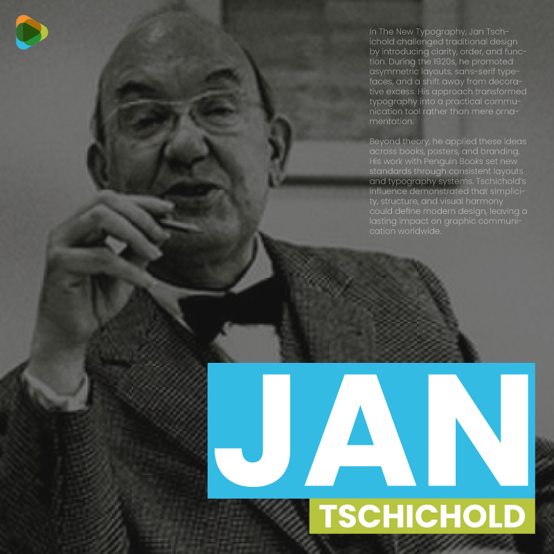
1. Jan Tschichold
Jan Tschichold, 1963. Photograph by Erling Mandelmann. © photo©ErlingMandelmann.ch. Licensed under CC BY-SA 3.0, via Wikimedia Commons.
Flip through The New Typography, and it’s clear that Jan Tschichold was rewriting the rules of design. In the 1920s, he championed clean, asymmetric layouts, sans-serif typefaces, and functional design, challenging the ornate, decorative styles of the era. His ideas made typography not just readable but purposeful, turning every page into a tool for clear communication.
TypoGestaltung (typographic composition sheet / design poster). Unknown author. Public domain / Wikimedia Commons.
Tschichold didn’t stop at theory. He applied these principles to book cover design, posters, and corporate identity, most famously for Penguin Books, where he standardized layouts and type usage. His work proved that structure and clarity could coexist with beauty, laying the foundation for modern graphic design as we know it.
2. Herbert Bayer
Bayer pattern diagram by Cburnett, licensed under CC BY-SA 3.0 / GFDL, via Wikimedia Commons.
Herbert Bayer, an Austrian designer strongly associated with the Bauhaus, transformed perceptions of typography. During his time at Bauhaus, he developed the universal typeface in the 1920s—a font that eliminated uppercase letters and emphasized simple, geometric shapes. His aim was simple but bold: make typography functional, efficient, and easy to read, without unnecessary decoration.
Herbert Bayer, Stadelwand, 1936. Photo: M.T. Abraham Center for the Visual Arts / Wikimedia Commons. CC BY 3.0, Wikimedia Commons.
Bayer applied the same philosophy across posters, exhibitions, and identity projects. His Bauhaus posters are instantly recognizable for their bold layouts, minimal elements, and clear hierarchy. While the Universal Typeface never became mainstream, it sparked a movement toward simplicity in design, influencing how modern designers approach typography and visual communication today.
3. László Moholy-Nagy
László Moholy-Nagy, c. 1930. Photograph by Hugo Erfurth. Public domain, via Wikimedia Commons.
At the Bauhaus, László Moholy-Nagy quietly reimagined how posters could communicate. He mixed photography, bold typography, and geometric shapes to create designs that felt modern and functional at the same time. One of his standout works, the Bauhaus Exhibition 1923 poster, turned simple information into a visually engaging composition that still feels fresh today.
László Moholy-Nagy, 1922. Photo: Hattula Moholy-Nagy (MI), Wikimedia Commons. CC BY 3.0, Wikimedia Commons.
Beyond posters, Moholy-Nagy experimented with photomontage, light, and motion, always applying the Bauhaus principle that design should be clear, practical, and visually compelling. His ideas helped shape a generation of designers who saw that form and function could coexist beautifully.
4. El Lissitzky
El Lissitzky, Self-Portrait, 1924. Public domain, via Wikimedia Commons.
El Lissitzky, a pioneering Russian designer and artist, created Beat the Whites with the Red Wedge in 1919—a poster that turned simple geometric shapes into a powerful political statement. The red triangle piercing the white circle symbolized the Bolsheviks’ triumph over their opponents, and its clean, bold composition made it instantly memorable. This work defined Lissitzky’s approach and became a landmark in Constructivist graphic design.
El Lissitzky, 1919–1920. Artwork: Beat the Whites with the Red Wedge (Klinom Krasnym Bej Belych), Russian State Library. Public domain, Wikimedia Commons.
Beyond this iconic poster, Lissitzky applied the same principles to typography, book layouts, and exhibition design. By experimenting with perspective, space, and minimal forms, he showed that design could communicate complex ideas clearly and effectively, influencing generations of modern designers.
5. Piet Zwart
Piet Zwart, photograph (NL-HaNA 2.24.01.03-917-1515). Photographer: Hugo van Gelderen. Dutch National Archives (Nationaal Archief). Licensed under CC BY-SA 3.0 Netherlands, via Wikimedia Commons.
The NKF Cable catalogs are where Piet Zwart’s genius really shows. In the 1920s and 30s, he took what could have been ordinary technical documents and turned them into bold, visually engaging designs. With clean grids, dynamic layouts, and inventive typography, Zwart made information easy to follow while giving it a modern, almost playful energy.
Piet Zwart, 1931. Design: Dutch postal stamp “Goudse Glazen” series. Staatsbedrijf der Posterijen, Telegrafie en Telefonie (PTT). Public domain, Wikimedia Commons.
He carried this approach into photography, advertising, and typography, always balancing function with visual interest. Zwart’s work proved that even industrial and technical design could be stylish and clear, influencing generations of modern designers who wanted practicality and creativity to coexist.
6. Alexey Brodovitch
Alexey Brodovitch, 1950. Photograph (unknown author). Public domain, via Wikimedia Commons.
The Harper’s Bazaar spreads of the 1930s redefined what a magazine could look like. Bold typography, dynamic photography, and unconventional page arrangements turned fashion spreads into visual stories that felt modern and alive. Alexey Brodovitch’s clever use of scale, contrast, and white space made every page not only beautiful but easy to navigate—a revolutionary approach for its time.
These layouts set a new standard for editorial design, influencing generations of designers and photographers. By treating layout as a creative tool rather than just a framework, Brodovitch showed how rhythm, composition, and visual flair could elevate storytelling—an approach that still resonates in magazines, advertising, and digital media today.
7. Jan van Krimpen
Haarlemmer Specimen (type specimen sheet) by Jan van Krimpen. SVG digital reproduction by Typehigh / Dutch Type Library. Licensed under CC BY-SA 3.0 / GFDL, via Wikimedia Commons.
When Lutetia was released in the 1920s, it immediately stood out for its elegance and readability. Jan van Krimpen designed this typeface with a perfect balance between classic Roman letterforms and modern functionality, making it ideal for books, posters, and printed text that needed sophistication without sacrificing clarity. Its subtle curves and carefully considered proportions give every letter a sense of harmony and precision.
Jan van Krimpen. Design: Voorbeeld initialen (specimen of initials). Photographer/creator: unknown, Wikimedia Commons. Public domain / Wikimedia Commons.
Van Krimpen’s work went beyond creating a beautiful type. He believed that typography should serve the text, guiding readers effortlessly while enhancing the overall aesthetic. With Lutetia and his other typefaces, he influenced generations of typographers, proving that thoughtful design could quietly transform how we read, interpret, and experience the written word.
8. Paul Renner
Paul Renner, c. 1927. Photograph by Eduard Wasow. Public domain, via Wikimedia Commons.
When Futura appeared in 1927, it immediately marked a shift in modern typography. Paul Renner designed the typeface with clean geometric shapes, sharp lines, and a sense of precision that reflected the optimism of the modern age. Its minimalist, functional design made it perfect for advertising, signage, and publications, giving text a clarity and elegance that felt entirely new.
Paul Renner. Design: Futura typeface specimen (SVG reproduction). Creator: ZoeB, Wikimedia Commons. CC BY-SA 4.0, Wikimedia Commons.
Renner’s influence went far beyond a single typeface. With Futura, he showed that typography could be both practical and expressive, balancing simplicity with personality. The typeface has endured for nearly a century, becoming a staple in print, branding, and digital design, proving that thoughtful, modernist principles can stand the test of time.
9. Eric Gill
Eric Gill, bronze sculpture, photograph of artwork. Public domain via Wikimedia Commons.
The release of Gill Sans in 1928 turned heads in the design world with its clean, humanist forms and approachable geometry. Eric Gill created a typeface that was both elegant and versatile, perfect for signage, publishing, and corporate branding, most famously used by the London Underground and Penguin Books.
Eric Gill, 1909. Design: Alphabets and Numerals. Photographer/scan: Colin McLaughlin (V&A Museum reproduction). CC BY-SA 4.0, Wikimedia Commons.
Beyond Gill Sans, Gill’s work as a sculptor and letter cutter informed his attention to detail and balance in typography. His designs proved that type could be functional, readable, and subtly expressive, creating a lasting impression on modern graphic design.
10. Frederic Goudy
Frederic W. Goudy, 1924. Photograph by Arnold Genthe. Public domain, via Wikimedia Commons.
The Goudy Typeface Family, created in the early 20th century, brought warmth and elegance to printed text. Frederic Goudy designed these typefaces with classic proportions and a humanist touch, making them highly readable while retaining a handcrafted charm. Works like Goudy Old Style became staples for books, magazines, and advertising.
Frederic Goudy specimen sheet showing type samples, 2014. Photo: Blythwood, Wikimedia Commons. CC BY-SA 4.0, Wikimedia Commons.
Goudy’s contribution went beyond individual typefaces. Over his career, he designed more than 100 fonts, shaping American typography with a focus on legibility, craftsmanship, and subtle beauty. His work set a standard for type design that balances tradition with timeless appeal.
11. William Addison Dwiggins
William Addison Dwiggins, circa 1953. Photograph by Dorothy Abbe. Public domain, via Wikimedia Commons.
If you look at typography from the 1920s, Metro stands out as a typeface that seemed ahead of its time. It combined clean lines with balanced forms, giving magazine covers, books, and advertisements a modern clarity that was rare back then. Its simplicity felt purposeful, proving that a type could be functional without ever feeling dull.
William Addison Dwiggins’ initial letter designs, c. 1940s. Photo: Dorothy Abbe. Public domain, Wikimedia Commons.
William Addison Dwiggins didn’t stop with type design. He coined the term “graphic designer” and applied his ideas across book layouts, calligraphy, and illustration, showing how thoughtful design could make information both readable and visually engaging.
12. Josef Albers
Proto-Form (B), 1938, oil on fiberboard, by Josef Albers. Collection of the Hirshhorn Museum and Sculpture Garden, Washington, DC. Image via Wikimedia Commons.
Josef Albers‘ Homage to the Square series immerses you in a world of color, form, and subtle optical illusion. Starting in the 1950s, Albers explored how simple nested squares could create endless variations in perception, showing how color changes depending on its surroundings and context. Each painting feels quiet and precise, yet surprisingly dynamic—a study in both restraint and experimentation.
Josef Albers Wrestling artwork, 1977. Photo: Whiteghost.ink. CC BY-SA 4.0, Wikimedia Commons.
Albers’ teaching at the Bauhaus and later at Yale emphasized observation, experimentation, and disciplined creativity, influencing generations of designers and artists. Through his work, he proved that even the simplest forms could be powerful tools for understanding color, space, and visual communication.
13. Theo van Doesburg
Theo van Doesburg in military service, c. 1915. Anonymous photographer (Netherlands). Courtesy of RKD – Netherlands Institute for Art History. Public domain, via Wikimedia Commons.
Walk through the pages of De Stijl publications, and you immediately notice Theo van Doesburg’s radical sense of order and balance. In the 1910s and 20s, he used grids, geometric shapes, and carefully aligned typography to create layouts that felt both precise and dynamic. Every line, block of text, and rectangle was deliberate, turning design into a visual language that could communicate as clearly as words.
Theo van Doesburg, 1916–1917. Artwork: Card Players. Photo: Google Art Project / Kunstmuseum Den Haag. Public domain, Wikimedia Commons.
Van Doesburg’s influence extended beyond magazines. He shaped the De Stijl movement through painting, architecture, and exhibitions, proving that abstraction and geometry could guide not just art, but design, typography, and visual communication in ways that still resonate today.
14. Hendrik Nicolaas Werkman
Hendrik Nicolaas Werkman, c. 1906. Photograph by S. Weinberg. Public domain, via Wikimedia Commons.
A Hendrik Nicolaas Werkman poster immediately feels alive, as if the letters themselves are moving across the page. Working in the 1920s and 30s, he experimented with printing techniques, stencils, and hand-applied typography to create dynamic compositions that blurred the line between text and visual art. His posters for De Ploeg and other publications turned typography into rhythm, energy, and expression.
Hendrik Nicolaas Werkman “The Next Call” cover design, 1926. Photo: H.N. Werkman. Public domain, Wikimedia Commons.
Werkman didn’t limit himself to design for communication alone. His playful approach to type and printing inspired future generations to see letters as more than symbols—they could be visual elements, experimental forms, and a way to inject personality into design without losing readability.
15. Kurt Schwitters
Kurt Schwitters, 1927. Photograph by Genja Jonas. Public domain, via Wikimedia Commons.
Open a page of Kurt Schwitters’ Merz works, and you step into a world where scraps of text, images, and letters collide to form something entirely new. In the 1920s and 30s, Schwitters used typography, collage, and found materials to create dynamic compositions that challenged traditional design rules. His Merz layouts transformed type into texture and rhythm, turning every page into an experimental visual experience.
Kurt Schwitters The Grave of Alves Bäsenstiel, 1919. Photo: unknown, Sotheby’s / Wikimedia Commons. Public domain, Wikimedia Commons.
Beyond his publications, Schwitters’ approach influenced modern graphic design, typography, and collage, showing that even chaotic elements could be arranged with harmony and purpose. His work proved that typography could evoke emotion, movement, and energy.
16. Adolphe Jean-Marie Mouron (Cassandre)
Portrait of A. M. Cassandre, 1967. Photograph by Ron Kroon / Anefo. Nationaal Archief (Dutch National Archives). Dedicated to the public domain under CC0, via Wikimedia Commons.
The Normandie poster captures movement and elegance in a single glance. Designed in 1935, A.M. Cassandre used bold geometric shapes, streamlined lines, and perspective to convey the speed and luxury of the famous French ocean liner. Every element—from the typography to the angled composition—works together to create a sense of motion that feels both modern and sophisticated.
A. M. Cassandre Étoile du Nord poster. Photo: Nationaal Archief (Bestanddeelnr 189-0330). Public domain, Wikimedia Commons.
Cassandre’s mastery extended beyond posters. He revolutionized advertising design, typefaces, and brand identity, showing how graphics could communicate emotion, speed, and style with precision. His work on Normandie remains a benchmark for combining art, commerce, and visual storytelling in design
17. Edward McKnight Kauffer
Portrait of E. McKnight Kauffer, London. Courtesy of the Library of Congress Prints and Photographs Division. Public domain, via Wikimedia Commons.
Step onto the streets of London in the 1920s, and Kauffer’s posters for the Underground grab your attention with bold colors, abstract forms, and dynamic layouts. Edward McKnight Kauffer transformed public transit advertising into modern art, using geometric shapes, expressive typography, and stylized figures to make travel feel exciting and accessible. Posters such as Night Travel and Daily Mail demonstrate the ability to encapsulate movement, speed, and atmosphere in a single visual.
Edward McKnight Kauffer Godstone poster, 1915. Photo: Cooper Hewitt, Smithsonian Design Museum. Public domain, Wikimedia Commons.
Kauffer’s work went beyond the Underground. His approach to poster design, illustration, and typography influenced commercial art worldwide, proving that public-facing graphics could be both functional and visually striking. His innovations set a standard for clarity, impact, and creativity in mass communication.
18. Fortunato Deper
Fortunato Depero, Autoritratto su un albero (Self-portrait on a tree), 1915. Photograph/print displayed in Rovereto. Image by Lungoleno. Licensed under CC BY-SA 4.0, via Wikimedia Commons.
Walk into the world of 1920s advertising, and Depero’s Campari campaigns immediately stand out with their bold colors, geometric forms, and playful energy. Fortunato Depero posters and packaging used strong diagonals, dynamic typography, and vibrant palettes to make the brand feel modern, lively, and unmistakably Italian. Each design turned a simple drink into a visual celebration of movement and style.
Fortunato Depero Campari poster, 1925. Photo: Fortunato Depero. Public domain, Wikimedia Commons.
Depero didn’t stop at Campari. As a Futurist, he applied the same dynamic approach to books, exhibitions, and product design, showing how art and commerce could merge seamlessly. His work proved that advertising could be daring, visually engaging, and a true expression of personality.
19. Paul Schuitema
Photograph of Chaja Goldstein. Associated with Paul Schuitema. Dutch National Archives (Nationaal Archief), Bestanddeelnr 901-9424. Public domain, via Wikimedia Commons.
Step into the industrial world of the 1920s Netherlands, and Schuitema’s posters immediately stand out with their bold typography, strong diagonals, and striking photography. Paul Schuitema designs for companies like Philips and other industrial clients transformed utilitarian products into visually compelling messages, using minimal elements to convey maximum impact.
Paul Schuitema Chair No. 55 furniture design, 1932. Photo: Sailko. CC BY 3.0, Wikimedia Commons.
Schuitema’s approach went beyond advertising. He applied De Stijl principles to typography, layout, and photography, showing that industrial design could be modern, clear, and engaging. His work influenced European graphic design, proving that simplicity and precision could communicate as effectively as ornamentation.
20. Ladislav Sutnar
Ladislav Sutnar, 1934. Photograph: anonymous (published in Světozor, 1934). Public domain, via Wikimedia Commons.
Open a Sutnar catalog, and you immediately notice how organized and effortless it feels. In the 1930s and 40s, Ladislav Sutnar turned complex product information into clean, easy-to-follow layouts, using grids, color psychology, and clear typography. His designs for consumer catalogs and signage made navigating information simple, practical, and visually engaging.
Sutnar’s influence went beyond catalogs. He helped define modern information design, showing that clarity, hierarchy, and consistency could make even dense content approachable. His principles are still used in wayfinding, interface design, and corporate publications today.
21. Alexander Rodchenko
Alexander Rodchenko, 1935. Photograph by Isaak Brodsky. Public domain, via Wikimedia Commons.
Step into the streets of 1920s Russia, and Alexander Rodchenko’s posters almost leap off the walls. Sharp diagonals, bold typography, and dramatic contrasts made his work feel alive, turning simple messages into visual commands. Posters like Books and Lenin for the Party didn’t just inform—they energized, persuaded, and reshaped how people experienced graphic design.
Alexander Rodchenko Books! In All Branches of Knowledge poster (Lilya Brik), 1924. Photo: Alexander Rodchenko. Public domain (U.S.), Wikimedia Commons.
Beyond his posters, Rodchenko experimented with photomontage, typography, and exhibition design, laying the groundwork for modernist and constructivist design principles. His approach proved that design could be both functional and revolutionary, influencing generations of artists and designers worldwide.
22. Gustav Klutsis
Gustav Klutsis and Valentina Kulagina, Photomontage, 1922. Created by Gustav Klutsis. Public domain, via Wikimedia Commons.
Looking at Klutsis’ posters, you can immediately see the power of visual rhythm. In the 1920s and 30s, Gustav Klutsis combined photomontage, bold typography, and strong geometric shapes to communicate Soviet ideals with clarity and energy. Campaigns like Electrification of Russia and various political posters made complex messages feel immediate and persuasive, using composition as a tool for both attention and understanding.
Gustav Klutsis Construction photomontage, 1921. Photo: Google Art Project / Latvian National Museum of Art. Public domain, Wikimedia Commons.
Klutsis’ work extended beyond propaganda. His innovations in photomontage and graphic structure influenced modern poster design, showing how typography, photography, and layout could work together to convey meaning efficiently and effectively. His approach remains a reference point for designers working with political and commercial messaging alike.
23. Cipe Pineles
Cipe Pineles, ca. 1950. Photograph (artist unknown). Courtesy of the RIT Cary Graphic Arts Collection. Licensed under CC BY-SA 4.0, via Wikimedia Commons.
Some of the most influential works from Cipe Pineles are her editorial designs for magazines like Seventeen, Charm, and Glamour in the mid-20th century. Her innovative layouts combined fine art, illustration, and photography, bringing a new level of sophistication to mainstream publications while reshaping how visual stories were told.
Pineles also introduced a more thoughtful and modern portrayal of women in print media, using design to move beyond stereotypes and connect with readers on a deeper level. By blending typography and imagery with clarity and elegance, she influenced generations of designers and demonstrated that editorial design could be both highly functional and visually compelling, setting a new standard for magazine design.
24. John Heartfield
Some of John Heartfield’s most striking works are his anti-fascist photomontages created for German political publications in the 1920s and 30s. Using bold juxtapositions of images and text, he turned everyday photographs into sharp political commentary, exposing propaganda and injustice with a clarity that was impossible to ignore.
John Heartfield The Hand Has Five Fingers poster, 1928. Photo: John Heartfield. Public domain (U.S.), Wikimedia Commons.
Heartfield’s work went beyond posters; his photomontage techniques influenced graphic design, editorial layouts, and visual activism. His innovative approach proved that design could be a powerful tool for communication and social change, blending artistry with purpose in every composition.
25. Elmer Simms Campbell
Elmer Simms Campbell (profile portrait). Photograph (unknown photographer). Public domain, via Wikimedia Commons.
Some of Elmer Simms Campbell’s most recognizable works are his lively illustrations for The New Yorker in the 1920s and 30s. His playful, elegant depictions of city life, nightlife, and social scenes captured the energy of the Jazz Age with humor, style, and a keen eye for character.
E. Simms Campbell Cuties, 1968. Syndicated by King Features. Public domain (U.S.), Wikimedia Commons.
Beyond magazine illustrations, Campbell influenced visual storytelling in advertising and editorial design. His ability to convey mood, personality, and motion through simple lines and composition made him a defining voice of American illustration during a transformative cultural era.
26. Will Burtin
Will Burtin’s most remarkable works are his visual explanations for complex scientific and technical subjects in the 1940s and 50s. Through clear diagrams, models, and infographics, he made complicated processes—from industrial systems to medical concepts—simple to understand and visually engaging.
Burtin’s approach went beyond mere illustration. He bridged design and science, showing that graphics could clarify information, guide decision-making, and communicate knowledge effectively. His work laid the foundation for modern information design, influencing everything from corporate communications to educational graphics.
27. Herbert Matter
Herbert Matter, portrait (date unknown). Photograph by Herbert Matter or studio attribution not specified. Public domain via Wikimedia Commons.
Herbert Matter’s Swiss posters captured movement and mood with just a few photographs and shapes. By layering photography, typography, and bold geometric forms, he turned travel and corporate promotions into dynamic, modern visuals that were both clear and memorable.
Herbert Matter World War II poster, 1941. Photo: Arthur H. Fisher. Public domain (U.S.), Wikimedia Commons.
Beyond posters, Matter influenced advertising and editorial design worldwide, showing how photography could be fully integrated into graphic design to communicate ideas with elegance and impact.
28. Gerd Arntz
Gerd Arntz, 1982. Photograph by Robert Scheers. Collection of the Haags Gemeentearchief (The Hague Municipal Archives). Licensed under an attribution-only license, via Wikimedia Commons.
Look at an isotype chart, and Arntz’s pictograms make complex data instantly understandable. In the 1920s and 30s, Gerd Arntz designed simple, consistent symbols for Otto Neurath’s social and economic statistics, turning abstract numbers into visuals that anyone could read at a glance.
Arntz’s work went beyond clarity—his pictograms influenced infographics, wayfinding, and information design for decades. By combining simplicity with precision, he proved that well-designed visuals could communicate large amounts of information quickly and effectively.
29. Charles Loupot
Charles Loupot, portrait (date unknown). Public domain, via Wikimedia Commons.
Bright reds, sweeping curves, and a perfect visual hierarchy of form and space define Charles Loupot’s posters for Pétrole Hahn and La Vache Qui Rit. In the 1930s, he made advertising feel alive, turning everyday products into visual statements that were both modern and elegant.
Beyond individual campaigns, Loupot influenced French poster art as a whole, showing that commercial design could be stylish, memorable, and visually compelling without sacrificing clarity.
30. Lucian Bernhard
Lucian Bernhard, c. 1929. Photo: Unknown. Public domain (U.S.), Wikimedia Commons.
A single coffee cup or bottle could tell a story in Lucian Bernhard’s hands. With the Sachplakat style in the 1910s, he stripped visuals down to bold shapes, minimal text, and striking color contrasts, making products instantly recognizable and memorable. Posters for Priester Matches and Manoli Cigarettes showed that simplicity could have an extraordinary impact.
Lucian Bernhard, c. 1906. Poster: Priester matches. Public domain, Wikimedia Commons.
Bernhard’s approach went beyond advertising—he influenced modern branding and poster design by proving that clarity, focus, and bold visual language could sell ideas as powerfully as words. His work remains a cornerstone of minimalistic commercial design.
The post 100 Legendary Graphic Designers Behind the World’s Most Iconic Work appeared first on ZD Blog.