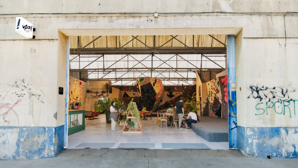
I see a lot of branding work through my writing here at PRINT, and a lot of good branding work at that. Even the good branding can often times feel formulaic or derivative though; something I’ve seen time and again, packaged up nicely but in a way that’s expected. But every so often I encounter a project that breaks through the noise and demands deeper inspection. This was the experience I had recently when I came upon the work of designers Allie Heesh and Sara Silva Santos for a rock climbing gym in Coimbra, Portugal, upa!
When I think rock climbing gyms, my mind goes to classic outdoorsy brand aesthetics established by the heavy-hitters in the recreational nature space like REI, Patagonia, and L.L.Bean. But the upa! brand system completely upends those expectations, using organic and gestural design elements like brush lettering and collage. And while the branding deviates from categorical norms, it still feels authentic to the culture of rock climbing gyms, just through new framing. Drawn to this unique take as well as the hand-made quality of the visuals, I was sold, and reached out to the designers to learn more about what they created.
Heesh and Santos teamed up to build out a brand identity for upa! that was scalable across on their signage, print and website design. They walk me through their thought process behind the project below.
What was the brief upa! came to you all with for this project? What were their core goals for what you created?
From the outset, the brief from upa! was very clear, and Julien (one of the upa! founders) articulated it perfectly. He described it as:
“We wanted upa! to feel welcoming and down to earth, without losing credibility as a serious bouldering gym. As climbing grows, a lot of spaces have become too focused on performance. That can be great, but it can also create a ‘train hard, leave fast’ atmosphere that feels intimidating or overly earnest in tone.
For us, climbing is naturally about fun, creativity, problem solving, and social connection. The visual identity needed to signal that straight away. This is a place where you can try, laugh, and learn, not a place where you have to ‘belong’ before you even walk in. At the same time, we wanted it to feel sharp and well run, welcoming should not mean messy or unserious.”
As designers, our role was to translate that balance into something tangible creating an identity that feels open and communal, while still holding onto the clarity and confidence of a well-run, credible climbing space.
What were the main considerations that went into what you created? What look and feel were you trying to convey and why?
It needed to feel un-intimidating for newcomers and still sharp enough for more experienced climbers, but above all, a place to pause. We kept coming back to the idea of urban tribes, where analogue and off-mainstream cultures have space. We wanted it to feel like a social environment where you can be your quirky self and maybe even make new friendships, a genuinely welcoming place to be. It was also important to the founders that the space serve the local Coimbra community as much as the visiting climbing crowd.
In your development process, was there any inspiration you came upon that influenced the direction you went in?
We were constantly looking outward at visual culture rather than just within the climbing space. Both of us are really drawn to things like zines, independent print, posters, and grassroots design movements, spaces where communication feels expressive, and human.
Printed matter from collective, hands-on efforts that aim to build connections through making was a big influence. That DIY spirit was already present in the founders’ approach, whether in route setting, working out of a busy workshop, or reusing and building their own furniture from found materials.
There was also an early reference point in Berlin, mainly because the client had spent time there climbing and being part of that scene. It came through as a starting point, a raw, pared-back visual attitude and honesty in presentation. But we were careful not to turn it into a pastiche of a specific place. Instead, we pushed it toward something more universal and open. We introduced more colour, warmth, and personality, drawing from a broader mix of references, editorial layouts, DIY graphics, and playful typographic systems you might find in zines or community-led projects. That shift felt more aligned with what upa! is about: making climbing accessible and social rather than exclusive or overly performance-driven.
Can you elaborate on the analog brushlettering process you used to create the design system? Why did that style feel right for this project? It feels unexpected for the category!
Building on that cultural and tactile approach, the brush lettering came quite instinctively. The space itself was a big influence, it has a raw, warehouse feel with rough textures, and upa! were keen to retain that honesty rather than polish it away.
That naturally led us toward something analogue and handmade. The brush lettering brings a sense of imperfection and movement, which feels much more aligned with climbing as playful and expressive, rather than rigid or performance-driven. There’s also a subtle connection in the form itself; the slightly rocky, uneven edges of the lettering echo both the meaning of “upa!” (to go up) and the physicality of climbing. It adds an immediate layer of relevance.To balance that rawness, we introduced colour to bring warmth and accessibility, especially with students and families in mind. The result is an identity with real character that feels welcoming rather than intimidating which is what makes it feel unexpected for the category.
What other design details in the brand system are your favorites?
One of our favorite details is the textured type treatment, it carries that analogue, imperfect character through everything and really ties the system together. We also love the collage approach: it’s bold, expressive and playful, giving the brand a lot of energy and personality.
What aspect of this project on the whole are you proudest of?
For us, it’s a combination of the foundations we created and how they’ve been used since. The naming and the logo mark feel strong, but more importantly, we built a system that started from something quite analogue, layered, and textural, and still made it scalable in a practical way. Seeing upa! thriving in Coimbra over the past year has been a big part of that. It’s rewarding to know we had a small role in shaping something that’s now part of a growing community, not just for climbing, but as a place to hang out and host cultural events. The fact that their team has been able to take the identity and run with it across different media really shows that the system works. It’s not about perfection or rigid rules, so the brand can evolve over time and seeing that actually happen feels like a real success.
The post This Climbing Gym in Portugal Has an Unexpected Brand System Built on Brush Lettering and Collage appeared first on PRINT Magazine.