If treated with care and expertise, typography can be almost like a full character in a film.
Marie Boulanger, Monotype
Wes Anderson is synonymous with distinct cinematic aesthetics, with each of his films unmistakably his by their visuals alone. His latest release, The Phoenician Scheme, continues this legacy from that classic Wes Anderson hyper-stylized framing to dynamic use of color and pattern, to carefully considered typography. Monotype’s Marie Boulanger is something of a Wes Anderson cinematic universe typography scholar, having seen every one of his films from her perspective as a type designer and expert in the field. Boulanger has a keen eye for the way typography is deployed in movies and has a particular appreciation for the way Wes Anderson uses it to elevate the worlds he builds in his films.
Below, Boulanger elaborates on Wes Anderson’s exemplary use of typography in his films and how The Phoenician Scheme type stacks up to the rest of his filmography.
(Interview lightly edited for clarity and length.)
When deployed well, in what specific ways can typography add to a film? How do the type choices in the opening title card and title sequence help set the film’s tone? What other places throughout a movie can type make an impact?
If treated with care and expertise, typography can be almost like a full character in a film, much like color, framing, or pace. It can help the story come to life through visual cues, give historical or cultural context, and help to shape the mood.
The title sequence is usually the big typographic spotlight, which many filmmakers treat very seriously as an introduction to the film’s universe. You have the audience’s full attention, and you have typographic characters as stand-ins for your actual characters, sometimes foreshadowing events through typographic treatments. Are the glyphs distressed or languid? Do they appear suddenly or slowly roll through?
The importance of typography usually goes beyond that sequence, too. Any time a word shows up on screen, somebody in the art department is making decisions about it and talking to you through typography. A bottle of pills, food packaging, a street sign, a love letter, newspaper clippings… Typography is here to deliver important storytelling elements through language.
What are some of your favorite examples of particularly successful typography from the Wes Anderson universe?
There are too many to count.
It’s hard to ignore the graphic impact of Futura and the role it plays in blurring the perception of time periods. It’s almost 100 years old, but it still feels contemporary. It’s a classic but not immediately recognizable to an untrained eye. I think it helps to make the films feel both timeless and hyper-specific.
I have a huge admiration for the designers and art directors working with Wes Anderson, crafting this level of detail. I think my favorite use of Futura in all of Anderson’s filmography is either in the very small details (like business cards in The French Dispatch) or very big, like city signage in The Royal Tenenbaums. Aside from Futura, I really enjoyed cultural and historical nods in the typographic elements of The French Dispatch. The film was full of intricate details that delighted me. But I don’t think you have to be French and work at Monotype to enjoy them.
Typography is successful when it helps the film’s world to come together, when you believe it, and when it makes you feel things.
Typography is successful when it helps the film’s world to come together, when you believe it, and when it makes you feel things. Typography is never just type; it’s words, and the best moments are when language really comes alive on screen.
Can you speak to Anderson’s typography choices in The Phoenician Scheme? What stylistic moves does he make with type, and how do those elevate the film’s look and feel?
This is a personal opinion, but I found typography to be more subtle throughout the film, almost as if he took a step back, especially compared to Asteroid City, which was typographically very dense, full of signs, shopfronts, and letters. I don’t know if it was deliberate, because some other things felt amplified, like the density of dialogue or the number of locations and costumes.
Something I found interesting, as a point of comparison: Isle of Dogs, set in Japan, and The Darjeeling Limited, set in India, both generously used local typographic culture and scripts. This film is loosely based on ancient Phoenicia, the Middle East and Egypt, and yet there was very little engagement with type as a cultural component.
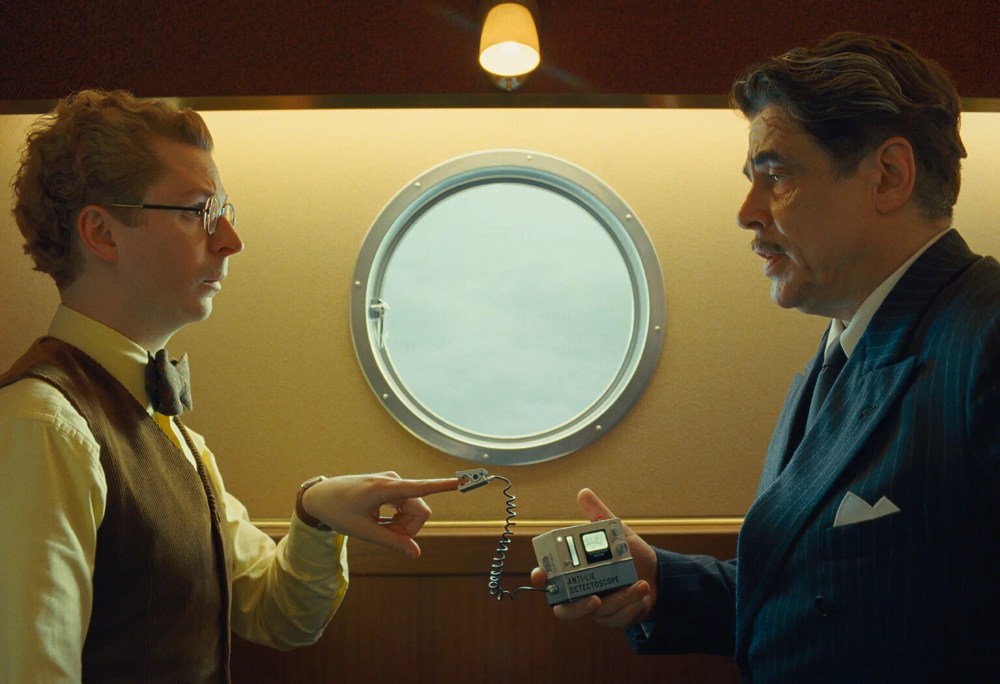
Additionally, the tightly framed sequences focused on objects like grenades and a bejeweled pipe, where we’re more accustomed to seeing books, letters, or newspapers. A comedic highlight for me: the “Fruits Frais” (fresh fruit) case storing the grenades.
In your expert opinion, how does the typography in The Phoenician Scheme stack up against the typography in other Wes Anderson films?
I’ll be perfectly honest, I was less taken with the narrative of The Phoenician Scheme and found it complex and hard to relate to. I did find typography to be less present throughout the film, so maybe those two things are linked for me.
When I left the cinema, I couldn’t really remember a big typography moment or specific frames (I usually do). There are big letters that appear on planes and hotels, and really nice details such as book covers belonging to Michael Cera’s character, but it somehow felt less cohesive than past films. Interestingly, my favorite sequences were the short black-and-white scenes representing the afterlife. They felt different and new.
The post A Snapshot of Typography From the Wes Anderson Cinematic Universe appeared first on PRINT Magazine.