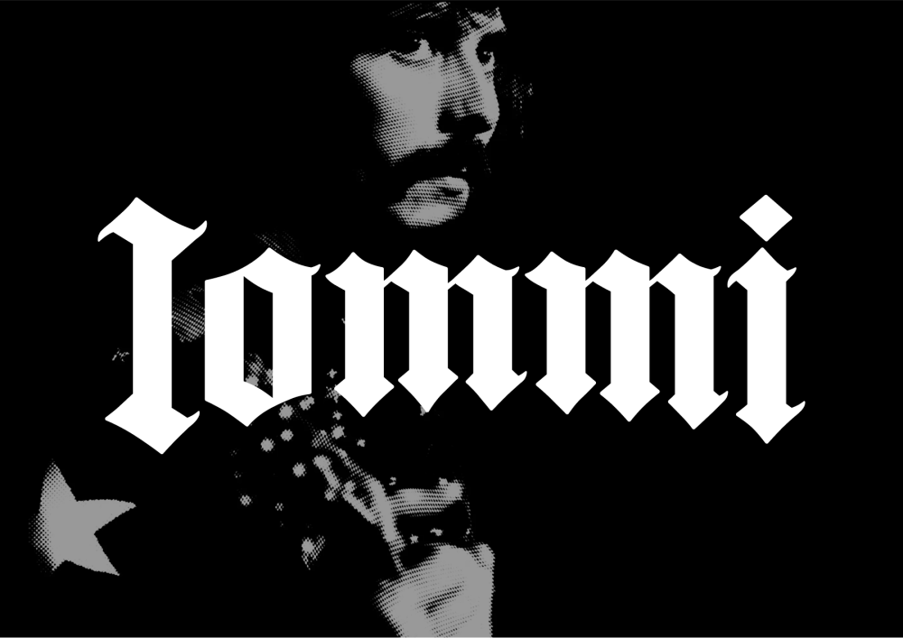
It’s been nearly sixty years since Black Sabbath’s tension-filled guitar riffs heralded heavy metal’s arrival in Birmingham and the global music culture. Tony Iommi, the band’s guitarist and founding member, is often called the godfather of heavy metal for his foundational sound and as a creative champion of metal and several metal sub-genres. Iommi is celebrated as one of the greatest guitarists of all time, earning the 13th spot on Rolling Stone‘s venerable list, and he continues to inspire generations of musicians and fans.
It’s the end of an era for Iommi and the original Black Sabbath members. The four came together on July 5, after having just been awarded Birmingham’s Freedom of the City honour, for Ozzy’s final live concert, alongside a line-up of metal royalty, like Guns N’ Roses, Metallica, and Alice in Chains, to name a few. It was a fitting send-off for “The Prince of Darkness,” who passed away at 76 less than three weeks later.
For Iommi, a new chapter is just beginning.
With the help of London-based studio The Creative Corporation, Iommi launched a bold new visual identity and website. The visual system leans heavily into heavy metal’s aesthetic roots—gothic, heavy, commanding. “Creating a new visual identity for Tony Iommi meant going back to where it all began – to the raw sound, the roots of the aesthetics, and the power that helped give rise to heavy metal,” said Dave Stansbie, founder and director of The Creative Corporation.
Anchoring the new visual world is a custom blackletter wordmark. Gothic lettering and heavy metal have been together from the beginning; there’s no better style to evoke the drama and the darkness of the music. Created by Sam Baker, the new logo is refined for application across Iommi’s digital ecosystem.
To complement the custom wordmark, the team chose Fautive, a serif typeface that balances tradition and modernity, with compressed curves and a provocative sharpness. Presented together, the team created a typographic system that “delivers a voice that is confident, distinctive, and unmistakably heavy metal.”
The typography and other brand elements come together with a perfectly Gothic color palette full of contrast and drama. Black and off-white create a nice contrast as the foundation. Red draws from Iommi’s signature guitar finish. And purple is an ode and a visual thread to the original Black Sabbath. The cross, a profound and personal symbol to Iommi and something he’s worn on stage for his entire career, is a motif used sparingly across the system.
The visual system is meant to signify all the moments of Iommi’s career so far and set the stage for what’s to come. And it strikingly comes to life on iommi.com. This fully redesigned website includes Iommi’s discography, archival imagery, iconic guitars, and a digital home for Iommi’s narrative to evolve into the next chapter.
[The Creative Corporation] really captured what my music has always stood for – not just the sound, but the weight and intent behind it.
Tony Iommi
The Creative Corporation is known for its work with labels, artists, and music estates, such as Janis Joplin, Nine Inch Nails, Roxy Music, and Nick Cave. Employing a strategic focus, the team creates bold identities and immersive digital platforms and experiences for legendary artists, helping them stay culturally relevant at the pace of digital change. View their work on Instagram.
The post A Type & Roots-Led Identity for the Godfather of Heavy Metal appeared first on PRINT Magazine.

