Roger van den Bergh’s visual history of the New York City subway map, from a 1972 beautiful minimalist diagram to a clear and functional navigation tool.
Before the 1967 Map-Merger: IND, BMT, & IRT
In 1940, the IND, BMT, and IRT (Independent, Brooklyn-Manhattan Transit, and the Interborough Rapid Transit) were acquired by the City of New York because of increasing financial challenges to keep the systems operating. The new agency was operated by the New York City Board of Transportation (NYCBOT) or the New York Subway.
Then, in 1953, the subway system was replaced by the New York City Transit Authority (NYCTA). In 1968, after many complex restructurings involving the New Haven Line as well as the Long Island Railroad, the Harlem & Hudson Lines, and the Staten Island Railroad, the larger Agency was renamed the Metropolitan Transportation Authority (MTA).
A year earlier, a so-called subway map-merger took place in 1967: The IND, BMT, and the IRT were now called the New York Subway.
Maps from 1948. Left: Independent (IND); Center: Brooklyn-Manhattan Transit (BMT); Right: Interborough Rapid Transit (IRT)
After the Map-Merger of 1967
As one can see at the newly created map (below left) illustrating all three transit systems—IND, BMT, and IRT combined—the overall information was not particularly clear to the public, let alone to the city’s visitors and tourists.
Fortunately, this was acknowledged by the MTA, and a fairly new (and international) design firm out of Chicago called UNIMARK was retained. The reason for approaching this firm was that one of the founding partners, Bob Noorda, had designed a clear and modern signage, identity, and information system for the Milan subway system in 1963.
First, the largest subway system in the world got a new, functional signage system designed by Bob Noorda and comprised the Akzidenz Grotesk (called Standard in the US), then a new identification system for the subway lines, using letters and numbers contained in circles which had different colors depending on each individual line.
At UNIMARK, along with the signage, Massimo Vignelli, Joan Charysyn, and Ine Wijtvliet worked on solutions to address the huge challenge of how to navigate a more and more complex subway system.
In 1972, a new map was introduced and installed throughout the entire subway system as well as all subway car interiors. This new creation was an instant hit with designers, architects, and people in the arts.
Left: 1967; Right: New map for 1972, designed by Massimo Vignelli
The 1972 Minimalist Diagram Versus a Map That Works
Unfortunately, this map turned out to be quite controversial because subway riders had trouble understanding how to use it.
In 1979, the MTA went back to the drawing board and launched a new geography-based map that still can be found in every subway car and station today. It was created by Michael Hertz and Nobu Siraisi.
Left: Geography-based map by Michael Hertz and Nobu Siraisi from 1979; Right: Vignelli’s 1972 map
The “Men’s Vogue” Special 2008 Limited Edition
It was 2008, and Vignelli couldn’t sit still. Nearly 30 years ago, the diagrammatic map was taken away from him. What could he do? Together with two of his protégés, Yoshiki Waterhouse and Beatriz Cifuentes, Vignelli refined the 1972 map, based on the new subway-line-color-codes.
But the concept of the 1972 map was kept intact, in fact, this new iteration was an even better example of minimalism, including a reductive approach: reference points, parks, the Hudson River, and the East River, were depicted in an extremely subtle fashion and barely noticeable, just the lines were in bright colors. (see below left).
The need for a clear navigation tool, which should have been available for everybody, was totally ignored; instead, it was something that was quite beautiful but did not possess the desired communicative purpose. An illustration of this map was included in a 2008 Men’s Vogue edition. Then, four years later, this version was printed in a limited edition and is still available at the MTA Transit Museum’s bookstore. It can be purchased, signed, or unsigned for $300.
Left: 2008 “Men’s Vogue” special by Vignelli, Waterhouse, and Cifuentes; Right: 1972 map (Vignelli)
Introduction of the Second Avenue Line
After countless delays and at a cost of over $4.4 billion, New York City’s Second Avenue Subway (the new Q extension) was finally scheduled to open on December 31, 2016.
In honor of this historic achievement, a complimentary print version of a Subway Diagram, commemorating the Second Avenue Subway Grand Opening, was given away to the visitors at the opening. It was the 2008/2012 version of the Vignelli map.
Left: 2008/2012 version of the Vignelli MTA map; Right: Vignelli’s original 1972 map
Subsequent Try-Outs of the 1972 Concept
After the 2017 introduction of the Second Avenue Line, the MTA launched a so-called Weekender, an app that was intended to give the traveling public information about disruptions due to maintenance and trackwork. The monitor hardware is provided by Outfront Media, and the software platform is provided by Mercury. Information is delivered in real-time, but a derivative of the original 1972 map design was still used.
Wall monitors from the top left: Lexington Avenue line #6 @ 23rd; BMT ‘R’ and ‘W’ Station at Prince; Lexington Avenue line #6 @ 77th
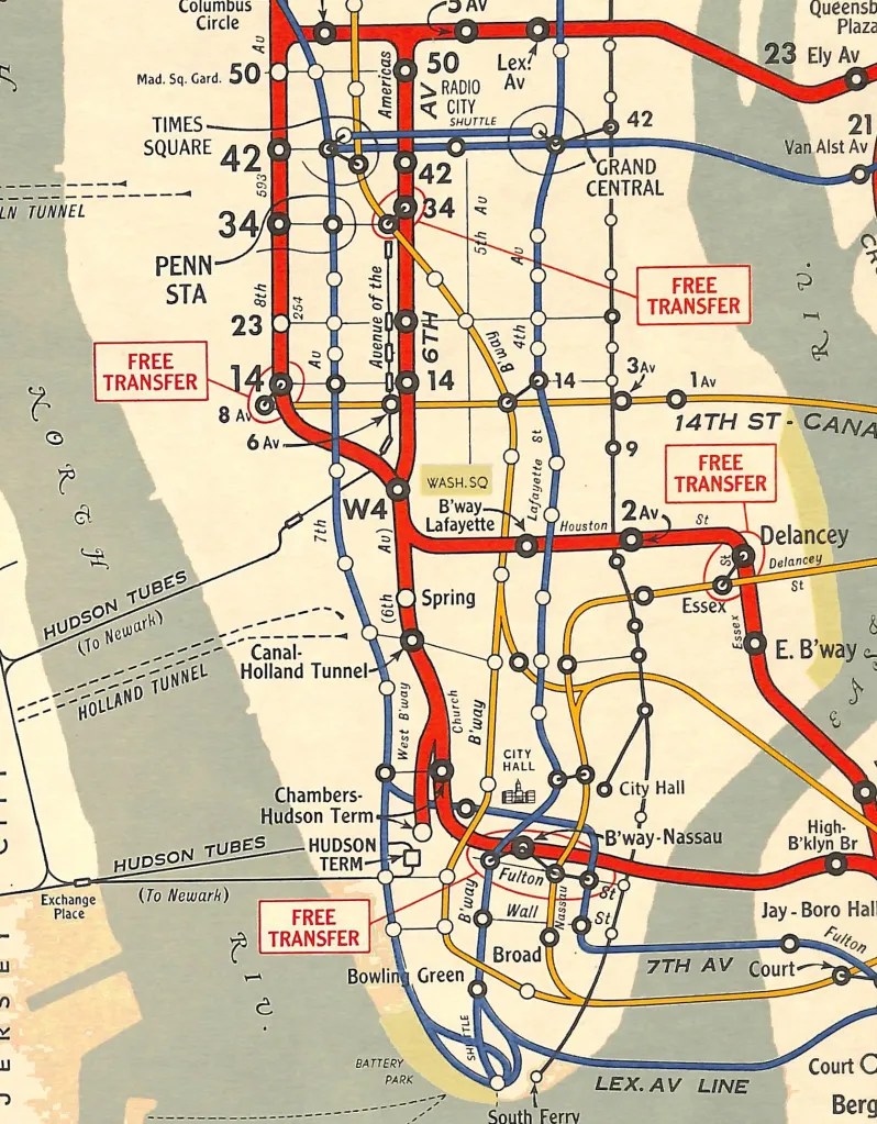
From a Minimalist Diagram to a Powerful Navigation Tool
Why did it take 53 years to finally have someone add a straightforward and down-to-earth design change to make this map successful? Since the 1972 launch, it was quite obvious that the greatest flaw of the Vignelli design was the way in which the transfer points were designed.
Nobody really understood how to interpret this crucial map component. Until a few months ago, it was always agreed at the MTA that the philosophy of fewer elements, the better the design, was the only objective to solve navigation challenges. Consistently sticking to that rigid approach was the main obstacle to the conversion of a minimalist diagram into a powerful navigation tool.
New transfer points
The final result (below left) shows not only a great navigation tool that works, but also is quite attractive.
Left: the current NYC Subway map; Right: Vignelli’s 1972 version
Roger van den Bergh, co-founder of Onoma, has lived in New York City since 1980. He translates strategies in comprehensive brand / corporate identity programs for companies in the US and abroad.
All imagery courtesy of the MTA and the author.
The post A Visual Study of the New York City Subway Map appeared first on PRINT Magazine.