Pentagram’s incredible identity for The Joslyn Art Museum in Omaha launched in late January. The distinctive letterforms and the earthy yet bright color palette were a much-welcome sight on my Instagram feed. It’s a tremendous comfort to me that we have cultural institutions like The Joslyn to celebrate the best of what we’re capable of creating, even amidst the chaos of our domestic (and global) political sphere. Equally reassuring are those centuries-old institutions engaging in intentional progress. And if they are capable of it, perhaps we are too.
As with the new identity for the IIT College of Architecture (last week’s Type Tuesday feature), Pentagram’s new look for the Joslyn Art Museum was inspired by its distinctive architecture.
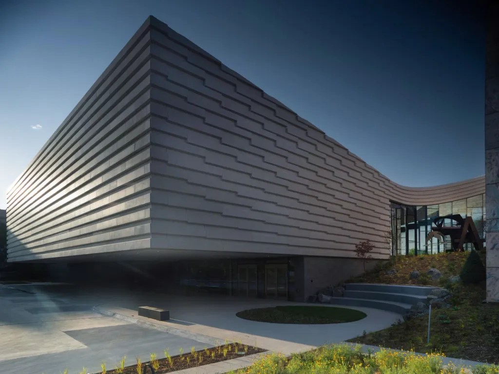
Known familiarly as ‘The Joslyn,’ the museum is nearing its 100th birthday. Built in 1931 as a gift to the city from Sarah Joslyn in memory of her husband, the Georgia pink marble building is a celebrated icon of Art Deco architecture. Together with its subsequent additions—Norman Foster’s 1994 pavilion in the same pink marble and the newest, a 42,000-square-foot expansion designed by Snøhetta that opened last fall (pictured above)—The Joslyn continues to evolve in conversation with the past.
A strategic reset also accompanies the new look — one of progressivism, inclusivity, and accessibility. Pentagram’s brand system leans into this, elevating the casual moniker, ‘The Joslyn.’ The design team, led by partner Eddie Opara, built a flexible brand around this wordmark rather than a single logo, with custom typography at its foundation.
The wordmark set pulls structural facets from the museum’s three structures. Pentagram created a highly agile system, with variation in angled cuts and crossbars, flares, and sharp corners, evoking the hand-drawn Art Deco lettering of the 1931 entrance, the rectilinear shapes of Foster’s pavilion, and the addition of the graceful curvature of the Snøhetta expansion.
The typography is modern but timeless—the entire system can be calibrated depending on context, from historical to contemporary.
The brand weaves in inclusivity and community, with an acknowledgment of Nebraska’s Indigenous population. Pentagram collaborated with Berlin type design studio Dinamo, whose team adapted their typeface Arizona to encompass an alphabet of glyphs and phonetic characters for Umóⁿhoⁿ (Omaha) and other Indigenous languages spoken in the region.
Read the Pentagram case study here.
The post Bespoke Architectural Type at the Heart of Pentagram’s New Identity for The Joslyn appeared first on PRINT Magazine.