For a new specimen book and self-promo, Contrast Foundry (CoFo, familiarly) wanted to explore ways to highlight the retail typefaces and give designers a fun way to play with font pairings. The foundry enlisted the help of fellow San Francisco creative agency, The Office of Ordinary Things, to design something deliciously out of the ordinary.
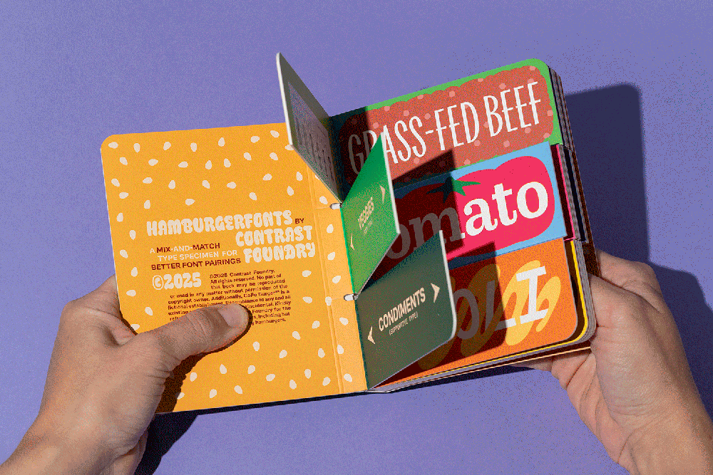
Designers often use ‘Hamburgervons’ to assess the appearance and function of typefaces. Hamburgerfonts came to life as a fun play on this concept.
Based on layering ingredients as you would when assembling the project’s namesake, proteins become display type, veggies form the body, and condiments add a little something on top as supporting type. The concept, designed by TOOOT’s Johnny Gage, Camilla Gwise, and Giorgia Sage, isn’t simply about imagining your perfect burger, in theory; the piece is interactive, like an old-school children’s mix-and-match book.
Love the organic repetition of CoFo FlicFlac? CoFo Sans Black might be an ideal counterpoint. Add a grid-like element with CoFo Sans Pixel, or a variable industrial quality with CoFo Peshka. With CoFo’s 19 typefaces (and counting), you can customize the pairings to your heart’s delight.
Bright and colorful illustrations, a collaboration between the TOOOT team and CoFo’s Egor Golovyrin and Nikita Sapozhkov, complement the typefaces. The burger story continues through the packaging, with the adorable, handheld-sized book presented in a burger-style wrap, enclosed with a sticker.
The post Build a Tasty Font Pairing with Hamburgerfonts appeared first on PRINT Magazine.