For a lot of artists and designers, Copic markers are a must have because of its quality and versatility. They’re not just tools — they’re staples in the creative process, beloved by professionals and hobbyists alike for blending, layering, and precise detailing. The extent of my own artistic skills is mainly journaling, but even I own several of these markers because they’re just that cool — they glide smoothly across the pages of my Hobonichi and Moleskine, making everyday notes and doodles feel a little more special. Its packaging though hasn’t changed over the years and is built to store these markers vertically even though it is recommended that they should be placed horizontally so the ink will be evenly distributed.
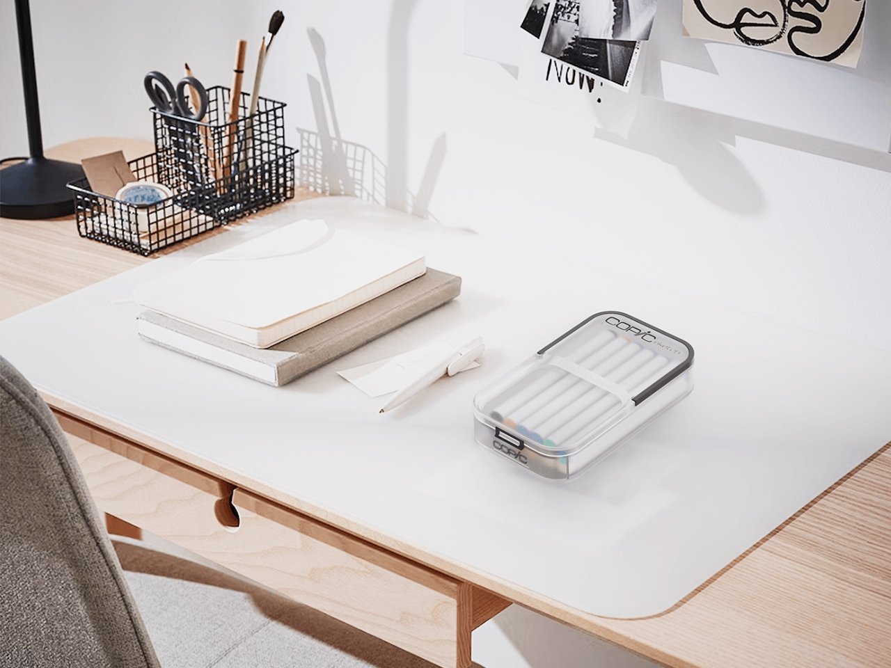
Designer Sneha Gupta embarked on a project to reimagine what’s the best way to redesign the classic Copic marker packaging. What we get is a more modern aesthetic that aligns with current design trends while still preserving the brand’s identity and also adding an eco-friendly aspect to it. The minimalist look features clean lines and a subdued color palette, offering a sleek appearance that should appeal to consumers. It comes with a matte finish and uses soft tones and translucent details with soft, rounded lines.
Designer: Sneha Gupta
Of course it’s also important to bring user-friendly features to this since it will probably be used a lot anyway. It has several compartments so you can organize your markers whatever way you want to and also fit in seamlessly with your desk setup. You can also place sticky notes on the case in case you need a space to place these reminder tools. It also has easy-open mechanisms so opening and closing this case will not be a struggle. In response to growing environmental concerns, the redesign incorporates eco-friendly materials, reducing the ecological footprint without compromising durability.
While it’s just a redesign project, of course, it’s easy to picture this concept fitting seamlessly into the world of actual Copic markers, thanks to the careful attention paid to preserving the brand’s identity. The designer has skillfully incorporated several key branding elements, from familiar color palettes to recognizable logo placements, creating subtle nods to the Copic legacy that long-time users will immediately recognize and appreciate.
These thoughtful details ensure that even with updated aesthetics, the design feels authentic and grounded in the brand’s history, fostering a sense of continuity and loyalty. Beyond simply refreshing the look, this project highlights how thoughtful design has the power to revitalize a classic product, striking a delicate balance between honoring tradition and pushing forward with innovation.
The post Copic packaging redesign concept bridges tradition with more modern look first appeared on Yanko Design.