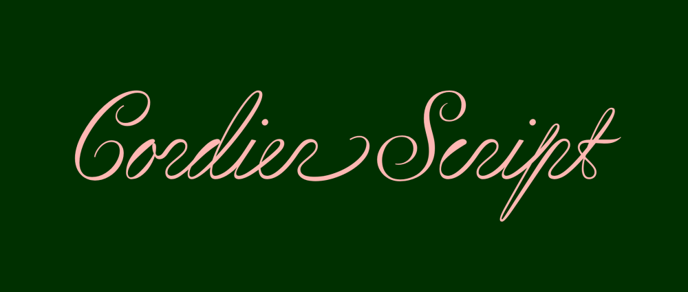
As script typefaces go, Sharp Type‘s Cordier Script hits all the right notes. It is serpentine, graceful, and rhythmic. The letterforms are not so tightly wound as to resemble an elementary school cursive primer — look at that gorgeous capital B! Its quirks give it space and an almost handwritten quality. Like the birds that grace its samples, Cordier Script flutters and dances on screen.
It’s the handwriting I wish I had: elegant but a little left-of-center.
For the pleasure of the line, the pen no longer stops between words, and the whole sentence is formed in a single stroke.
Benjamin Gomez
Designed by Benjamin Gomez, Cordier Script was inspired by the penmanship of Louis Barbedor, a 17th-century French calligrapher. Gomez drew the letterforms from the intricate plates of Barbedor’s 1650 book, Les écritures financière et italienne-bastarde, engraved by Pierre Cordier. The result feels uniquely of this moment and steeped in tradition.
Sample of Louis Barbedor’s caliigraphy, courtesy Benjamin Gomez
Cordier Script echoes Barbedor’s daring hand—its inverted thick-and-thin strokes sweep diagonally upward, each letter a study in acrobatic finesse.
Sharp Type
Like the calligrapher’s pen, sentences express themselves in one fluid and dynamic stroke. Everything points optimistically to the sky as if it plans to take off.
Explorations of calligraphic strokes in pencil. Image courtesy of Benjamin Gomez.
Gomez says that the inverted think and thin strokes of this handwriting naturally emphasize the diagonal, “supposing an acrobatic position of the hand.”
Image courtesy of Benjamin Gomez.
Gomez says that he composed Cordier Script of multiple half-letter forms that enable connections between letters at varying heights to reflect handwriting’s natural fluidity.
Image courtesy of Benjamin Gomez.
Gomez drew each letter with various contextual variations, giving the text “suppleness and fluidity.” Cordier Script comes with two styles: linked and regular. Designers can play with long, sinuous lines of text or traditional word breaks.
Cordier Script would work beautifully as a display typeface, yet it also does something special to blocks of editorial text. It is also ideal for animations — even in stillness, Cordier Script has an innate momentum. The two styles come with an impressive range of letter variations, glyphs, OpenType features, and language support that spans the globe.
Read more about Sharp Type’s Cordier Script.
All images © Sharp Type, except where otherwise noted.
The post Cordier Script is a Typeface for the Pleasure of the Line appeared first on PRINT Magazine.