The Playboy logo is amongst the iconic logos that people and target audiences recognize for its unique design. It has successfully built the identity of the brand over the decades. Besides adorning the Playboy magazine cover, the Playboy symbol (bunny) appears on all its merchandise right from money clips to fanny packs, socks, and more.
Over the years, the famous Bunny logo has connected people with Playboy magazine and what it stands for. While there are dozens of men’s magazines, Playboy has consistently maintained its unique place, thanks to its easily recognizable logo design.
What does Playboy Bunny mean?
The Playboy Bunny logo has the bunny as its chief feature. But when deciding on Playboy bunny meaning, know it was once a term used for a waitress that served cocktails. She used to work at a Playboy Club and wore costumes with bunny ears and a strapless teddy. She wore black stockings, cuffs, a bow tie, and a collar, displaying a fluffy tail.
The bunny with a bow tie conveys allure, elegance, and playfulness. It also represents a world where beautiful women are confident and powerful.
History of the Playboy Bunny logo
The Playboy logo did not take years to evolve. Instead, the designer created it right away, and since then, the same Playboy logo design continues to be a powerful brand identity globally.
1953 — The Bunny logo appears
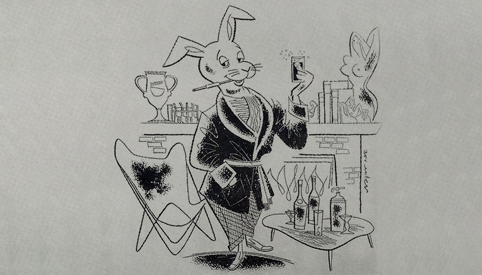
The Playboy bunny logo design journey started in 1953. At that time, the logo depicted a rabbit wearing a tuxedo jacket with a glass in hand and cigarette in mouth. There were uncovered statues, wood pipes, trophies, and cocktails around the rabbit figure.
But, the logo was a complicated design due to multiple elements shown in a tiny space. Therefore, Art Paul, the logo designer, immediately simplified the idea and sketched it after recreating it. He recreated a bunny that had long and cocked ears and made it wear a bow tie to give it a gentleman’s look. This time, the rabbit image was retained, eliminating the remaining elements.
As a result, the designer came up with a combination logo having the rabbit and the brand name underneath. Later, the company removed its name when the bunny logo became a well-recognized symbol. This simple sketch was welcomed and appreciated at the Playboy office. It was soon taken as a major visual identity of the brand.
Art Paul took inspiration from the previously drafted version created by Arv Miller. He improved the logo designed by Playboy magazine’s cartoonist Arv Miller.
Crucial design elements of the Playboy logo
The Playboy logo may seem simple, but it’s a strategically created visual identity that gave the magazine an intended image. Here are the key elements reflecting the core essence and emphasizing the brand’s personality.
The Bunny
The bunny is the central figure, the main attraction its logo design. But why was this animal picked to represent the company’s business? Hugh Hefner, the Playboy founder himself, elaborated on it. During an interview, he had said that the bunny conveyed, “Freshness, shyness, vivacity, and sexiness.”
According to Hefner, “The rabbit, the bunny, in America has a sensual meaning, and I chose it because it’s a fresh animal, shy, vivacious, jumping – stimulating. First, it smells you, then it escapes, then it comes back, and you want to caress it, to play with it. A girl resembles a bunny, joyful.”
The rabbit also represents desire, comfort, and vulnerability associated with the work of a playboy.
Bow tie
The bow tie is another element that gives the Playboy logo its personality. It represents the class of the people who are taken as gentlemen. The bow tie gives the rabbit sophistication and represents the elite class. That helped the brand convey the refined lifestyle generally aligned with Playboy.
Font
Besides the bunny icon, the Playboy logo has the brand name underneath. The brand name is in bold and capital serif Masthead font to express the company’s authority in its target market. The Masthead font was first used in 2022 when Playboy was redesigned. The Serif typeface is used as the primary font.
Color
The Playboy logo is entirely black, a color of authority and sophistication. It is also a color of simplicity and success, quite famous amongst the elite class. However, some Playboy logos are, at times, seen in pink or red for marketing purposes only.
So, we can say that the Playboy logo has remained the same since its inception in 1953. Its initial sketch was elaborate but immediately transformed into a simple design we recognize today. The bunny logo is an inspirational design that has influenced many logo designs. You can create logos for Playboy like magazines in your own way using a logo maker or seeking professional designers’ help.
Alternatively, you can visit platforms like Designhill to crowdsource your logo design. The creative marketplace simplifies launching a design contest for business owners.
Wrapping Up
The Playboy bunny logo is a unique design that evolved from being an elaborative sketch to a simple but memorable icon worldwide. The logo reflects Playboy magazine’s identity, signifying its sensuous content, elite customer base, and electrifying merchandise.

