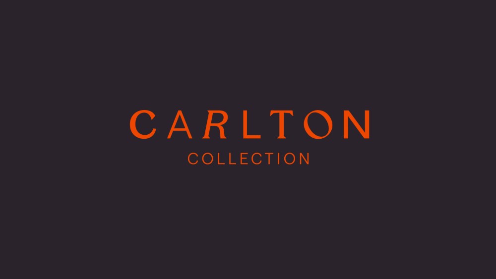
In a hospitality market saturated with boutique claims and global loyalty schemes, differentiation is everything. For Carlton Collection—a family of hotels and hospitality destinations that includes two DesignHotels™—the challenge wasn’t quality or character. It was cohesion. Each property had its own personality and audience. But collectively, the brand wasn’t registering their clients’ consciousness. There was no clear master identity connecting the dots.
Amsterdam-based strategic creative agency D8 set out to change that. The result is a comprehensive rebrand that transforms Carlton Collection from a quiet holding name into a confident, expressive identity—one designed to inspire exploration while celebrating individuality and connection.
For years, Carlton Collection operated as an umbrella company but the hotel properties functioned independently, with little visible link to the broader group.
The Carlton Collection’s biggest challenge was that it didn’t exist as a brand in the consumer’s consciousness. Each hotel operated independently, with no visible connection to the broader collection.
Rosie Street, Managing Director of D8 in Amsterdam
The strategy was to enhance the brand by moving the focus from direct sales to promoting the overall value of the hotel collection itself. That meant creating an over-arching identity to unify the portfolio while preserving the distinct character of each destination.
One of the first changes was dropping the word “hotel” from the name. As Carlton Collection, the brand expands beyond accommodation to encompass restaurants, bars, and the broader experiences each destination offers. It’s a subtle repositioning, but an important one. The collection becomes less about transactions and more about curated experiences—places to stay, gather, dine, and discover.
At the heart of the new identity is a bespoke wordmark that embodies the brand’s ethos. Each letter is individually crafted—no two characters are the same. Some feel playful, others more restrained. Together, they form a harmonious whole—a typographic metaphor for the portfolio itself.
The visual identity is all about celebrating individuality while maintaining harmony. Each character in the wordmark is distinctly different, yet together they form a cohesive whole.
Andrew Neely, Creative Director at D8
The custom letterforms extend into headline typography, giving communications a distinctive voice. The effect is expressive and slightly unexpected—reflecting the eclectic nature of the collection.
To ensure cut-through in a competitive landscape, D8 anchored the identity in a bold but streamlined color palette. A warm blue provides consistency and depth. A vibrant orange adds energy and optimism. Together, the pairing feels confident without overwhelming the properties themselves. In a category often dominated by muted minimalism, the palette brings clarity and recognizability across digital platforms and printed materials while allowing flexibility at the property level.
Conceptually, the rebrand centers on the idea of “family.” Not in a nostalgic sense, but as a modern network of diverse individuals connected by shared values. This theme informs everything from tone of voice to internal culture. It aligns with contemporary consumer preferences for authenticity and belonging—positioning Carlton Collection as a connected community rather than a corporate chain.
In a world of great diversity, our collection is a celebration of character. We embrace individuality—whether it’s our team members or the hotels and travelers we serve.
Christa van Camp, Commercial Director at Carlton Collection
As part of the transformation, D8 also considered what loyalty might mean for the brand. To that end, they developed ON-US, a new benefits program designed to encourage guests to explore the wider portfolio. Unlike traditional tier-based loyalty schemes, ON-US focuses on flexibility and shared access—offering perks, discounts, and special events across all destinations. The goal is to foster exploration rather than reward repetition.
In a sector where consolidation often leads to sameness, Carlton Collection’s new identity offers a different model: individuality within harmony. By finding its voice, the brand has moved from background operator to foreground presence—defining not just what it offers, but what it stands for.
The post Designing Connection: How D8 Unified the Carlton Collection appeared first on PRINT Magazine.

