We’re excited to share the standout student work selected by this year’s PRINT Awards jury. Recognizing student creativity not only celebrates emerging talent but also encourages innovation and fresh thinking within the industry. It gives young designers a platform to showcase their vision, build confidence, and gain exposure early in their careers. At PRINT, we believe that bridging the gap between education and professional practice signals that their ideas matter and their voices are worth listening to.
We’re proud to offer a platform that helps students showcase their vision, build confidence, and gain exposure early in their careers.
Annual Reports
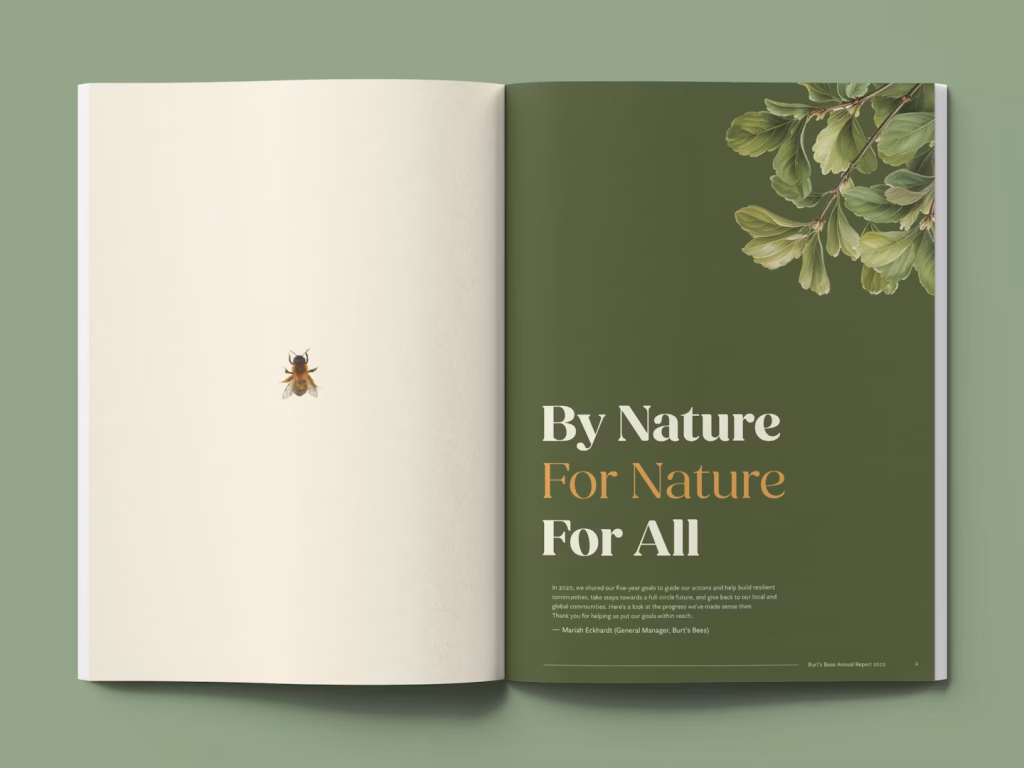
First Place – Burt’s Bees Annual Report
University of North Texas – Lauren Dean
For this project, the students were tasked with redesigning a conceptually strong annual report for a corporate company of their choice. They selected Burt’s Bees, a natural skincare brand known for ethical sourcing and clean ingredients. Their goal was to reflect the brand’s identity through a minimal, earthy color palette and an organic, approachable typeface. Data visualizations incorporated both Burt’s Bees products and the natural ingredients used within them, reinforcing the company’s core values. One graphic featured honey, shea butter, and botanical oils—shaped into a cosmetic swash—to highlight the brand’s key ingredients.
Another visualization used Burt’s Bees chapsticks, their most iconic product, to represent data on the percentage of recyclable virgin materials used in the brand’s packaging. The final piece included five interior spreads along with a front and back cover. Through its cohesive visual language and thoughtful use of materials, the redesign captured the essence of the Burt’s Bees brand while effectively communicating its sustainability efforts.
Books – Covers & Jackets
First Place – The Stranger by Albert Camus
Rochester Institute of Technology – Ipek Koprululu
This book cover design draws from the quote, “I opened myself to the gentle indifference of the world,” reflecting themes of detachment from societal norms and the search for meaning in an indifferent universe. Inspired by existentialism and the feeling of alienation, the visual concept uses optical distortions to convey a fragmented perception of reality, mirroring the protagonist’s disconnection from the world around him.
The imagery is created through an analog process using concave and convex lenses of varying thicknesses. By layering these lenses and photographing them from multiple angles, the designer produced distortions that reflect the story’s emotional and philosophical distance. Every element in the composition is handmade, consisting of original photographs rather than digital effects. These lens-based images are then digitally refined and layered to form the final cover, preserving their raw, tactile quality. The resulting play of light and glass reinforces the central theme of existential alienation.
Second Place – Ever Arriving: Highlands to Islands
Utah Valley University – Megan Barnum
The creation of Ever Arriving was a journey shaped by unexpected changes. Initially planned as a response to the writings of Robert Louis Stevenson, the project shifted after a twice-canceled study abroad program. Inspired instead by the spirit of travel found in The Songs of Travel and Other Verses, the focus shited from Stevenson’s texts to the broader idea of personal transformation through travel. Stevenson became a symbolic guide rather than a central subject, as the project evolved into a reflection on the creative power of movement and change.
The project took a new turn after a chance reunion with Brock Jones, a former student and now a professor of creative writing. His involvement brought fresh energy and collaboration, resulting in 21 original poems from his students, each exploring their own relationship with travel. Jones also contributed a found poem that captured the essence of the project’s evolution. Ultimately, Ever Arriving became a collective journey of students, artists, and writers seeking growth, perspective, and the unexpected insights travel can bring.
Third Place – A History of Our Time
Loyola University New Orleans – Aleigha Thompson
The challenge was to design a book cover for John Biguenet’s A History of Our Time and Other Poems that conveyed the emotional intensity and vulnerability of the poetry within. The goal was to reflect the collection’s intimate and personal tone while maintaining visual clarity and market appeal. The cover needed to resonate with both literary readers and a broader audience, standing out in a competitive landscape without compromising its emotional resonance.
The designer focused on texture, layering, and depth to express the unpredictable and emotive nature of the content. Crinkled paper and bold black marker lines were used to evoke the look of redacted government documents, symbolizing censorship, concealment, and the tension between what is hidden and revealed—an idea closely tied to the themes of the collection.
Books- Entire Package
First Place – Devisos
Centro Universitário Belas Artes de São Paulo – Camila Leite
Technological progress in Western society, while aimed at increasing efficiency, has often led to exhaustion, disconnection, and a loss of time for observation and reflection. Desvios responds to this paradox by proposing slowness and aimless walking as tools for reclaiming presence, creativity, and awareness in the urban environment. Drawing from a long history of artists and thinkers who used walking as a method of exploration, the project invites a shift in perspective—one that values the in-between moments often overlooked in fast-paced digital life.
The book is divided into two sections. The first is theoretical, grounded in the work of authors like Baudelaire, Debord, and Hartmut Rosa, and explores how walking can construct meaning and reconnect us with everyday surroundings. The second is practical, documenting a series of walks along São Paulo’s Avenida Paulista through photos, found objects, and spontaneous notes. With 28 unstructured pages—mirroring the avenue’s 2.8 km length—and a dos-à-dos binding, the book becomes both a visual manifesto and a poetic reflection on deviation, analog process, and the creative potential of slowing down.
Second Place – Different Ways of Seeing
ArtCenter College of Design – Yaheng Li
Graphic design is a powerful form of visual storytelling, shaping perception and bias much like visual poetry. Through its ability to communicate complex ideas and evoke emotional responses, design plays a significant role in influencing how individuals think, feel, and interpret the world around them. Li’s thesis explores how design can subtly shift consciousness and shape beliefs and actions through immersive, carefully crafted visual narratives.
The project is rooted in a personal memory: a childhood experience of fever-induced disorientation sparked early questions about perception and the nature of reality. Later research into neuroscience revealed that our brains invert visual input, much like a camera, highlighting how perception is a constructed experience. As humans, we naturally create and respond to stories. This thesis positions graphic design as a medium that both reflects and shapes those stories, encouraging critical reflection on the ways visual language affects our understanding of the world.
Third Place – undercurrent*
University of the Arts, London – Zhouyan Sun
Every mother has been a daughter, and every daughter either has been or could become a mother. They are contained within one another, and such relationships will circle endlessly. The mother seeks a double in her daughter, and the daughter, sooner or later, will find herself grown into her mother as if by destiny.
undercurrent explores the complex relationship between mother and daughter through seven films from diverse cultural backgrounds. It examines how mothers often see their daughters as extensions of themselves, and how daughters, in turn, reflect their mothers, revealing a lifelong bond marked by love, conflict, and ambivalence.
Presented as a two-volume book, one focused on language and the other on imagery, the project uses overlapping dialogues and emotionally charged visuals to evoke the layered dynamics of this relationship. A muted red threads through the design, symbolizing blood, menstruation, and emotional inheritance. Water, inspired by the film Spring Tide, recurs as a motif for unspoken emotional depth. With varied textures and careful material choices, undercurrent offers a poetic and tactile reflection on one of the most underrepresented yet profound human connections.
Branding Campaigns
First Place – Amoeba Rebrand
ArtCenter College of Design – Peilin Li
Amoeba Music, a legendary destination for vinyl enthusiasts, inspired the “Music Time Machine” concept—an immersive system that turns record browsing into a journey through music’s past and future. By blending physical and digital experiences, the project aims to make exploration more intuitive while deepening emotional connections between customers and music.
The brand identity reflects this sense of motion and discovery. A slanted, flowing logo paired with a glowing star—evoking a vintage time portal—symbolizes musical travel across eras. Posters balance bold, youthful colors with nostalgic halftone textures, capturing both energy and heritage. An app supports collectors of all levels with curated recommendations, tracking tools, and community features, while merchandise, such as T-shirts and tote bags, extends Amoeba’s culture beyond the store. The design system channels Amoeba’s chaotic yet organized charm, reimagining it for a global, multigenerational audience.
Second Place – TOHO
ArtCenter College of Design – Kevin Lee
Completed during Ming Tai’s Type 5: Motion course, the assignment was to create a 180-degree rebrand of an existing content provider. The project included a video montage consisting of a new logo lockup, typography, posters, brand elements, digital, and printed collateral. The overarching goal for the rebrand was to prove to the public and viewers that TOHO Animation is the powerhouse of invigorating animation.
The original identity system of TOHO Animation lacked the liveliness and cohesiveness that are the main components of their animation works. The rebrand solves the problem by changing the logo to a unique geometric type and developing a fresh visual system composed of a vibrant color palette with each color intentionally connected to the newly developed iconography based on TOHO’s six major genres. All of these elements have been combined and finessed with an energetic motion system.
Third Place – One Flew Over The Cuckoo’s Nest
The design concept employs a strict grid system to reflect the film’s themes of oppression and psychological confinement, capturing the rigid and somber atmosphere central to the story. Stencil typography, reminiscent of institutional or prison-like lettering, reinforces the mental hospital setting and contributes to the visual language of control and restriction.
To represent the struggle for freedom and the persistence of hope, bold colors are introduced as disruptive elements, breaking through a black-and-white foundation and the rigid grid. These visual choices are extended across the broader identity of the film, creating a cohesive and impactful aesthetic. The result is a design system that embodies rebellion and the courage to break free, mirroring the narrative’s journey from constraint to liberation.
Brand Identities & Identity Systems
First Place – ISSUE Project Room
ArtCenter College of Design – Jamie Kim
This visual identity system reimagines the brand of ISSUE Project Room, an experimental performance space in Brooklyn, NY. The rebrand seeks to reflect the organization’s core values, positioning it as an open, inclusive platform for artistic expression and audience discovery. Drawing inspiration from the expanding lines of a field of view diagram, the new logo symbolizes ISSUE’s mission to introduce fresh perspectives and foster critical dialogue within a diverse creative community.
The identity explores the expressive potential of typography to represent experimental performance art. Techniques such as drawing shapes with letterforms, using lines as content containers, and layering graphic elements create a dynamic visual and motion language. This approach reinforces ISSUE Project Room’s role as a site of innovation, where boundaries between disciplines are pushed and new artistic voices are amplified.
Second Place – Tickticktick
Maryland Institute College of Art – Jaden Kim
The project involved creating a publishing company from the ground up, including a complete visual identity system, a series of four book covers, and supporting collateral. The resulting imprint, Tickticktick, is dedicated to publishing philosophical works. Its name functions as a double entendre—evoking both the slow, contemplative ticking of a clock and the urgent countdown of a bomb—capturing the tension between deep thought and disruptive ideas.
The visual identity is built around a flexible, motion-driven system inspired by rotation and angularity. The angles of the logo serve as the foundation for the design language, applied consistently across book covers, collateral, and brand materials. The deliverables include a comprehensive brand guideline, four distinct book covers that demonstrate the varied applications of the system, and five additional branded items—all reinforcing Tickticktick’s dynamic and intellectually charged character.
Third Place – Tokyo 2036
ArtCenter College of Design – Jaiwon Lee
Tokyo experienced a $9 billion loss hosting the 2020 Olympics during the pandemic, with empty stadiums and a weakened local economy. This project reimagines the 2036 Olympics as a chance for renewal, focusing on sustainability, cultural relevance, and the repurposing of existing infrastructure. The aim was to create a comprehensive identity system that repositions Tokyo as a forward-thinking global host, sparking tourism, national pride, and excitement for the Games.
The visual identity captures Tokyo’s energetic, youthful spirit through evolving forms of the letter ‘T’ and a vibrant custom typeface. This dynamic system reflects both innovation and heritage, underscored by the slogan “History Inspires Tomorrow,” which bridges Japan’s past and future. A motion montage ties together the visual evolution of the Tokyo Olympics—from 1964 and 2020 to the imagined 2036—emphasizing the enduring influence of Japanese culture on the global stage.
Brochures & Catalogs
First Place – Ecobites
Maryland Institute College of Art – Kanika Anand
Ecobites is a collection of ten ecology-themed DIY experiments, adapted from the Exploratorium’s Science Snacks—a series of hands-on educational activities developed by the public learning laboratory in San Francisco. Each experiment introduces an ecological concept such as biodiversity, germination, plankton, bacteria, soil aeration, or leaf structure, using simple, accessible materials. The goal of the project was to make these learning experiences portable and engaging for a wide audience.
Designed as foldable pamphlets printed on newsprint, each piece unfolds into a collectible mini-poster that combines educational content with visual appeal. The format encourages exploration, making science approachable and tactile. Created as part of the Graduate Typography course taught by Jennifer Cole Phillips at the Maryland Institute College of Art, Ecobites transforms scientific learning into an accessible, design-forward experience.
Second Place – Mysterious Islands
Maryland Institute College of Art – Shengxuan Hu
Mysterious Islands is a conceptual series exploring remote islands untouched by human civilization, each known for either dangerous creatures or enigmatic historical landmarks. To introduce audiences to the intrigue and allure of these locations, the project features a set of travel brochures—each designed to share the island’s backstory and hidden mysteries in an engaging, accessible format.
Complementing the brochures is an interactive poster designed to make learning more playful and immersive. Images on the poster can be torn off and transformed into cards of various shapes, allowing users to collect and memorize the unique symbols associated with each island through tactile interaction. The project combines storytelling, visual design, and interactivity to spark curiosity about these fictional yet compelling destinations.
Third Place – Verses in Form: Generative Sheet Poetry
University of the Arts, London – Zhouyan Sun
“Verse in Form: Generative Sheet Poetry” is a design project that visually translates the poetry of Emily Dickinson using P22 Blox, a modular typeface, through letterpress printing at the London College of Communication. Each composition functions as a visual score, encoding poetic elements such as syllabic rhythm, rhyme schemes, capitalizations, and Dickinson’s signature use of dashes. By breaking down each poem into syllabic units, the designs create structured yet expressive visual interpretations of her verses.
P22 Blox is used experimentally, less as a typographic tool and more as a means of exploring form. The tactile quality of the letterpress process adds material depth, while the overall aesthetic nods to Bauhaus modernism. The poems, selected from “Fascicle One” and “Two of Poems: As She Preserved Them” (2016), are constrained to lines of no more than seven syllables, reinforcing the rhythmic precision of the system. The result is a fusion of literature, generative design, and visual language that offers a new, immersive way to experience Dickinson’s work.
Citizen Design
First Place – Lewis Latimer House: Inspiring Tomorrow’s Problem Solvers
School of Visual Arts – Vidisha Agarwal
Located in Flushing, Queens, the Lewis Latimer House Museum honors the legacy of Lewis Howard Latimer—a self-taught inventor, poet, and community advocate who contributed to some of the 19th century’s most significant technological advancements, including Alexander Graham Bell’s telephone and Edison’s light bulb. The house, Latimer’s residence until his death in 1928, now serves as a historic site preserving his life and work.
Through research and brand audit, the project revealed that Latimer’s greatest legacy lies not just in his inventions but in his fearless pursuit of knowledge and his commitment to uplifting others. Born to formerly enslaved parents, Latimer overcame systemic barriers to become a multidimensional figure whose values continue to resonate. The rebrand shifts the museum’s role from a traditional legacy institution to an active, community-driven “open house”—a space for underrepresented communities to gather, learn, and find support. This new direction transforms the museum into a living platform for empowerment and connection.
Second Place – Cada Voto Cuenta
Texas A&M University-Corpus Christi – Jayden Rea
“Cada Voto Cuenta” is a bilingual voting campaign designed to empower and welcome Spanish-speaking residents in the Corpus Christi area to register and participate in elections. Acknowledging that the voting process can often feel overwhelming—especially for first-time voters or those facing language barriers—the campaign aimed to create an experience that felt accessible, warm, and inclusive. Vibrant colors and playful illustrations helped shift the tone of civic engagement from serious and intimidating to celebratory and inviting.
To effectively connect with the Spanish-speaking community, all campaign materials were thoughtfully created in both English and Spanish. From posters and social media graphics to community flyers, every element was designed to clearly communicate essential voting steps in a culturally resonant and visually engaging way. At its heart, the campaign focused on increasing participation and ensuring that every individual felt seen, supported, and empowered to make their voice heard—because stronger communities begin with informed and active voters.
Third Place – #MyFeelingsMyAnswer
Kean University – Michele Rivero, Andrew Kong, Alexander Ryan
In today’s digitally connected world, many young people—especially Gen Z and college students—struggle to express their emotions, often feeling misunderstood or dismissed. The experience can feel like hitting an error message: you know what you’re feeling, but you can’t communicate it in a way others understand. Even when they try, their emotions are often misinterpreted or ignored, leading to frustration, confusion, and emotional isolation.
The “#MyFeelingsMyAnswer” campaign draws on digital metaphors—“wrong password,” “file not found”—to reflect the trial-and-error nature of emotional expression. Through bold visuals, social media, video, and an accessible website, the campaign promotes empathy, destigmatizes emotional struggles, and encourages open and validating conversations about mental health.
Concept Work
First Place – Yaar
School of Visual Arts – Soumya Gupta
Moving to a new country can be both exciting and isolating, especially for immigrants, students, and expatriates navigating unfamiliar environments without established support systems. Yaar, a digital companion named after the Hindi word for “buddy,” is designed to ease this transition by fostering connection, cultural understanding, and emotional well-being. Through local buddy-matching, city guides, and a gamified task system, Yaar helps users build friendships, understand their new surroundings, and approach everyday challenges with confidence and support.
Beyond its practical features, Yaar encourages a cycle of community support—once users complete their onboarding journey, they’re invited to become Yaars for others. With a warm, intuitive design and a culturally inclusive approach, the app acknowledges the unique needs of newcomers from diverse backgrounds. Yaar is more than an app—it’s a step toward building empathetic, cross-cultural communities where no one has to face the journey of starting over alone.
Data Visualization & Information Design
First Place – Donald’s Twitter Wonderland
The Cooper Union – Yun Gao
“Donald’s Twitter Wonderland” is a visual timeline that tracks the volume, themes, and patterns of misleading tweets posted by Donald J. Trump during his last year in office, from 2020 to 2021. As the 45th—and now 47th—President of the United States, Trump used Twitter as a key platform to promote his views, attack critics, amplify allies, and frequently share false or misleading information without consequence. This came to a head on January 8, 2021, when Twitter permanently suspended his account, citing the risk of further incitement to violence.
Originally conceived as a tabloid-style print project, “Donald’s Twitter Wonderland” has since evolved into an accordion book (2022) and a website (2025), reflecting its ongoing relevance in a shifting political climate. With Trump’s return to public office, the project has gained renewed urgency. More than just a timeline, it serves as a quiet protest and a critical reflection on misinformation and the influence of politics in the digital age. As the creator’s first foray into data visualization, the project marks both a personal milestone and a continuing act of civic engagement.
Second Place – Bouncing Conversations
Maryland Institute College of Art – Aayush Agarwal
One day, one lotus. Each petal represents a distinct type of conversation—gossip, reminders, deep dives, and playful tangents—mirroring the natural flow of long-distance calls that continuously branch into unexpected directions. Over time, the designer tracked these conversations, identifying recurring patterns and organizing them into eight specific categories.
After exploring various forms, the final structure took shape: a lotus, transforming fragmented moments into a cohesive visual pattern. The result is a form that not only documents the rhythm of shared dialogue but also symbolizes the evolving nature of connection—a shape that feels deeply personal and reflective of the relationship it represents.
Design for Social Impact
First Place – What if? Richmond Public Schools
Claire Snyder
Richmond Public Schools face more than financial shortfalls—they face an imagination gap. Students are too often defined by their current circumstances rather than their potential, resulting in a lack of resources, belief in oneself, and opportunities that limit their future growth.
The What IF initiative repositions Richmond’s InnovatED Fund as a venture fund for young minds, investing not in who students have been, but in who they can become. Through strategic branding, storytelling, and community engagement, the campaign shifts the narrative from past achievement to future possibility. With a new name, a focused mission, and the call to action—Think Forward. Fund Forward.—the initiative redefines how Richmond’s students are seen and supported, inspiring others to imagine what’s possible when we invest in potential.
Editorial
First Place – Science Snacks
Maryland Institute College of Art – Aayush Agarwal
The Exploratorium is an internationally recognized museum of art, science, and human perception based in San Francisco, California. This project focused on promoting its “Science Snacks”—affordable, teacher-tested, and scientifically accurate mini-experiments designed for classrooms and curious learners alike.
As part of a Graduate Typography assignment, the designer aimed to make complex scientific concepts accessible and engaging through thoughtful visual communication. The result was an illustrated poster featuring pockets that hold individual pamphlets, turning static information into an interactive learning experience. Each pamphlet follows a clear, systematic layout that balances dynamic typography and imagery while maintaining readability. The project demonstrates advanced typographic and content-management skills, translating detailed processes into visually engaging and easy-to-follow formats.
Second Place – Postmodern Heretics
ArtCenter College of Design – Ronnie Alley
This project reimagines Eleanor Heartney’s essay Postmodern Heretics as a standalone zine. First published in Art in America in February 1997, the essay examines the impact of Catholicism on postmodern art, particularly in the context of the transgressive art movement of the late 1980s and early 1990s. The publication seeks to visually echo the essay’s exploration of religion and rebellion within contemporary artistic practices.
The zine’s design draws directly from Catholic visual language to reinforce its themes. Structured to open like a triptych, each page follows cross-like proportions, creating a spatial and symbolic connection to liturgical formats. The choice of paper, muted color palette, and type treatment is inspired by biblical texts, while subtle design cues reference ecclesiastical iconography. Together, these elements create a visual framework that deepens the dialogue between sacred tradition and radical artistic expression.
Third Place – Queue Magazine
School of Visual Arts – Sooyoung Yang
The average person spends six months of their life waiting in line—a paradox in a culture fixated on speed and efficiency. Queue Magazine reimagines this often-overlooked experience, transforming moments of idle waiting into opportunities for reflection, discovery, and engagement.
The magazine invites readers to explore the history, cultural significance, and future of the queue, accompanied by a collection of illustrated artifacts that bring these pauses to life. Its visual identity is rooted in original illustrations created specifically for the publication, shaping a style that is both playful and contemplative. Queue serves as a thoughtful companion in life’s in-between moments, reminding readers that sometimes, the wait is where the story begins.
Illustration
First Place – The Brief Moments We Are (Gorgeous)
School of Visual Arts – Trang Hoang
“The Brief Moments We Are (Gorgeous)” is a visual response inspired by the strength and resilience of the artist’s grandmother, mother, and the women in her family who have endured generational trauma. The project serves as an homage to their stories and a reflection on their inherited experiences. Its title references the book On Earth We’re Briefly Gorgeous by Vietnamese-American author Ocean Vuong, whose writing deeply influenced the emotional tone and intent of the work.
Rooted in a desire to create meaningful and impactful art, the project explores how visual storytelling can serve as both a form of expression and a tool for healing. Through this work, the artist aims to inspire others to embrace their stories and use creative expression as a force for connection, empowerment, and positive change.
Second Place – Science Channel
ArtCenter College of Design – Heji Joo
This illustrated teaser campaign for the Science Channel brings the tagline “Question Everything” to life by diving into the unseen world of skin mites. Once considered parasites, recent studies reveal their symbiotic role in regulating sebum. The project presents a sequence of style frames from a 30-second cell-animated teaser, arranged as a poster, capturing both the narrative arc and visual tone of the piece. Through humor and stylized illustration, the campaign turns an often-overlooked topic into a fun and accessible science story.
Set in a dramatized office inside a pore, the animation follows mite workers amid workplace chaos as rising sebum levels go unnoticed by a distracted security guard. The eruption of a pimple sends the mites into space, with one splatting against a window, seamlessly transitioning into the Science Channel logo. The illustrated, exaggerated style softens the subject’s discomfort, making it approachable and entertaining. By reframing mites as essential (and relatable) workers, the campaign challenges misconceptions and encourages curiosity about the microscopic world.
Third Place – HAHA, YES, YES, I UNDERSTAND
Cambridge School of Art – Vannysha Chang
The illustration entitled “HAHA, Yes, Yes, Economy, Philosophy, Laws of Physics, I Understand” is part of a zine centered on the theme of connection, structured into four sections: moments of deep connection with loved ones, connection with oneself, experiences of disconnection, and the journey back to reconnecting. The featured scene belongs to the third section, exploring the emotional toll of feeling unworthy of love unless one exceeds their own limits to earn it.
The illustration was designed to create a layered relationship between text and image, ensuring neither element merely describes the other, but instead deepens the emotional impact when combined. Particular attention was given to color, framing, and composition to visually reinforce the theme of disconnection. Originally painted at A3 scale, the image is cropped into a narrow frame for the zine, heightening a sense of constraint. A muted palette of umbers and beiges dominates the scene, with only the wine and milk on the table offering contrast, subtle cues that anchor the emotional weight of the narrative.
Logo Design
First Place – Classic Kickboxing
ArtCenter College of Design – Mishen Liu
This rebrand strategy repositions Classic Kickboxing as a gym that offers more than physical training—it becomes a space for personal transformation, promoting strength and growth in both body and mind. The final logo lockup references an aerial view of a boxing ring, with two sides curved inward. This contrast between straight and shaped edges symbolizes the shift from inactivity to action, reflecting the personal journey members undergo through their fitness experience at the gym.
The animated version of the logo builds on this concept, featuring a series of kickboxing poses that seamlessly transform into one another, visually reinforcing the idea of continuous growth and change. The branding system extends across various applications, including posters, a mobile app, a website, and environmental graphics, unifying the gym’s message of transformation through consistent, dynamic visual language.
Second Place – And Then?
Loyola University New Orleans – Gabby Yenewine
This project involved developing a logo for a film content creation studio, using only typographic elements with a limited color palette of black, white, and minimal accents. Designed over the course of two weeks, the process involved multiple iterations focused on refining the logo’s visual clarity and appeal.
The final logotype draws from retro typography, with dynamic interactions between letterforms that convey movement and energy. The design concept bridges the past and future, reflecting the studio’s mission to create forward-thinking film content while honoring cinematic history. The animated logo captures the playful, creative nature of the industry, and its applications strike a balance between bold modernity and vintage charm through both color and style.
Motion Graphics & Video
First Place – I Worried: Visual Poem
ArtCenter College of Design – Jamie Kim
This animation interprets “I Worried,” a poem by Mary Oliver that captures the universal experience of anxiety and overthinking as it builds throughout a lifetime. The visual narrative mirrors the emotional arc of the poem, which begins with uncertainty and ends in a moment of clarity and release. The final line, “…took my old body and went out into the morning, and sang,” symbolizes a turning point—choosing life, beauty, and creation over fear.
Set against the context of the pandemic and its accompanying introspection, the piece takes on added resonance. The blooming flower at the end represents both resolution and the quiet reassurance that growth was always happening beneath the surface, even when unseen. Rather than a literal retelling, each stanza is interpreted abstractly, using nonliteral forms and smooth transitions to evoke emotion while leaving space for personal interpretation. This approach reinforces the poem’s themes while inviting viewers to find their own meaning within it.
Second Place – Fungal Fantasia
ArtCenter College of Design – Heji Joo
To emphasize their otherworldly presence, the mushroom spirits are illustrated in a hand-crafted, whimsical style, contrasting with the realistic environment around them. This visual juxtaposition enhances the fantasy element while grounding the story in real-world environmental themes. The result is a poetic narrative about nature’s quiet power to heal and endure.
Third Place – Animated Christmas Card: Berry Sweet Holidays
ArtCenter College of Design – Yeon Ko
This 3D animated holiday card was created during an internship at Imaginary Forces, a motion studio. Set on Christmas Eve, the story follows a baker who leaves a tray of freshly baked cookie gnomes out for Santa. Once she’s asleep, the gnomes magically come to life, reveling in their brief moment of joy and discovery.
Their excitement quickly turns to fear as sleigh bells and a sudden gust of wind announce the arrival of a shadowy figure. A hand reaches into the frame, snatching one gnome as the others watch in horror. A crunch and a satisfied “mmmm” confirm their fate—until the hand returns to deliver a mysterious gift. The box bursts open to reveal cookie typography that spells out “Happy Holidays.” Inspired by childhood memories of baking strawberry gnomes, the animation blends realism with an illustrative touch, capturing both the warmth and playful mischief of the season.
Packaging Design
First Place – Live By The Sun, Love By The Moon
ArtCenter X – Jazmyne (Christine) Choi
Created for Art Center X’s Introduction to Package Design course with Professor Dan Hoy, this project reimagines kombucha branding through the theme “Live by the Sun, Love by the Moon.” The result is Love Stars, a beverage line that reflects the rhythms of day and night, pairing wellness with astrological inspiration. The Sun is a non-alcoholic kombucha infused with citrus, mango, and pineapple, designed to energize and support focus through natural ingredients and probiotics.
As evening sets in, The Moon (blueberry vanilla) and The Star (grape chia) offer alcoholic kombucha blends crafted for relaxation and reflection. These flavors promote rest while maintaining kombucha’s health benefits. Sustainability is central to the brand: cans are made from 100% recycled aluminum and printed with eco-friendly, water-based UV inks. Balancing design, wellness, and environmental consciousness, Love Stars offers more than a drink—it’s a daily ritual that aligns body and mind with the energy of the cosmos.
Second Place – Into You
ArtCenter College of Design – Yitong Jiang
Into You’s packaging design redefines beauty products as lasting accessories, blending sustainability with luxury. Using 100% recyclable stainless steel, the packaging offers durability, corrosion resistance, and a jewelry-like luster, reinforcing the brand’s focus on long-term use. Available in various colors and finishes, the cases are designed to suit a wide range of users, emphasizing quality and aesthetic appeal.
To minimize waste, the system features refillable inner containers made from Luxe by Sulapac, a bio-based, recyclable material. This approach reduces material usage and simplifies recycling for consumers. Visually, the brand identity mirrors the packaging’s form, with trimmed corners and diagonal lines suggesting light and movement. Inspired by moiré patterns, subtle stripe effects enhance the design’s depth, symbolizing confidence, individuality, and the dynamic interaction between light and form.
Third Place – MYCO Mushroom Team
School of Visual Arts – Seungeun Song, Elena Mehlman, Margaret Sun
Derived from the Latin root for fungi, MYCO is a line of adaptogenic mushroom teas designed to support energy, stress relief, and immune health. Infused with the free-spirited essence of the 1970s, MYCO promotes wellness through natural ingredients, offering a vibrant, earthy experience with every sip.
The packaging takes inspiration from spice jars designed to sit at multiple angles, a detail that informed the layout and orientation of the label design. The box contrasts exterior simplicity with an interactive interior, featuring puzzles, diagrams, and information about the health benefits of each tea variety. Hidden inside is a link to a curated 70s-themed Spotify playlist, enhancing the sensory experience and reinforcing MYCO’s retro-inspired identity.
Poster Design
First Place – Macbeth – Shakespeare in the Park
Rochester Institute of Technology – Ipek Koprululu
Shakespeare in the Park, presented by The Public Theater, served as the inspiration for this triptych poster series for Macbeth. Designed as a flexible system, each poster functions individually while forming a powerful visual narrative when displayed together. Central to the concept is a cut “M” shape—referencing both a dagger and a fallen crown—symbolizing the central themes of violence, ambition, and power in the play.
The design merges analog and digital techniques, beginning with a photographed collage assembled by hand. Textures created using ink and hair combs evoke the natural setting of the park, the wooden theater stage, and the bloodshed in the story. The cut “M” shape appears across all three posters, aligning to form a larger composition when placed side by side. Analog transfer methods were used for the typography, adding a tactile quality. This visual identity extends beyond the posters to three building banners, reinforcing the narrative flow and dramatic impact of the triptych.
Second Place – Tokyo 2036
ArtCenter College of Design – Jaiwon Lee
Following the financial and emotional toll of the 2020 Olympics—held without spectators and resulting in a $9 billion loss—Tokyo is reimagined in this project as a future host of the 2036 Olympic Games. Rather than starting from scratch, the concept focuses on repurposing existing infrastructure to create a more sustainable, community-driven event that reflects Tokyo’s cultural depth and resilience. The project positions the Games not only as a sporting event but as a catalyst for urban revitalization and national renewal.
Central to the proposal is a bold visual identity system that reintroduces Tokyo to the global stage with a forward-looking spirit. By blending heritage with innovation, the identity aims to reignite public excitement, attract international tourism, and reinforce a sense of national pride. The 2036 Games are framed as a second chance, not just to host the Olympics, but to do so with intention, sustainability, and cultural meaning at the heart of the games.
Third Place – Next Wave Festival 2023
Maryland Institute College of Art – Shengxuan Hu
This project features a series of motion and folded posters designed for the 2023 Next Wave Festival. Drawing on the concept of “waves of images,” the visuals capture the dynamic, layered energy of the event. While unified by a consistent typographic system, each production is distinguished by its own color palette, celebrating the diversity and vibrancy of the festival’s programming.
The reverse side of each folded poster expands into a comprehensive guide to all festival productions, offering a clear and engaging overview. This dual-function format not only promotes individual performances but also serves as a practical tool for audiences to explore and curate their own festival experience.
Type Design
First Place – DELTA ORIGIN
School of Visual Arts – Dong Hyun Kim
DELTA ORIGIN is a typography-led rebrand celebrating Delta Air Lines’ 100th anniversary. Drawing from the airline’s 1925 beginnings in the Mississippi Delta, the project reimagines Delta’s identity through the convergence of land, water, and sky—symbols of the brand’s roots and evolution.
The centerpiece is a custom typeface, adapted from Morris Sans, that visually mimics natural erosion and deposition, progressing through 13 organic transformations. This evolving form reflects Delta’s continuous growth and adaptability. The system extends into logo design, motion graphics, and campaign materials, unifying the brand under a bold, future-facing identity that honors its heritage while looking ahead.
Second Place – BFRB Type Family
Maryland Institute College of Art – Shengxuan Hu
This project explores the intersection of typography and psychological healing, focusing on Body-Focused Repetitive Behaviors (BFRBs)—a lesser-known group of disorders associated with factors such as genetics, trauma, and external stress. The designer specifically examines three types: trichotillomania, excoriation, and onychophagia, each associated with compulsive behaviors affecting the body.
Three custom typefaces were developed to reflect the distinct morphological and emotional characteristics of these conditions. These typefaces were then used to create a series of zines, posters, and 3D models that express both the pain experienced by individuals with BFRBs and their journey toward healing. The project uses form and distortion to visualize internal struggle, aiming to foster empathy, awareness, and emotional resonance through typographic design.
Third Place – Soil
Maryland Institute College of Art – Navya Arora
In the garden, time unfolds slowly and intentionally. The act of observing growth becomes an invitation to pause, be present, and step outside the structure of calendar or clock time. This project embraces that rhythm, using the garden as a metaphor for awareness and the natural progression of time.
Soil is a variable typeface that interprets the serif as a seed, evolving organically from a clean sans to a fully flourished serif. Its three weights—Seed, Sprout, and Bloom—reflect stages of plant growth, with design elements inspired by natural forms. Ligatures mimic the way flower bulbs grow together, reinforcing the theme of interconnectedness in nature. Designed for display and headline use, Soil confidently transitions through its forms, capturing the quiet beauty and expressive strength of organic growth.
Website & App Design
First Place – Intosphere
ArtCenter College of Design – Yaheng Li
Intosphere is a platform that allows users to document personal memories through existing and generated photos and videos, transforming familiar neighborhoods into evolving memory archives. By connecting these moments through a time thread, Intosphere deepens users’ relationships with their environment and fosters a sense of community tied to place and personal history.
The concept is rooted in a personal experience of rapid urban transformation in China. Growing up in a Soviet-style residential neighborhood from the 1980s—one of the oldest in a small city—the designer witnessed its disappearance due to redevelopment. With only a few family photos left, the urgency to preserve memories became clear. Inspired by a love for exploring virtual worlds and a passion for history, the project also responds to the global loss of heritage due to war or destruction. Though these changes can’t be halted, Intosphere serves as a tool for recording, preserving, and honoring the places and stories that shape our shared past.
Second Place – Strava
ArtCenter College of Design – Kristopher Boyce
Strava’s rebrand transforms the platform from a fitness tracker into a vibrant, global community celebrating every athlete’s journey. The new identity is built around energy, movement, and connection, designed to engage a diverse audience through intuitive, inclusive design. The updated mobile and watch apps enhance usability, making progress tracking and challenge discovery seamless. This redesign prioritizes user experience—especially for beginners—by balancing personalized goals with social connection to foster motivation and a sense of belonging.
A custom wordmark, featuring a 78-degree angle to symbolize momentum, anchors the visual identity. The tagline “Move with the world” reinforces Strava’s community-driven mission. The refreshed color palette—hyper green, electric blue, and sand beige—offers emotional flexibility, from energizing to calming tones, and is adaptable to various user needs. Unified iconography and flexible design systems extend across digital and physical touchpoints, ensuring brand consistency. Every element—from route-inspired graphics to motion visuals—amplifies Strava’s core values of energy, progress, and connection, empowering athletes everywhere to move forward, together.
Third Place – Space Exploration with Astr
California College of the Arts – Mehak Garg, Rithvika Reddy
Astr reimagines space exploration through a visual-first, immersive platform designed for both casual stargazers and professional astronomers. By integrating astrophotography, virtual reality, and real-time event tracking, Astr transforms how users experience and engage with the cosmos. Research shows that compelling visuals increase engagement across all knowledge levels, and Astr uses this insight to foster curiosity, deepen contextual learning, and build a global astrophotography community.
Users receive personalized alerts for visible planets, meteor showers, auroras, and other celestial events—complete with optimal viewing times, locations, and recommended camera settings. The platform offers a curated feed of space imagery, videos, and discoveries, alongside immersive VR environments that bring celestial events to life. With live uploads from fellow explorers and insights from experienced astrophotographers, Astr connects people to the universe and to one another, ensuring no cosmic moment goes unnoticed.
Although the PRINT Awards 2025 season is coming to a close, the celebration will continue as we feature the work of these incredibly talented designers, design students, and design teams throughout the year.
Each year, it’s an honor to amplify the leading voices in the design community and share the vision, creativity, innovation, and exploration that make this industry a fundamental part of our culture.
You can still dig deeper into the creative process, the creators, and additional design credits by visiting the PRINT Awards Gallery.
The PRINT Awards are more than just a celebration—they’re a vital platform that honors the power of design to inform, inspire, and challenge. By recognizing exceptional work across disciplines, the awards elevate voices from all corners of the creative world and set a benchmark for innovation and excellence. For the design community, the PRINT Awards serve as both a mirror and a catalyst: reflecting the best of what we’ve accomplished and pushing us toward what’s next.
Congratulations to all the honorees in the 2025 PRINT Awards!
A Big Thank You to PepsiCo Design + Innovation
This year, PepsiCo Design + Innovation partnered with us to support the PRINT Awards as our Presenting Sponsor. PepsiCo believes in the value and importance of design in helping us navigate the challenges and choices that we face in our daily lives.
As we look to the future of our industry and the emerging creative talents who will shape it, we rely on leaders like PepsiCo to champion the community that fuels our growth.
At PepsiCo Design + Innovation, we know design has the power to shape culture. We’re proud to support the PRINT Awards and celebrate the creative excellence that makes a meaningful difference in people’s lives and creates value for business and brands.
Richard Bates, interim chief design officer, PepsiCo
We’re deeply grateful for PepsiCo’s continued support and commitment to PRINT as a leading voice in the design world. And we’re excited to share the work of the next generation of design leaders.
The post Design’s Future is Bright: Meet the 2025 PRINT Award Student Honorees appeared first on PRINT Magazine.