There was a time when Futura felt like the future. All circles and conviction, it carried modernism’s belief that geometry could build a better world—and maybe even get us to the moon. But history moves on. Utopias get complicated. Screens replace skies.
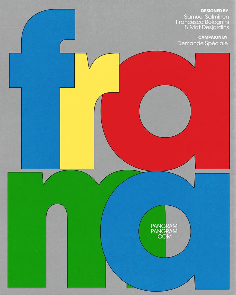
Enter Frama, a geometric sans that doesn’t reject that legacy—it recalibrates it. Designed by Samuel Salminen, Mat Desjardins, and Francesca Bolognini of Pangram Pangram Foundry, where Futura projected forward with rocket-fuel certainty, Frama moves with a softer gravitational pull. The geometry is still there—clear, orbital, disciplined—but it’s tempered by something more human. Less manifesto, more conversation. If Futura was the typeface of the Space Age, Frama feels designed for what comes after: the vast, quiet frontier of digital space.
Rooted in early 20th-century modernist thinking, Frama bridges clarity and character. It revisits the familiar vocabulary of geometric sans serifs—circles, straight lines, crisp counterforms—but speaks it with contemporary nuance. Look closer and the harmony reveals itself. Letterforms balance ideal shapes with near-imperceptible irregularities, creating a tension that gives the typeface warmth and rhythm. What reads as simple at first unfolds into a careful choreography of proportion and spacing—functional readability carrying a layer of refined detail just beneath the surface.
Frama’s dual personality reinforces that flexibility. Available in both Display and Text cuts, it scales effortlessly across media. The Display styles lean into sharper contrast and expressive alternates, showcasing the typeface’s geometric bones. The Text styles ease the forms for extended reading, maintaining structure while prioritizing comfort. Together, the multi-weight system supports everything from editorial design and brand systems to UI, motion, and beyond.
Stylistic alternates further expand Frama’s voice, offering designers room to shift tone and rhythm without breaking the system. Minimal compositions, bold typographic posters, or restrained identity work—all feel equally natural. Through it all, Frama holds a steady visual line: clean, modern, and unmistakably considered.
Frama isn’t just another geometric sans. It’s a contemporary reinterpretation of modernist ideals—one that acknowledges the past without being bound by it. In a typographic landscape shaped as much by screens as by print, it brings balance, warmth, and modern precision to every word.
The post Frama—Geometry After the Space Age appeared first on PRINT Magazine.