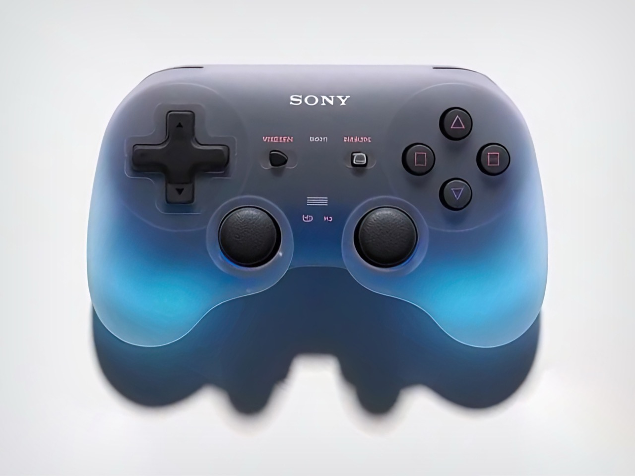
For too long gaming-related gadgets and peripherals have relied on a predictable template for aesthetics. Either they go down the standard Black plastic meets RGB lighting route, or when they do differ from that boring DNA, they go for futuristic edgy alien-inspired forms… but here’s what I don’t understand. Not all aliens look unfriendly. Not all aliens need to have Ridley Scott-esque visual DNAs. Not every gaming peripheral needs to look either like a Cyberpunk gizmo or something teleported out of an alien mothership. Sometimes, a soft form factor can convey futurism too – think Baymax, or the wide range of aliens in the MIB franchise. I digress… the point I’m making is that sometimes you can play with elements like translucency and light to create futurism, case in point this ‘Goo’ Sony controller from An Improbable Future.
This isn’t their first Goo controller, however… in June we got a taste of the Goo controller’s version 1. That variant focused more on the translucency than on the ‘mysterious glowing orb’ that is the concept we have in front of us today. Disclaimer, An Improbable Future’s designs are all made using AI, so glean from that what you will. I, for one, love the idea of a controller that looks like a tactile dream come true. Soft curves that the palm can wrap around, maybe a slight rubbery texture for good grip as well as ergonomics, and inner glowing lights that have the entire controller come to life, not just the buttons. While companies are relentlessly chasing transparency as a design trend, this translucent design aesthetic desperately needs to kick off.
Designer: An Improbable Future
The bulbous design feels reminiscent of the Switch Pro controller, with short, stocky arms that give the controller a compact height while still providing grip. When off, the controller looks fairly ordinary, thanks to the cloudy black plastic/rubber that makes up its exterior. As soon as the lights come on, it’s like the controller has been brought to life, feeling nothing like the gaming peripherals you’re used to. The controller feels like a power up, it glows in your palms like a magic elixir, responding to your gaming, feeling like a living entity, not a wireless gadget.
And that’s precisely the design language I’d personally like to see more of. Remember the translucent Switch Pro controller? Just imagine it had concealed lighting that gave it character. This one definitely pushes the boundaries though, with the two arms pulsating with a glow like the controller’s lungs are in action. Is it weird? Some people will probably say so – these are the same people that hate skeletal gaming gear because trypophobia triggers them. The ‘Goo 2’, as I call it, is for a niche demographic who wants their peripherals to have actual character. Like lively character.
The reason we’re in this design trap is because most designers perform word association tests while designing. Every gaming brand WANTS to embrace that ruthless killing machine aesthetic (barring probably Nintendo), which results in a lot of gaming gear looking, well, predictable. I know there are some of you who will call this ‘AI Slop’, some who will leave comments on Social Media saying ‘this is not real design’, but what is AI if not the ultimate ideation partner? Here’s a proof of concept (albeit digital) that demonstrates the Goo aesthetic flawlessly, and it works. It worked in June with the Goo 1, and it works just as well with the Goo 2.
The post ‘Goo’ inspired Sony Game Controller concepts make me wonder why nobody’s embraced this DNA before first appeared on Yanko Design.

