Even though the Phone (3a) doesn’t officially launch until the 4th of March, Nothing pre-emptively released the phone’s design through a YouTube video following some online leaks. As is with any new tech, the internet is thoroughly divided – some people are praising Nothing for creating a phone that breaks tradition, experimenting with a layout that’s edgy and nonconventional. However, there are others who find the camera bump weird, unplanned, and displeasing. If you’re a part of the latter, I’m here to explain to you exactly why the Phone (3a)’s camera bump is making you feel those feelings.
The Phone (3a)’s camera bump embraces industrial rawness – but not in a way that everyone likes. Sure, exposed screws look great. Ribbon cables add a lot of dynamism. A bare-bones aesthetic can be wonderful. But as a designer with 15 years of experience, the one glaring thing that stands out is just a sheer lack of visual symmetry. On a geometric level, the Phone (3a)’s camera layout makes some questionable choices. There are small lapses in symmetry that just feel wrong – and objectively the phone might look good, but the camera bump sits out like a sore thumb. I took the liberty to load images into a CAD software so that I could make some rough measurements. A lot of the details are off to a point of pure frustration. The cameras are in a weird polygonal shape, they’re all different sizes, they don’t line up even though they should, and hell, even the entire camera bump isn’t aligned with the phone’s body.
Designer: Nothing
I’m not hating on the Phone (3a), I love what Nothing’s done to shake up the tech industry, and more power to them – but the camera bump on the (3a) feels like a great movie with just a few plotholes that were difficult to look past. It’s difficult to say whether this camera bump was designed as a sort of compromise because they could only fit the camera modules in a certain layout without clashing with other parts, or whether they came up with that layout and then put the blocks in place. Either way, the hardware is (at least on paper) pretty impressive, but it gets a few points deducted on the visual level.
Human eyes crave patterns, symmetry, and meaning. It’s something we’re taught in design school when we learn the laws of visual Gestalt. The six laws of Gestalt go as follows – Proximity (closely placed objects are grouped visually), Good Figure (these proximal groups are then perceived as single units), Similarity (objects that look similar are perceived as a group), Continuation (the eyes tend to follow a path even if it isn’t a direct one), Closure (the eyes complete objects that are obviously incomplete), and finally Symmetry (symmetric objects are perceived as a group).
These laws govern every aspect of how our eyes ‘digest’ the world, and when you break such patterns, the best way to do it is break them with careful consideration. What the Phone (3a)’s camera layout does is defy a few simple gestalt laws in a way that feels slightly annoying – like gravel in your shoe – small enough on its own to really not be a problem, but in this context, be quite discomforting.
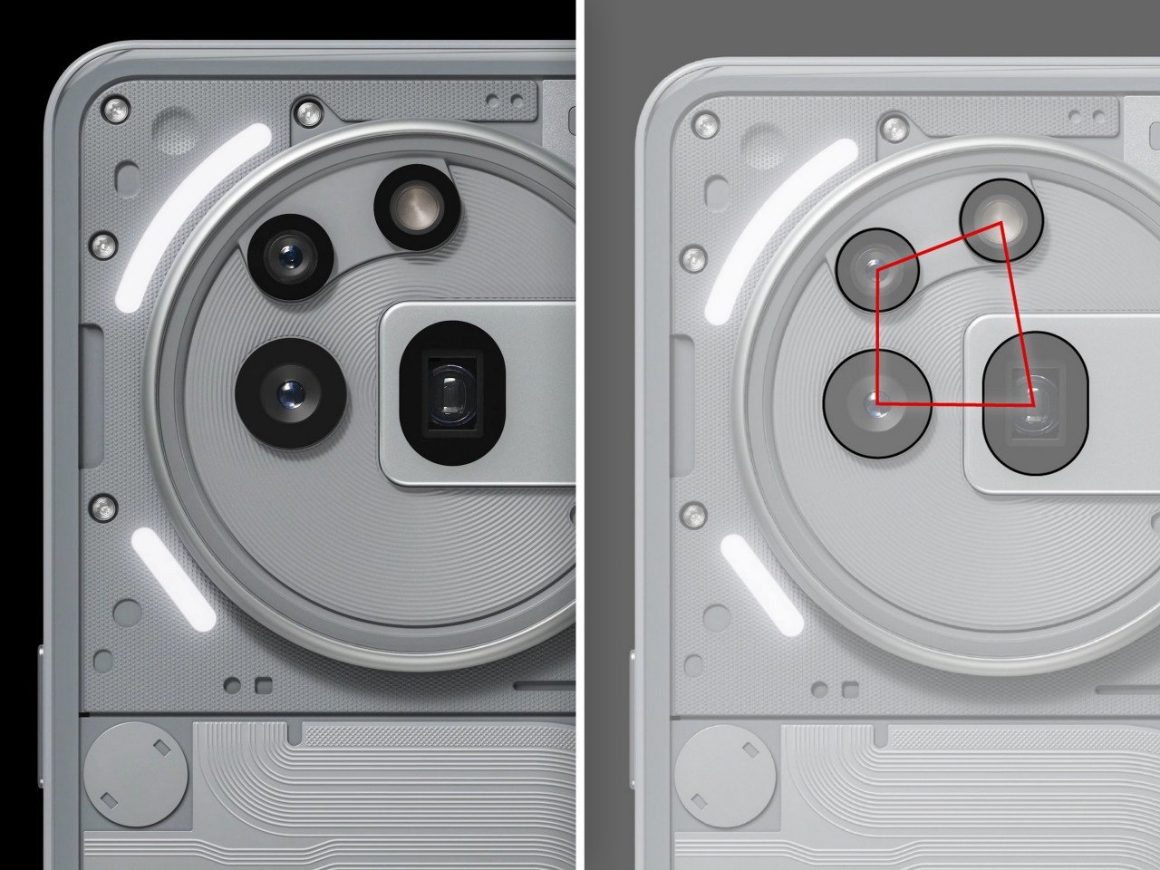
The layout itself breaks the laws of Symmetry, with a weirdly polygonal shape that has no equal sides or geometric order. Nothing’s centrally aligned, there’s a camera ring on the outside but they aren’t radially aligned either. It’s an odd polygon placed seemingly randomly inside a perfect circle inside a rounded rectangle that is the phone. This weird hierarchy is probably the first thing the eye tends to notice. The cameras are all different sizes, and in some cases even different shapes, violating the Gestalt law of similarity. However, the lenses range from most powerful to least depending on their size, which is reassuring.
Human eyes crave some form of symmetry – it’s why the iPhone lenses are an equilateral triangle aligned perfectly inside a square which sits equidistant from the top left corner. The (3a) lacks that symmetry in ways that would otherwise make the camera layout perfect. The main lens sits right off the center of the overall camera bump. It wouldn’t be that much of a problem had the camera bump not been made of concentric circles that actually guide the eye to this observation. There’s visual continuity there in the concentric texture, but the main camera’s off-center placement breaks things. It also sits inside a capsule-shaped cutout, which sits inside a rounded rectangle – which wouldn’t be a problem, except their radii don’t match.
Go into the granular details (and I’m being excessively pedantic here) but the two most prominent cameras aren’t horizontally aligned too. Now the alignment changes between renders – Nothing released a photo a fortnight ago that showed a massive misalignment (that’s the one I’m sharing below). The images from the video today look mildly better, but even in my CAD software, it’s off by half a millimeter, which at that scale, feels excessive. Just take a look at the alignment issue below.
If you zoom out, the entire camera bump itself isn’t aligned with the phone! The distance between the silk screen (the paint on the glass to hid the glue lines) and the camera bump shows up to a 2mm difference, with irregularity on the top, left, and right sides. In short, unless I hold the phone and take the measurements myself, these images do show some discrepancies. Discrepancies that might be really small on paper, but they’re enough for your mind to know that something’s off. A piece of spinach stuck in your teeth could be a VERY tiny problem if you measure the spinach fragment compared to your body, but it’s enough for your brain to notice and fixate on.
This kind of obsessive measurement-hounding is something Steve Jobs was notorious for. He famously demanded that circuitry in his machines looked ‘aesthetic’. Circuit boards, that nobody would ever look at, were made to look visually pleasing because the devil lay in the details – the same approach is what Nothing banks on, with its transparent designs that let you view the circuitry underneath. Heck, Jobs once complained to executives that the yellow color on the O in the Google logo looked off on iPhone screens. He had the color balance adjusted for a logo that wasn’t even his.
The Phone (3a) series is set to launch exactly a week from now, and I won’t lie, I’ll be one of the first to tune in and see what Nothing has in store for us. The company’s on a warpath to change the perception of tech being serious by making things more unconventional and fun, through their casual, engaging YouTube videos, and even through their products and experiences. The Phone (2) still remains by my side as my secondary device, and the Phone (3a) will undoubtedly make a major impact on the Android market. I just wish that camera bump didn’t stand out like such a sore thumb.
The post Hate The Nothing Phone (3a) Camera Layout? Here’s A Designer’s Detailed Breakdown Of Why first appeared on Yanko Design.