When people think about UX design, they usually picture buttons, layouts, and colors. But if you’re running any kind of top-of-funnel marketing, such as ads, landing pages, and lead magnets, UX plays a much bigger role than it gets credit for.
UX may seem like it’s about looking polished, while it’s actually about helping people move forward without friction, from the moment they first land on your site.
If that experience feels confusing, clunky, or too busy, you lose people fast. On the flip side, smart UX design can improve conversion rates by up to 400%. That kind of lift at the top of the funnel changes everything. It lowers your cost per lead, stretches your ad budget, and gives your sales team more to work with.
Today, I’ll be walking through what that actually looks like, why it works, and what to fix first, without needing a full redesign or bloated strategy deck.
Design for Distinct Audience Segments Without Diluting Your Message
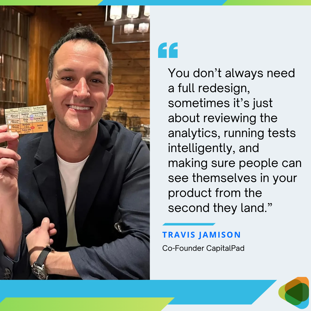
When we launched CapitalPad, a financing platform that connects independent sponsors with accredited investors, we knew our biggest asset wasn’t just the product. It was the network effect. The more high-quality operators we attracted, the more valuable the platform became for investors, and vice versa.
But we quickly noticed a disconnect. Early visitors didn’t always know where to click. Some weren’t sure if the site was meant for them. Others left before reaching a relevant CTA. The problem wasn’t traffic, it was clarity.
That’s when we restructured the UX to honor both sides of the marketplace equally, not just with a single design tweak, but through a layered approach:
Just below the header, we introduced a clear vertical segmentation with two CTAs: one for independent sponsors, one for investors.
Lower on the page, we used differently styled value sections to highlight the benefits each audience cared about most.
Even our social proof is split, with testimonials chosen specifically to reflect each segment’s point of view.
Source: Capitalpad.com
The result? Higher engagement, more qualified leads, and far fewer drop-offs. When your UX respects the dual nature of your audience (and lets each one feel spoken to) it strengthens the entire network.
This is just one example of how thoughtful UX can supercharge your top-of-funnel efforts. Let’s look at more tactics that drive similar results, no full overhaul required.
Place an Enticing Funnel Entry Point in Your Website Header
Your website header is prime real estate. It’s the first thing most visitors see, and in many cases, it decides whether they stick around or bounce.
That makes it the ideal spot to place a clear, compelling entry point into your funnel. Not buried in a menu. Not hidden in a footer. Right at the top, where attention is highest.
Done well, this can move cold visitors into warm leads without relying on heavy sales tactics. It shortens the path from curiosity to action. For marketing teams, that means stronger lead flow. For the business, it means more chances to convert traffic you’ve already paid for.
To make it work, focus on three things:
The CTA needs to be benefit-driven. Not “Submit” or “Learn More,” but something that speaks directly to what the user wants.
The action should feel easy. If clicking the button leads to a maze of steps or an aggressive sales pitch, you’ll lose momentum.
Support the CTA with microcopy that addresses hesitation, like effort, time, or cost.
Let’s look at a company doing this right: Somewhere, a platform that helps businesses outsource vetted remote talent. Their header features a clean CTA that leads to a short, three-step signup form.
Each step only asks for what’s needed to match users with the right talent, without any overwhelm. The layout is simple and focused, which keeps friction low.
Right under the button, a short line of copy reads: “Zero Risk: You pay nothing if you don’t hire anyone.” That’s a smart touch. It reduces the sense of commitment and encourages more users to take that first step.
Source: somewhere.com
This reassures prospects upfront, removing a major objection before it even forms.
Use Smart UX Cues to Align Your Products with User Goals
A lot of brands still segment their audience by age, gender, or job title. But these surface-level categories don’t always reflect what your users are actually trying to accomplish.
When you shift the focus from who they are to what they’re trying to achieve, your UX becomes more relevant and your marketing becomes more effective.
This strategy works because it puts the product in the context of the user’s goal. Instead of making them figure out how your offer fits into their world, you’re showing them how it solves a specific problem they’re already thinking about. That makes decision-making easier and increases the chance they’ll move forward.
To apply this:
Start by mapping out the top goals your visitors might have when landing on your site.
Then, adjust how you present your products or services to reflect those goals.
This can be as simple as renaming categories, reworking your navigation, or adding filters that speak directly to user intent.
Two brands that do this well are Transparent Labs and HubSpot.
Transparent Labs is a sports nutrition company that focuses on natural supplements. On their homepage, there’s a section titled “Find Your Clean Supplements” that divides products into categories like “protein,” “build mass & recover,” “pre-workout,” and “weight loss.”
These seem like they’re just product types, while they’re actually user goals. This helps shoppers identify what they need without digging through every option.
Source: transparentlabs.com
HubSpot, a CRM and marketing automation platform, uses a similar approach. Their site navigation isn’t organized around product names or departments. It’s segmented by user objectives.
You’ll see items like “generate leads,” “build pipeline,” and “close deals.” It speaks directly to what prospects want to achieve, which helps draw them into the right funnel path.
Source: hubspot.com
These two examples show how small UX cues can lead to better alignment and better conversions.
Populate Your Funnel Entrypoint with Trust Signals
If your top-of-funnel entry point isn’t converting, it might not be the offer but the lack of trust.
Visitors at the top don’t know your brand yet. They’re unsure if what you’re offering is legit, useful, or worth their time. That hesitation costs you leads.
Adding trust signals at this stage can help you get up to five times more leads than when they’re missing. Strong social proof buffers uncertainty and helps people commit with less hesitation.
This doesn’t mean that you should clutter your pages with every logo and star rating you can find.
Here’s what to do instead:
Place the right trust signals, in the right places, for the right reasons. Your funnel entry, whether it’s a signup form, free trial prompt, or lead magnet, should feel supported.
Add logos of well-known clients, relevant review site ratings, or testimonials that speak directly to what your target user cares about.
Even subtle signals like “used by over 10,000 teams” or “top-rated on G2” make a difference.
One brand using this approach well is DialMyCalls, a platform that offers mass text messaging services for businesses and organizations. Their signup page includes a standard registration form.
More importantly, it also features trust-building elements like a list of recognizable client logos, a direct link to reviews, and G2 badges displaying their accolades. Its UX is clear, not overdone, and serves a purpose: reduce doubt and nudge the visitor to take action.
Source: dialmycalls.com
By placing trust signals directly at the funnel entry, DialMyCalls makes the user’s decision easier. They don’t have to wonder, “Who else uses this?” or “Is this reliable?” The answers are right there – visible and relevant.
Let Video (and Audio) Take the Load Off Your UX
Some products need more than a headline and a short paragraph to make sense. If your offer requires context or explanation, cramming it all into your UI or copy can backfire. Too much information upfront slows down your funnel and overwhelms the user.
That’s where video and audio can step in to do the heavy lifting, without crowding the experience.
Video and audio aren’t UX shortcuts but powerful conversion tools. For instance, 88% of video marketers say video has helped them generate leads.
When used properly, video can explain your product faster, hold attention longer, and clear up confusion without adding clutter. Audio works the same way, especially when it helps users hear how your product functions in a real-world context.
To get it right:
Keep video and audio short and focused.
Don’t treat them like branding assets. Use them as functional parts of the user journey.
Place them near decision points, keep messaging tight, and make sure there’s a clear outcome or next step.
Don’t autoplay video with sound. Let the user choose to engage.
RE Cost Seg, a company offering cost segregation services for real estate owners, uses this well.
Their homepage features a video that covers what they do, how they’ve delivered results, and even includes client testimonials, all in a single asset. That reduces the need for long explanations or complex design layouts.
Source: recostseg.com
Another example is Rosie, an AI answering service, which takes a slightly different route.
On their homepage, a section titled “See Rosie in Action” plays short audio clips of the AI speaking with real people. This gives potential customers a clear sense of how the tool works, without needing to describe it in detail.
Source: heyrosie.com
In both cases, the media enhances clarity, simplifies the UX, and keeps users moving forward.
Use Your UX to Support High-Touch Sales
Some products can’t be sold with a self-service funnel alone. If your offer is complex, high-stakes, or emotionally sensitive, human support is essential rather than a nice-to-have. In those cases, your UX should make it easy for users to connect with a real person at the right moment.
When your UX supports high-touch sales, you reduce friction, build trust faster, and meet people where they are. That’s a big deal, especially since companies with excellent customer service are 60% more likely to retain customers and generate new leads.
But the UX has to do more than just throw a phone number in the footer. It needs to encourage connection without being pushy.
To do this well:
Make human contact options visible and accessible across key points in the journey.
Don’t force users to dig for support.
Use persistent chat elements, clear CTA buttons like “Talk to a Specialist,” and upfront contact info that invites people to reach out on their own terms.
The goal isn’t to rush them but to give them options.
Bay Alarm Medical, a company that offers medical alert systems, nails this approach. Their site is built for an audience that often prefers human reassurance – the elderly and their families.
Right at the top of their header, there’s a toll-free number. A live chat icon stays fixed in the lower-right corner. Various CTAs throughout the site encourage users to talk to customer support, ask questions, or speak with a sales rep.
Source: bayalarmmedical.com
Everything about the UX here supports personal interaction. The availability and variety of these options turn interest into trust, and trust into leads.
Build Interactive Tools That Guide Product Selection
When visitors land on your site unsure of what they need, giving them a simple way to figure it out can make all the difference. Interactive tools, like product finders, quizzes, calculators, and solution wizards, do just that.
They turn passive browsing into active engagement. And it works: interactive content generates conversions moderately or very well 70% of the time, compared to just 36% for passive content.
The value here is more than getting users to click. These tools guide people toward the right solution while capturing useful data and warming up leads in the process. For businesses, that means better-qualified leads and more efficient marketing handoffs.
Here’s how to make this work:
Keep the experience short, clear, and relevant.
Ask only what you need to guide the user, and focus on delivering value in return, whether that’s a personalized recommendation, a quick result, or a tailored CTA.
Don’t overload the tool with branding or unnecessary friction. The goal is to keep people moving forward.
Hims, a telehealth platform tailored to men, uses this tactic well. Their homepage features multiple quizzes and calculators that help users figure out the right solutions for everything from mental health and weight to skincare.
One standout is their BMI calculator. It delivers a clear result within seconds, using a simple and intuitive interface. What makes it effective is what comes next: a CTA that invites users to begin a professional consultation, right from the result screen.
Source: hims.com
That’s the key: don’t let the tool be a dead end. Use it as a natural transition into your funnel. Hims shows how to do that right: guiding users, providing real value, and making the next step easy.
Deploy No-Pressure Exit Popups That Rescue Departing Traffic
Most site visitors won’t convert on their first visit. That doesn’t mean that they’re not interested. It usually means that they’re not ready.
A well-timed, low-pressure exit-intent popup can give them a reason to stay just a little longer. It’s often crafted to offer something useful right before they go.
When done right, exit-intent popups can re-engage leads without sounding desperate or salesy. The key is to keep it simple, relevant, and completely free of pressure.
Here’s how to pull this off:
Use clear, friendly language and focus on quick wins.
Avoid generic lines like “Wait! Don’t leave!” Instead, offer something like a one-click signup, a free tool, or a short preview of your product.
Be specific. Users should immediately understand what they’re getting and how little it takes to try it.
Don’t offer a discount they didn’t ask for or flood them with urgency. Instead, make the popup about value – something that requires minimal effort and helps them explore your product on their own terms.
CoSchedule, a social media marketing calendar tool, uses this strategy effectively. When a visitor shows exit behavior, they’re met with a popup that says, in essence: Try building your calendar for free; it takes just thirty seconds.
This isn’t a hard sell but an invitation to engage with the product in a lightweight way. It gives the user something to do, instead of just leaving, and keeps the conversation going without any friction.
Source: coschedule.com
CoSchedule’s approach shows how exit-intent popups can support lead generation without sounding pushy. It respects the user’s intent while still guiding them toward a low-effort action that keeps them in the funnel.
Final Thoughts
Your website is your most scalable salesperson. Every design choice either moves visitors closer to conversion or pushes them toward your competitors. The difference between a 2% and 8% conversion rate isn’t luck or traffic quality but intentional UX decisions that remove friction and build trust at exactly the right moments.
Most businesses obsess over driving more traffic while ignoring the visitors they’re already losing. They don’t realize that fixing their UX delivers immediate returns on traffic they’ve already paid for.
So, start with one tactic that matches your biggest bottleneck, measure the results, then build from there. Your next customer is probably already on your site right now, deciding whether to stay or leave.
The post How Smart UX Design Supercharges Your Top-of-Funnel Marketing appeared first on ZD Blog.