How To Banish Boring Beige With Cohesive Pops Of Colour
Interiors
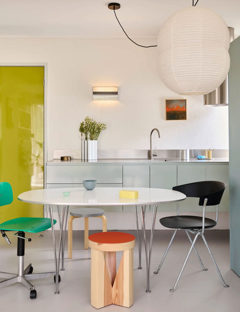
The home of Will Kelly. Hoatru Double Bubble pendant by Twentytwentyone. Art by John Lloyd. Fritz Hansen Super-Elliptical™ B611 Table from Cult. Ceramic bowls by Mud Australia. Butter dish from Cibi. Vintage office chair by Kevi. MC20—Cugino stool by Mattiazzi Cugino. Editorial styling – Annie Portelli. Photo – Eve Wilson
Fritz Hansen Super-Elliptical™ B611 Table from Cult. Ceramic bowls by Mud Australia. Butter dish from Cibi. Vintage office chair by Kevi. MC20—Cugino stool by Mattiazzi Cugino. Home of Will Kelly. Editorial styling – Annie Portelli. Photo – Eve Wilson
When introducing a ‘pop of colour’ into your home, it helps to start with a fairly neutral base. This, after all, is what will make the colours well and truly POP!
For this style, we’re not against layering colour over colour, as it won’t have the same effect. We’re looking for contrast, so those boring white walls that fill your home are the perfect backdrop for your new colour journey.
Where to begin
Start with a clean palette by de-cluttering and simplifying the space, and then slowly introduce the desired ‘pops’ one by one. Choose a larger piece first — an armchair or an artwork — and then layer other items around it. It’s important not to ‘over clutter’, let the largest ‘pop’ have a moment to shine. It always helps to stand back and assess as you add more items in, and if something is detracting from the main event, it needs to go.
Contrast is everything
When deciding on your bold-coloured statement piece, it’s important not to be shy. Find the brightest and most out-there colour you can tolerate, and pop it in pride of place, in a spot that has no other colour or tone like it around. A bright red side table against a white couch, or a bold artwork up on a big white white wall, for example. We’re not going for tonal, we’re going for main character energy!
For beginners
If the idea of committing to a big, bright red armchair scares you, or you’re not in the market for a new artwork, start small by injecting little pops of colour into your home. Maybe it’s a vase, a cushion or a little side lamp to break up your beige room. Pop these smaller items around your home until you start to get a feel for living with bolder colour choices, and then you can go bigger and brighter!
Colour choice
Keep the colours primary. Reds, yellow, blues and greens are perfect. For this effect, we want to steer clear of subdued colours or neutrals and instead go bold, or go home!
Additional moodboard credits: (From left) Art by Tali Steer from Brunswick Street Gallery. Arum portable lamp from Trit House. Rip Current sculpture by Tatts from Pépite. Glazed stoneware by Aileen Corbett from Brunswick Street Gallery. Goodhue vase in green by Tom Summers from Craft Victoria. Light and Dark vessel by Angela Hayes from Pépite. Large bowl by Connie Augoustinos from Pépite.
Want to see more? Visit The Design Directory to discover our top picks in flooring, furniture, lighting, tiles, tapware and more!