Future of design has fewer colors and more minimalism
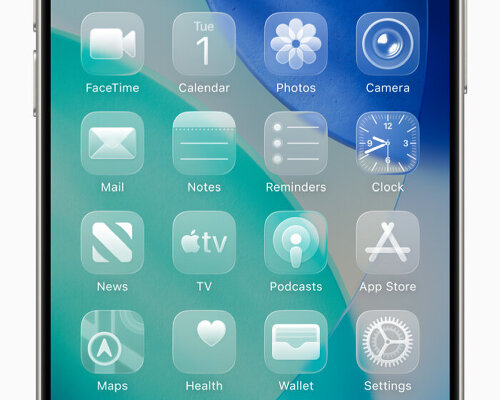
These days, if users want vibrant colors back in design, they’ll have to ‘pay’ for them. On June 9th, 2025, Apple unveiled the Liquid Glass UI, which turns all the apps, buttons, and controls on iOS 26 transparent. The vivid colors are gone, replaced by floating icons that mimic the wallpaper with a blur. Users have weighed in on the update on our Instagram post. Some have compared it to the floating, glassy icons of Windows Vista between 2006 and 2007, while the update reminds a user of the Gaussian blur, which is a blurring technique that makes an image softer or have a smoother appearance. There’s a comment imagining how Steve Jobs would react to the color-free icons (which is the standard option that users can change), while another says, ‘welcome to the future.’
In many ways, this has become a road brands and companies choose for their branding, logos, and even gadgets, products, and objects. The past was bursting with colors, and recently, these shades have gotten lighter, more translucent, faded. With Apple, it’s a consistent move towards reduced colors in line with its ‘simplicity’ ethos. The brand had a colorful time around the 1990s when it introduced its fruit logo in rainbow. It became metallic, glassy blue in that period, and soon enough, it went monochrome around 2001, predominantly using white, silver, and black color schemes as an appeal to minimalist consumer style. Nowadays, the similar look spreads around with brands shifting their identities to a lot less color. For them, it’s not just a trend. It’s part of their design strategy.
graph showing changes in the colour of objects over time | image courtesy of Science Museum Group | study here
Brands have shifted their identities to ‘simpler’ designs
Other brands, and not just Apple, have also lost vivid colors to appeal to a modern audience and adapt their designs to new gadgets. Google, for example, has turned their name in some of their apps into grayscale and just put the colors in their logos. Slack has gone from having a number sign with overlapping colors to a geometric logo with distinctive shades. Spotify has changed too, from different logo and text colors to a singular green shade. Firefox from a fox clinging onto the globe to just the animal’s silhouette in blazing hues of red and orange.
Even American Express has shifted from having a glow of white light in the background to just a plain blue backdrop. The Guardian has let go of its two-tone blue for a monochrome. Gap has switched from white text over a dark blue background to black text over a white backdrop. These brands, to name a few, have their reasons why they’ve decided to go through the change. Some studies have documented that losing colors to brand identities or making them more minimalist helps consumers understand them clearly and easily. In return, they trust them more.
Firefox loses the globe in the new logo | image courtesy of Mozilla Corporation and Mozilla Foundation, via Wikimedia Commons
minimalist logos, icons, and brands are easier to look at
It’s also because simple designs help brands be seen clearly on modern devices. In line with the device-reliant generation, there’s a less-is-more design strategy because there’s too much digital information happening at once. The burst of colors in brand identities doesn’t help since it can ‘confuse’ the users as to what they are. Simple designs use clear shapes, few colors, and easy-to-understand words, so this combination makes it easy for them to remember the brand. In a nutshell, a simple design stands out because it is not messy. Technically speaking, websites need logos that can change for different screen sizes, so having simple color plans and word styles works well in digital platforms. Aside from that, having less color means cheaper production and printing.
Spotify changes from two-tone to singular color | logo images courtesy of Spotify
Slack image past (above) and present (below) | logo images courtesy of Slack
Google goes monochrome for some of their brands | logo images courtesy of Google LLC
Apple’s Liquid Glass UI makes the buttons transparent | image courtesy of Apple | read more here
project info:
brands: Apple, Google, Slack, Spotify, Firefox, American Express, The Guardian, Gap
The post if you want vibrant colors back in design, you will have to ‘pay’ for them appeared first on designboom | architecture & design magazine.