When I spoke to Sharp Type’s co-founders, Chantra Malee and Lucas Sharp, a little over a year ago, the indie foundry was embarking on an adventure of sorts. Officially, Sharp Type was celebrating the parallel launch of a new website and “Season Two” of the retail type catalog. Candidly, the team was seeking more dynamism amidst the churn of client projects, a creative challenge of sorts—more play in the process. Dynamism, they got. Over 18 energetically-charged months, the Sharp team has released new fonts at a clip of one each month.
I was curious about the team’s experience over the last year, so I sat back down with Sharp and Malee.
Sharp admits it has been an intense release schedule. “We put out more fonts this year than we had in the previous decade,” said Sharp. “I’ve felt, and I think if you talked to members of our team, the consensus is that we’re super energized. We’re excited to be creating in this fluid environment. It’s built momentum. With client work coming in, too, we’re in this fast-paced cycle of ideating, creating, and drawing. And that’s been wonderful.”
Malee and Sharp both agree that the playful energy of this experimental year stems from working with new talent across the globe. “We weren’t sure how the industry would take the shooting off of Season One,” said Malee. “But we’ve had so much support, and have met so much new and incredible talent around the world. Many people said, ‘Let’s work together,’ and that’s why we were able to be so productive. We’re so lucky to work with the talent we have.” They have tried to build Sharp Type into a platform, said Sharp. “A big part of Season Two’s success has been our ability to collaborate with free-floating talent,” he continued. “We’ve been able to scale our esoteric design knowledge while helping ease the challenges of being a designer just starting out.”
Since we last talked, the couple relocated their family from the Bay Area to Rhode Island. Sharp grew up on the West Coast, but it was always a part of their long-term plan to move back to Malee’s hometown to establish roots for their family. With many clients in New York and Europe and a far-flung team, the move also made strategic business sense. Team Sharp’s new digs and community have proven generative and creatively expansive, attested by the company retreat in the archives at Newport’s The Redwood Library and Athenaeum, detailed in this feature in Monocle. The foundry is deep in an ongoing project with a centuries-old stone carving studio in Newport, due to be released in 2026. (More on that in a later column.)
As many conversations of this current moment do, ours veered into AI. While there are significant and potentially dystopian shifts in the market due to AI, Sharp and Malee are both heartened by the need for creative people who know how to see and speak the language, who know how to prompt, and who know why an artifact of type is good or not. “A core functionality of a craftsperson is taste,” said Sharp. “That is irreplaceable.” Sure, AI will do the thing. But AI won’t ever replace the particular combination of knowledge, experience, and the frame of the actual human who is wielding it.
“The competition to create compelling work will always be fierce,” said Sharp. “But the landscape is always shifting under our feet, so then it becomes about who is nimble and can adapt in that environment.” Perhaps ironically, being adaptable in this kind of landscape gets increasingly more fundamental: going back to basics. The playing field isn’t about tools. It’s about mindset—a way of seeing and thinking and a focus on the craft. “In a way,” Malee said, “we may be looking at a new renaissance, because it’s becoming a race to authenticity.”
The best shops and craftspeople are just chipping away at their block. And that produces the best work.
Lucas Sharp
Sharp compares what’s happening to the idea of creativity in the age of AI to the sea change in agriculture to the flattened industrial version we saw in the 20th century. Yes, it’s economical, efficient, and scalable, but is it actually good? “It took generations for us to get here, and now everyone we know is a homesteader.” It’s an energetic principle, Sharp says. “People are not going to want to put just anything on their walls, just like they don’t want to put just anything in their stomachs. They are going to want something created by someone, something that feels tangible.”
For a digital typeface foundry, it’s a beautiful thing that so much of the exploration has been in the archives, in the handmade. You’ll see this craft ethos throughout the team’s favorite typeface releases of the past year.
Sharp Serif
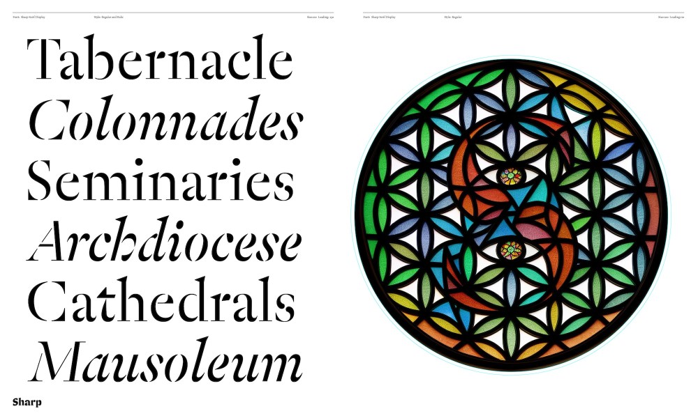
Sharp Serif pays homage to the 15th-century Italian and French Renaissance. It is classic in form, with modern refinement, making the serif typeface as beautiful as it is accessible. Sharp Serif Display takes a more radical optical approach, where stencil-inspired constructivist shapes meet the grace of the high contrast serif.
What began as Sharp’s exploration of utilitarian forms (it’s his third serif typeface) is now a centerpiece of the catalog and a lasting contribution to modern typographic style. There’s much more to his process, and the influences and historical threads he followed. Read about it here.
It may not be my last, but Sharp Serif is my best attempt thus far to contribute to the most noble of all typographic genres.
Lucas Sharp
Hauss & Raum
Designed by Justin Sloane & Huw Williams, Hauss & Raum are paired sans-serif and display typefaces that play together in extremes: from utilitarian to experimental.
Sloane planted the seeds for Raum in 2018 as a custom font he created for an unrealized branding project. That version played with no lowercase, two sets of uppercase characters—”one ‘vanilla’ and one ‘loco,’” as described by the team. Eclectic symbols replaced punctuation. It was a fun concept built on the proportions of Arial Regular, but it was eventually set aside.
When Hauss, the refined sans-serif workhorse that Sloane had been polishing for years, came to life, the team had an idea. They pulled Raum out of the drawer and re-drew it to mirror its weights and proportions. With Raum, the team wanted “to push the ‘display inktrap’ concept into uncharted, psychedelic retrofuturist territory.” You’ll notice the visual nods to Arnold Böcklin‘s namesake font and Leo Magg’s Westminster. A set of Böcklin alternates lean into the nouveau motif.
Hauss & Raum embody an all-in-one visual system—both practical and provocative.
Rosalie
Refined over the years by designer My Lan, Rosalie has evolved into a high contrast display serif that balances the historical and contemporary, sharp and smooth, and calligraphic and constructed forms.
It was October 2017, on a visit to the medieval town of Guérande in Loire-Atlantique, France, when Lan sheltered from the rain inside the 12th-century Collégiale Saint Aubin. She was captivated by the painted letterforms covering the walls, describing the details as “fussy yet elegant, medieval yet timeless.” Those shapes, twirls, curves, drops, and ornamental elements left a lasting impression that became the foundation for her concept. Built with a comprehensive Latin script character set, Rosalie features additional letters, diacritics, symbols, and combining marks to support as many Latin-based languages as possible.
Rosalie’s Roman and italic styles deliver unusual proportions, exuberant swashes, and innovative shapes.
Cordier Script
Cordier Script by Benjamin Gomez revives the 17th-century calligraphy of Louis Barbedor, as engraved by Pierre Cordier in 1650.
Cordier Script sweeps diagonally upward in daring, continuous movement. As with the natural movement of handwriting, sentences can be formed in a single flowing stroke. To accomplish this organic feel, Gomez designed multiple half-letter forms, enabling a variety of connection heights between letters, and there are variances in the thickness of the strokes. The typeface offers two expressive styles, one for flow and another with classic letterform breaks. Gomez drew each letter with numerous contextual variations for remarkable flexibility and flow.
Cordier Script blends classic refinement with a lithe modern rhythm.
Read our Type Tuesday feature on Cordier Script.
Sharp Earth
Warm, pragmatic, and versatile, Sharp Earth is a universally adaptable multi-script sans serif by Lucas Sharp, developed in collaboration with local experts around the globe.
Sharp began the sketches for a PanEuro-Japanese concept on a trackpad during a 2017 road trip in Thailand. It has since evolved into a global typeface, with a team of local collaborators, including Kostas Bartsokas and Maria Doreuli on Greek and Cyrillic scripts, and Calvin Kwok on Japanese. In addition, Sharp expanded his design to cover nearly every Latin-based language, Arabic, Thai, and Devanagari.
Sharp Earth blends disparate sans serif traditions into a forward-looking aesthetic.
Special characters & languages from top left: arrows, Japanese, Thai, Devanagari, and Arabic.
Read more about Sharp Earth and my conversation with Malee and Lucas last summer as they launched Season Two.
Learn more about Sharp Type and view the Season Two catalog.
Header visual is Sharp Serif; All graphics courtesy of Sharp Type.
The post Inside Sharp Type’s Experimental Year: 18 Fonts and an Energized Team appeared first on PRINT Magazine.