Fresh off the plane from covering Huawei’s Paris launch event, Apple’s iPhone Air and iPhone 17 lineup just arrived on my desk. After diving straight into unboxing and initial hands-on testing, here are my first impressions of these three distinct approaches to smartphone design.
Designer: Apple
First Unboxing: The Briefing Room Moment
Apple’s briefing room feels different this year. There’s anticipation around just how thin the iPhone Air really is. When that first box slides open, the collective intake of breath is audible. At 5.6mm, the iPhone Air doesn’t just look impossibly thin. It genuinely challenges your perception of what a functional smartphone can be.
The iPhone 17 sits in the middle, both literally and figuratively, while the iPhone 17 Pro Max commands the table with its substantial aluminum presence. First impression? These aren’t just size variations. They feel like fundamentally different devices designed for completely different lives.
iPhone Air: Design as Absence
Architectural Minimalism
Even the packaging communicates minimalism. Less material, reduced weight, streamlined proportions. Lifting the iPhone Air reveals Apple’s most radical formal experiment: the seam between glass and titanium nearly disappears, creating the illusion of a unified monolithic object. The polished edge line refracts light differently than the flat glass plane, creating subtle optical breaks that emphasize the extreme thinness. At 5.6mm, the proportional relationship between width and thickness feels almost architectural. Like a precisely machined tablet rather than a phone.
Trade-offs in Thinness
The design challenge becomes immediately personal: how do you trust something that looks fragile but feels rigid? The rigid titanium frame creates cognitive dissonance. Your eyes expect flex, but your fingers find structural integrity. In early handling, the Air fits into pockets without creating the familiar bulge outline, fundamentally changing how the device lives on the body.
This reveals Apple’s deliberate design philosophy: thinness over tactile richness, prioritizing visual refinement while accepting that some tactile elements must be optimized for extreme spatial constraints. The flatter speaker sound I noticed isn’t a flaw but an acoustic consequence of physics pushing against engineering limits.
During more extended use, the featherlight feel eliminates the familiar grip strain associated with extended scrolling. The device seems to float in your palm rather than settle with weight. Edge transitions feel almost sharp against the skin during swipe gestures, a tactile reminder of the extreme thinness. This transforms how you interact with it. There’s a new sense of airiness and freedom – the device feels liberated from physical constraints, creating a fundamentally different kinesthetic relationship with the technology. More mindful placement, yes, but also an almost ethereal quality that makes interactions feel less burdensome.
Display Clarity and Glare Reduction
Apple officially describes Ceramic Shield 2 as having “improved anti-reflection to reduce glare” alongside 3x better scratch resistance. They also cite 3,000 nits peak outdoor brightness and “2x better outdoor contrast” as part of the overall outdoor usability improvements across the lineup.
In my early experience with the Air outdoors, glare does seem more controlled than on previous iPhones I’ve tested. During direct sunlight sessions, text remains readable without the aggressive screen angle adjustments I typically need with older models. Coffee shop testing under harsh fluorescent lighting shows similar improvement – the display feels more usable in challenging conditions.
Whether this comes from Apple’s new coating integrated into Ceramic Shield 2, the dramatically higher brightness working harder, or both elements combined, I can’t definitively determine. But the practical result is meaningful: less visual interference between you and the content, especially in bright environments where previous iPhones struggled.
Design as absence: Apple’s most extreme exploration of what happens when form approaches the theoretical limits of function. In these first hours, the Air feels like holding the future – technology that aspires to invisibility.
iPhone 17: Smoothness as Design Principle
Balance in Proportion
The iPhone 17 packaging signals accessible sophistication. Premium without pretense. Lifting the device reveals Apple’s masterful attention to curvature radius. The corners feel precisely calculated, creating tactile continuity from edge to edge that eliminates the harsh transitions found in earlier mainstream models. The proportional harmony between width, thickness, and height communicates design maturity.
Apple wisely maintained the fundamental design language from the iPhone 16, and that continuity feels reassuring. The familiar form factor means existing users won’t face a learning curve, but the iPhone 17 introduces meaningful refinements that genuinely improve the experience.
Display Balance in the iPhone 17
The move from a 6.1-inch display on the iPhone 16 to a 6.3-inch panel on the iPhone 17 adds screen space without dramatically changing the feel of the device. Width remains almost identical, while height and thickness increase only slightly. In my early handling, that means more room for content with proportions that still feel balanced in the hand. One-hand reach to the very top corners is a bit more demanding, but not to the point of feeling unwieldy. Slimmer bezels help the design feel intentional, giving the larger display a sense of refinement rather than bulk.
In one-handed use, the iPhone 17 feels familiar with subtle refinements. During extended scrolling sessions, the device sits comfortably in the palm. The matte aluminum sides provide controlled friction. Enough grip security without feeling sticky or overly textured. What I notice most is how the matte finish resists fingerprints completely – after extended handling, the aluminum surface maintains its clean appearance. When light catches the transition between these matte sides and the polished edges, it creates subtle visual hierarchy. The matte-to-polished contrast adds depth without being flashy, demonstrating how Apple uses material differences to organize visual information rather than just for aesthetic variety.
What struck me is how transformative ProMotion feels on the iPhone 17. Even casual scrolling immediately feels smoother in a way past standard models never managed. This reflects Apple’s recognition that smooth visual flow represents a fundamental shift in digital interaction expectations. Apple finally brought the standard iPhone in line with what practically every Android phone out there has offered since 2017. You can find 90Hz and 120Hz on budget Android phones under $300, making Apple’s delay all the more glaring. The buttery smooth motion transforms even basic scrolling into a more sophisticated sensory experience.
So far, the weight distribution seems to reduce the familiar reach strain when accessing top-screen elements. Unlike previous standard models that felt front heavy, the iPhone 17 maintains what feels like better equilibrium during both portrait and landscape orientations. The polished edges catch light strategically, creating visual interest without compromising grip security.
In early use, the balance feels more natural than previous standard models, showing how Apple’s design language continues to evolve in the mainstream lineup.
iPhone 17 Pro Max: Built to Perform Beyond Expectations
Heft as Stability
The Pro Max packaging communicates weight and substance before you even lift the device. Apple uses aerospace-grade 7000-series aluminum alloy for the Pro Max’s unibody, which in my handling gives a finish that seems to shift in tone under changing light – faint variances of sheen and color that feel like the alloy itself showcases material refinement. While Apple doesn’t explicitly claim this visual effect, in person it contributes to a sense of premium craftsmanship. The camera housing integration feels architecturally resolved this year, with smoother transitions between lens assembly and frame that eliminate the previous awkward stepped profile.
The substantial heft isn’t excessive. It’s purposeful, like a tool balanced for stability rather than mere spec accumulation. During landscape camera use, the weight rests strategically in the palm, providing the gravitational authority needed for steady shooting. The improved grip texture creates controlled friction that prevents slippage during extended creative sessions without feeling aggressive against the skin. Apple claims the aluminum construction delivers significantly better thermal performance, and in early use, the aluminum surface feels cooler to the touch during extended photo sessions compared to previous titanium models.
In design terms, this reveals Apple’s material science focused on thermal management over pure aesthetics.
One-handed use feels more manageable despite the size. From what I can tell so far, the weight distribution seems better calibrated to reduce reach strain when accessing notification panels. The aluminum unibody provides what Apple claims is 20 times better heat dissipation than the titanium used previously, and in early testing, the thermal management during processor intensive tasks does feel more controlled.
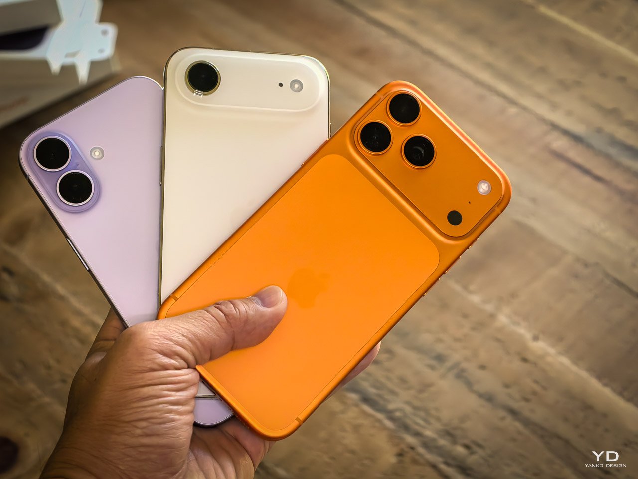
Color as Statement
The new Cosmic Orange finish is bolder in person than Apple’s product shots suggest. Under soft light it looks like a deep amber, while in direct sunlight it shifts toward a vivid, almost neon orange. I love how unapologetic it feels. It breaks from Apple’s usual muted palette and makes the Pro Max read less like a conservative tool and more like an expressive object. What I notice most is how the brushed aluminum unibody carries the pigment differently from glass – the orange doesn’t just sit on the surface, it seems to breathe with the alloy. It’s a finish that makes the Pro Max feel alive in hand, and it’s easily my favorite color Apple has shipped in years.
Authority through materiality: weight becomes an asset when it serves professional stability rather than simply containing more features.
Quick Impressions So Far
During a few hours of testing, I’m already noticing interesting patterns across the lineup that will need longer validation to confirm.
The haptic feedback on the Air feels sharper and more direct versus the broader, more balanced haptic that’s truer to a localized feel on the iPhone 17 Pro Max. Experiencing it firsthand, it’s less about weakness and more about deliberate recalibration. The iPhone 17’s addition of 120Hz ProMotion feels more transformative than expected. Basic interactions feel smoother, gaming becomes noticeably more responsive, and even simple scrolling provides that premium smoothness previously reserved for Pro models.
Camera performance will require extended testing across all three models to properly evaluate the significant hardware and software changes Apple has introduced.
Battery life across all three models will require extended real-world testing to properly evaluate daily performance patterns.
What’s Next
Alongside this early hands-on with the complete iPhone lineup, I’ll have separate pieces covering Apple’s new MagSafe cases and the updated crossbody strap system. Both are designed to influence how these phones are carried and protected daily, and I’ll be testing whether they deliver on practicality as well as design.
Extended iPhone 17 Pro Max first impressions will dive deeper into professional workflows, while longer testing will reveal how these initial impressions hold up in real-world use.
This is only the first handshake with the lineup. What lingers is not performance scores but how each model changes the way a phone feels on the body.
The post iPhone Air, iPhone 17 and iPhone 17 Pro Max Unboxing and Hands-On Design Impressions first appeared on Yanko Design.