For creative workers, making is the point. But how, why, and for whom is where it often gets sticky. Those were the questions that Joyce N. Ho, an Emmy Award-winning creative director who has designed graphics for acclaimed TV series and worldwide ad campaigns, was asking herself. She has been industrious and career-focused her entire adult life, but early in 2025, she did something unexpected. She took a step back and hit pause.
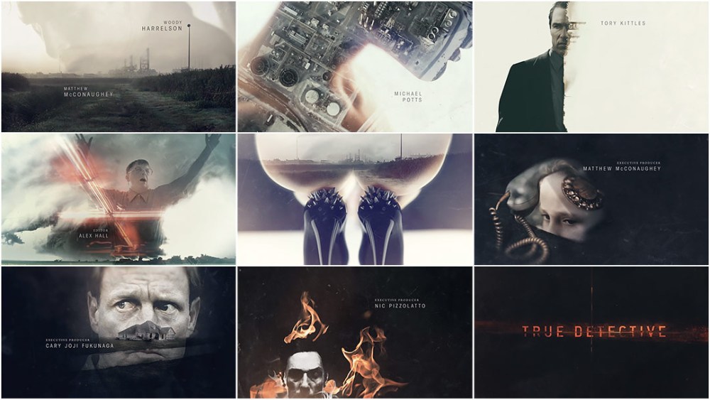
“What I was feeling after working for 14 years nonstop was that I started to get more and more away from the reason I got into design in the first place,” she says. Like most “people on the box”, as Ho calls them, she entered graphic design with a desire to make. She had a spark in her eye. Since 2013, when I encountered her work for the opening title sequence for what was then called Analogue/Digital, a design conference held in Brisbane, Australia, she has been piloting a rocketship of success. She has contributed to projects including the influential titles for True Detective (2014), the opening to lauded sci-fi series The Expanse (2015) with studio Breeder, and graphics for Patriot Act with Hasan Minhaj (2019). In 2021, Ho won an Emmy for her work on The 2020 Iowa Brown & Black Presidential Forum presented by Vice News. That same year, she joined global agency Buck as an associate creative director. Fast forward to 2025: she’s now a creative director with more than a decade of full-tilt grindstone behind her. She began to feel an itch. The spark was dwindling.
“I should be happy because this is what I wanted,” Ho says. But she missed hands-on design work. She began to wonder if she had chosen the wrong path. “I lost a joy,” she admits. It was an alarm bell she could not ignore. “I needed to hit reset on my work and have the mental space to dive into some of these feelings.” That hallowed word came to her, a whisper on the wind: sabbatical.
A weekend, a week, even a fortnight did not seem adequate lengths of time to understand the roots of these feelings. Early in 2025, she took several months away from her role as creative director at Buck. During this time, she collaborated with a friend to rebrand herself, dove into generative abstract art, and created an array of objects with her own joy in mind.
I reached her via Zoom to discuss her sabbatical, the personal work she made, and how she feels now, looking back at those experiences. Our chat is edited for length and clarity.
First, tell me how the sabbatical worked. How did you navigate it in terms of your role at Buck?
I asked about a year in advance, and I took three months off. For Buck, a sabbatical is open to anyone. You have to give a lot of heads-up that you want to do it, so that the company can plan. And then it’s case-by-case, depending on how much time you want to take off, when it lands in the year, and so on. It was unpaid, but I was guaranteed my job when I came back.
While you were on your sabbatical, you undertook a rebrand. People might assume, being a designer, you would do it yourself, but you worked with another designer. How did you decide to do this?
Yeah! The idea to rebrand and refresh my website happened before my sabbatical. It was always my goal, mainly because my old site and my old body of work didn’t quite represent who I was evolving into. Plus, I was just bored with the design. I have a close friend, Emily Sims, whom I met at Buck. Her expertise is in branding and beautiful photography. I wanted to work with someone I knew because I wanted that balance between someone who knows me—who I am as a person and as a creative—but who can also give me an outside perspective.
Part of this rebrand process was to include elements of your Chinese heritage. You’ve been embracing that part of yourself more recently. What inspired that?
I think it’s just me getting older. If I think about my upbringing in Australia, it was quite a Caucasian country to grow up in. As a kid, all I wanted to do was assimilate. As I get older and more mature, I realize that that’s a unique point of view. Not many people can say that they are both Chinese and Australian. It’s a really interesting cultural heritage that I should celebrate.
You commented on Instagram that Emily was the only person who could convince you to embrace color. Your new brand system uses a rich crimson. How did that come about?
[laughs] Yeah. Emily loves color. And me, before my rebrand, I was a black-and-white lover. Her perspective is: embrace color. She made a great case that this red color can help strengthen the connection to my Chinese heritage. I didn’t take much convincing. It’s more dynamic.
So now you have a stamp, a sticker, a clothing tag, prints… What are all of the new items you created?
When we did my rebrand, I also had this grand idea of opening a shop. That was a parallel project for me. So a lot of the elements came in service of physical things that ended up being packaging or something that made it feel more tangible. The stamp was a big part of that because it connected to my Chinese heritage, knowing that name stamps were such a key part in defining someone’s identity. I had this strong idea that I wanted to do my own, and a few years ago, when I went to Hong Kong, I actually got one of those stamps hand-carved. That became a big inspiration.
The one that we did for the brand is a more geometric style. It converts a lot of the very similar letterforms into digital versions. My Chinese name is pretty true to how the artisan wrote my name on the stamp. We just made it more geometric and fit it to a perfect square, so that it connects to some of my geometric work.
Along with that, I did a set of small prints. I did Exploration, my book. I did the See You Soon artwork and the incense holder. I had never created anything metal in my life, so step one was researching places where I could get parts made. There are actually a lot of online manufacturers that, if you send them schematics, they can make you parts. They’re marketed towards engineers and architects. It opened up the world of manufacturing to me. There are hard costs involved in making anything physical, but I found it really interesting to take on the challenge with a budget. How far can I stretch it? What restrictions are on the design and the functionality of this piece that I’m making? It’s a more interesting tightrope to walk than I’ve ever walked as a digital designer.
Left: See You Soon artwork; Right top: back corner with stamp and label; Right bottom: incense holder
I really enjoy the “final_final” hat. It’s the perfect designer’s joke.
That was an idea I always had in the back of my mind. Wouldn’t it be funny if someone made that? I realized I could be that person. I’ve never designed a piece of apparel before, and thought it would be an interesting challenge. Where would I get it manufactured? How much would it be?
The hats have this great tag – it’s two-sided, one side’s white, one side’s red. Why was it important to have it branded? I imagine that added considerable cost to each hat.
Yeah. It’s a woven tag that inverts. Honestly, it’s hard to give up my standards! I felt like all the things I sell should be branded so they feel bespoke and at home in my shop ecosystem.
final_final hat and tag
Tell me about making the artwork in your book, Exploration. The process is part mechanical, part analog, and then each product is one of a kind, right?
Yeah. I had bought the drawing robot a long time ago. It’s the AxiDraw. It has two arms, and you put drawing material on one of the axes. You can get it to hold whatever you want as long as that draws. It could be a paintbrush or any type of pen. Then it would plot whatever you feed into it, any vector-based artwork. On mine, the maximum is A3 size. Then, you tell it how fast to draw or how much pressure to use. It opens a lot of different results based on the parameters.
I felt really drawn to this experimentation. All of my personal work is very digital; it’s very clean, it’s line-based. I thought the drawing robot could be an interesting way to bring some of that into real life. When I finally had the months to do my own work, I dove in.
You used two colors, primarily black and red. Did you start with shapes in mind? How did you make the artwork?
I use Cavalry, the program. It’s actually an animation program. It was a tool that I picked up naturally and quickly because Cavalry is really good for creating systems. In After Effects, you have to write expressions and link up all these sliders and stuff manually. In Cavalry, that’s all very intuitive, and you don’t need to write a line of code to create complex design systems that are completely procedural-based. That clicked naturally with the way I like to design. I really enjoy building systems and then tweaking the hell out of them—experimenting with different parameters and seeing what happens.
I like the idea of opposition. So if the design has super-rigid lines, then maybe it should feel organic. I like that dynamism, and I like to play around with opposing themes. I like that tension.
On your Instagram grid, there’s one of your procedural flowers, and then right next to it, there’s a portrait of you at Naoshima, standing next to a Kusama pumpkin covered in dots. That juxtaposition really stood out to me.
When I look at things in real life, like that pumpkin, I always think, Can I make that procedurally? That’s my starting point. Whenever I feel inspired to make something new, I look to something that’s not design-related at all, and I ask, Can I – using the tools I’m really drawn to, and I use a lot – do my take on it? That becomes the impetus for either a technical problem I solve or a creative thing that I dive into. I like setting little challenges for myself.
That’s very much a designer’s point of view, isn’t it? I want freedom, but I need parameters.
Yes! That has helped quite a lot because I’ve had years when I didn’t do any personal work. A lot of that was just blank page syndrome. I didn’t know where to start. Now that I know how important personal work is, I have to set myself a brief to get started, a challenge that I start to solve. A lot of times, that evolves into something.
I’ve also been less precious about sharing stuff. I realized no one’s critiquing the work that I do for myself. That was a very important realization. I don’t need to look at my personal work through the same lens that I give to my client work. They’re different. They should be. They should be treated differently because they’re done for different reasons.
What has the sabbatical given you?
The realization that I love making things for myself. I’d never in my entire creative career had a long chunk of time where my whole goal was to not do any paid work. That was a rule I set for myself because doing paid work would counteract the point of a sabbatical. It was purely time to be creative for myself.
When you returned to work, what was that reintegration like?
People were very considerate. They didn’t put me on a fast-moving job straight away. They put me on something slow, which I appreciated. The hardest part was losing the mental space I had reclaimed and having that be filled with calendars, clients, and problem-solving for other people. Everyone has finite brain space, and I so enjoyed creating for myself that it was hard to give that up again. I really need that to be a person with joy in their life. Now that I am back to work, knowing that, it’s been easier to make time for it. I know it makes me happy.
Finally, I noticed you added a new title to your profiles. You now call yourself an abstract artist.
That’s a self-fulfilling prophecy kind of situation. I did five years of freelance, and no one gives you a title in freelance. You give your title to yourself. Sometimes, by calling yourself a certain thing, you embody it more. It will keep you motivated. Even though I don’t think I’ve reached my potential as an abstract artist, I feel like that’s a really easy first step of evolution. Sometimes, the easiest thing to do is just start calling yourself something and seeing how you can fulfill that.
Lola Landekic is a graphic designer working in film and TV. Alongside her design practice, she is a freelance writer and the editor-in-chief of the motion design website Art of the Title. She has taught graphic design, branding history, and cultural theory at the undergraduate level, lectured and moderated panels around the world, and curated exhibitions. She lives in Toronto.
All images courtesy of Joyce Ho.
The post It Shouldn’t Be Radical: How One Creative Director Took a Sabbatical appeared first on PRINT Magazine.