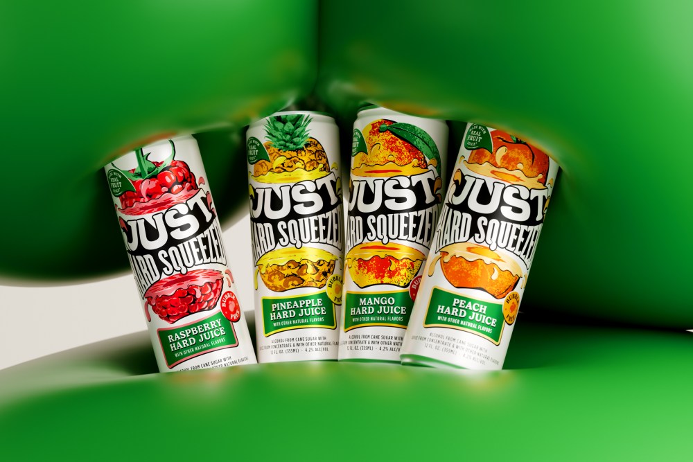
Just Hard Squeezed, the latest release from Boston Beer Company, brings a bold twist to the ready-to-drink (RTD) category with a non-carbonated hard juice made from real fruit. The visual identity, designed by Thirst, draws inspiration from Pop Art and editorial print ads from the ’50s and ’60s, bringing a juicy, attitude-filled aesthetic that drips with nostalgia without feeling retro. With bold typography, playful illustrations, and fruit practically falling off the can, the design is aimed at consumers looking to shake up their summer drink lineup with something fresh, fun, and a little unexpected.
Each design element reinforces a sense of fun and flavor, from the wordmark and illustrations to the typefaces (Gelica and Gotham) and the candid photography, setting Just Hard Squeezed apart in a crowded RTD space.
The brand centers around the ethos “Make Moments More Juicy,” which is reflected throughout the brand system. With cartoon-like droplets, colorful fruit graphics, and energetic styling, the design invites consumers to “squeeze the most out of life.”
The future of beverages is definitely leaning into nostalgia—and this design taps into it perfectly. From the bold typography to the playful photography, every element evokes that unmistakable “squeeze factor.” It brings back the vibrant, feel-good energy of the Millennial Fruitopia days (iykyk), while still feeling fresh and modern.
The post Just Hard Squeezed: Thirst’s Juicy Take on Ready-to-Drink appeared first on PRINT Magazine.

