A brand is not just about a company name and what it does. More importantly, it must establish a unique identity in its target market to earn customer trust. That’s why businesses strive to build a strong brand identity.
However, building a brand identity is a craft that requires considerable effort and patience. After all, identity is the result of the continuous projection of visuals with a strong purpose.
What is brand identity design?
Brand identity is all about how a business wants to project itself to its target audience. It determines how the audience or customers will perceive the brand.
Therefore, brand identity design encompasses a range of elements, such as logos, colors, typography, brand messaging, and packaging. The purpose of building a brand identity is to create a cohesive visual identity that conveys the purpose of the brand.
Why does brand identity matter?
Brand identity matters because your target audience sees it as the face of your business. To make the best impression on your potential customers, you would like to always present your best face. Therefore, people will judge your brand based on how it appears to them at a glance. That is the key reason that brand identity matters and why businesses polish it.
For example, if your logo and promotional material use bright colors, it gives your brand a playful identity. So, if your brand identity appears impressive, your audience will have trust in what you do and offer. The identity helps build credibility for a business.
Once you have carefully crafted your brand identity, it becomes a key factor in capturing your customers’ attention. It assures them that they are at the right place to buy things or get information.
Now that you understand what brand identity is, the next step is to identify the key elements that make it trustworthy. Here are the elements:
A memorable logo
To build your brand identity, ensure your logo is a memorable design. People should remember the logo for a long time. A logo’s memorability is a key element in building emotional appeal for the brand.
Know that the simplicity of a logo design does not necessarily make it memorable. A memorable logo is easily recognizable. Such a logo strongly associates with its brand and evokes positivity.
Color scheme
Colors are among the key elements responsible for building a trustworthy identity for a brand. This is because colors make a design an impressive visual that drives attention instantly. Colors evoke our emotions, which in turn convey a message of the brand to its target audience.
But the impact of a color on viewers will depend on how effective the color scheme is. So, choose a color scheme that reflects a brand’s emotions and personality. Consider a color scheme that helps convey a brand message by evoking the intended emotions.
For instance, most social media logos, such as Facebook, are in blue. This is because blue evokes calm, conveying that the social platforms are worthy of discussing issues in a relaxed and peaceful manner. Similarly, red symbolizes passion, which is why most fast food brands use it in their logos to attract young consumers.
Another consideration when choosing a color scheme is ensuring sufficient contrast with text, making marketing materials easily readable and comfortable for the eyes.
Typography
Typography can make or break a brand, depending on how effectively you use it to convey your brand message. Know that an out-of-place font will do more harm than good to your brand. This is due to your target audience not relating your choice of font to your brand personality.
Therefore, choose a font that is in line with your choice of colors and other elements. Also, pick fonts that are easily legible and recognizable. That will help your viewers to grasp the brand message and its personality at a glance.
Another tip is to use a mix of contrasting fonts, which creates a visually appealing effect to make the text readable and noticeable. So, use a mix of serif and sans-serif fonts.
Be aware that overly intricate fonts can make it difficult for people to read the text.
Also, when providing your brand guide, give the users guidelines regarding your font size and line length so that your marketing material adheres to your brand identity.
Shape
The shape of a logo and other marketing materials also plays a significant role. Therefore, strategically created shapes become an effective part of your overall branding strategy.
Talking about logos, know that they come in a variety of shapes. Logos can be circular, elliptical, and organically shaped, such as spirals. Sharp and angular shapes, such as square and triangular logos, are also popular for building brand identity. Then, vertical and horizontal lines also make logo shapes.
But the shape is not just about how your logo looks. Besides the logo, the shape of your website layout design, web page backgrounds, stationery, business cards, and packaging make up your brand identity.
Voice and tone
Voice and tone are the elements that determine how your brand sounds. Brand voice refers to the tone or style a company uses in its communication. It is about the overall character of a brand. So, a brand can be witty, friendly, serious, or authoritative.
Brand voice, therefore, is about establishing a consistent style of communication, regardless of the message. That means you can build strong recognition and customer loyalty if you apply your brand voice in your marketing materials.
When you give your brand voice an emotional expression, it becomes your brand tone. That is the way a brand can achieve its tone. But while expressing the voice, a brand can make slight changes in it for different audiences, channels, and situations.
That means a brand voice might be formal in legal documents, but the tone might become casual while promoting a brand on social media. The point is to ensure the brand tone aligns with the specific message of the target audience.
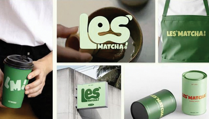
Visual language
Another key element of a brand identity design is its visual language. It is about taking a brand to its target audience. But people should be able to identify with those visuals. Such a visual language includes the use of graphics, iconography, photos, and design assets.
A visual language, when applied to build brand identity, is a set of design elements that look cohesive. All of those elements are consistent in their designs and help develop a brand personality. Such a language then conveys brand value and message effectively across all touchpoints.
With a consistent visual language, a brand can build brand recognition in its target market. It can also foster trust and ascertain customer loyalty.
Take, for example, multiple Google icons that are visual representations of specific services such as Gmail, Drive, Docs, Calendar, Meet, and many more. They are all created in the same visual language. All of them are flat designs and have geometric shapes. They have standard background colors, and the icon padding is per their shapes.
These are the core elements that contribute to building a trustworthy brand identity. Treat each with a clear focus on conveying your brand’s purpose. That is the way to incorporate the elements to drive customers’ attention and send them the right signals.
If you are unsure about building your brand identity for a small business, consider using a brand kit generator from Designhill. This kit allows you to create a brand identity in just a few steps: upload your logo, import your brand colors and fonts, and apply them across templates. As a final step, select a brand kit template to create multiple marketing materials that align with your brand identity.
Wrapping Up
Brand identity design is how you want your target audience to perceive your brand. It involves designing your logo, business card, packaging, and other promotional materials. Logo, color scheme, typography, shape, voice and tone, and overall visual language are the key elements of a brand identity design.