Some of the best travel memories I’ve made weren’t found in guidebooks; they were in hidden gems in alleyways, adventures off the beaten path, and hole-in-the-wall eateries all found through a stranger’s review. That’s the kind of travel Tripadvisor now evokes. The updated brand isn’t trying to sell me a dream; it’s showing me the trip I might actually take — the one I’ll laugh about later, with all its beautiful imperfections.
In an era dominated by polished filters and algorithm-driven recommendations, Tripadvisor’s latest brand refresh offers something refreshingly honest: a celebration of real stories from real travelers. Unveiled this month and developed by global creative studio Koto, the new brand marks a pivotal moment in Tripadvisor’s evolution from a trusted review site to a full-service platform for planning, booking, and sharing journeys.
For 25 years, Tripadvisor has thrived by championing unfiltered experiences shared by its global community. Now, with expanded offerings like AI-powered trip planning and direct booking tools, the brand needed to grow up without losing its soul. The solution wasn’t to push further into the digital void; it was a visual update that leans into humanity by reaffirming its values.
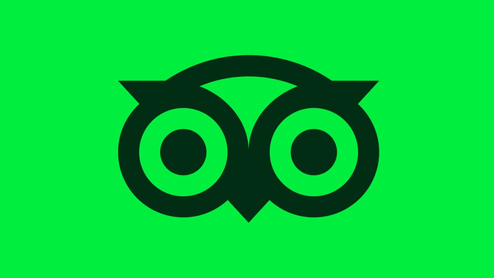
At the core of the new identity is a familiar figure with a fresh gaze. Ollie, the iconic owl mascot, has been reimagined as an active participant, watchful, expressive, and oriented toward traveler content. His subtle animations and attentive posture signal a brand that’s listening, absorbing, and responding to its community. He’s less of a mascot now and more of a quiet guide.
Koto’s design approach reflects intentionality by focusing on texture, emotion, and narrative. The refined color palette anchors the identity in warmth and trust. Tripadvisor Green remains, but it’s been made more vibrant. Trip Pine, a deep, earthy tone, replaces black to convey a sense of reassurance. The secondary colors are pulled from actual user-submitted photos, creating a visual language that feels grounded and lived-in.
Typography follows suit. The custom Trip Sans typeface — an homage to the brand’s signature bubble rating system — brings a soft, circular geometry that balances product clarity with personality. It’s a typeface designed to flex: equally at home on a mobile interface or a global campaign.
But perhaps the most compelling aspect of this identity lies in its structure. Koto introduced graphic devices such as review bubbles, green dots, and dividers inspired by vintage postcards, with each one a subtle nod to community voices and collective memory. These details organize content while keeping the brand emotionally accessible. Even the motion design reinforces this philosophy: UI elements move with care, Ollie’s gaze follows content, and transitions remain smooth and human.
The message is simple: this is what the world really looks like, through the eyes of people who were actually there.
Photography was treated not as decoration, but as the emotional spine of the brand. Every image is sourced from actual users, unfiltered and narrative-first. Koto developed tonal presets to unify the visual system without erasing the authenticity of each shot. The message is simple: this is what the world really looks like, through the eyes of people who were actually there.
This brand update is remarkable not because it reinvents Tripadvisor, but because it reflects it. Koto resisted the impulse to overwrite the brand’s legacy. Instead, they built a system designed to support, elevate, and make space for the community that defines it. In doing so, they’ve created something quietly revolutionary, a digital brand that doesn’t try to outshine its users, but rather lets them lead.
There’s a lesson here for anyone in design, branding, or storytelling. In a landscape obsessed with novelty, sometimes the most powerful thing a brand can do is listen. Tripadvisor’s new identity isn’t loud. It’s not trying to be cool. But it is confident. It knows that the most trusted recommendations don’t come from influencers or algorithms; they come from people who’ve actually been there.
The post Koto’s New Brand Identity for Tripadvisor is Built by Travelers, for Travelers appeared first on PRINT Magazine.