Many cultural institutions have rolled out new brand identities in the past few years, often identities that have decades, even centuries of history in the public sphere. The Joslyn, the New York Botanical Garden, St. John the Divine, the Brooklyn Museum of Art, and the list keeps growing. Where these institutions’ original identities were born out of a functional need to establish cultural authority and trust, this newest crop is about expanding the cultural mission, inviting a broader audience, and co-creating culture through dialogue, engagement, and interactivity.
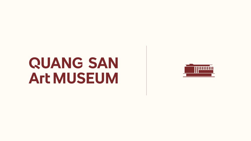
Newer institutions, such as Chicago’s Intuit Museum (opened in 1991), have the same need to communicate openness and cultural exchange, and with fewer legacy constraints to consider. One such example is Vietnam’s Quang San Art Museum (QSAM). Until 2023, when it opened to the public in Ho Chi Minh, the 1,600-object (and growing) collection of Vietnamese art from the Indochine period to the present was privately held. As a public-facing institution, the collection’s mission shifted to a place of access and cultural dialogue. Recently, the museum partnered with local design studio, M—N Associates, to develop a new identity fit for this purpose.
M—N’s studio team, led by Duy—N as creative director, developed a comprehensive brand identity for QSAM that spanned strategy, signage, editorial, and digital experience. QSAM’s new brand system also includes a custom sans-serif typeface inspired by the museum’s unique architectural facade.
Our concept, ‘Layers of Contemplation,’ draws inspiration from the structure of a painting itself — where canvas, frame, and gesture form a unified whole.
Duy—N, creative director
The typeface, designed by Bảo Trương and Duy—N, is solid, yet modular and rhythmic. For both the wordmark and the larger brand system, this combination evokes the timelessness of the subject matter, but also the ever-evolving nature of the curated space. Strong verticals (reminiscent of the building’s columns), curved terminals, and angular cuts give the typeface its distinctive presence.
Those angular cuts symbolize the corner of a painting and present a layered effect to invite the viewer in. The “missing square” shows up in the wordmark, standing in for the A, which functions as a window into the collection, a rotating showcase of sculpture, textiles, paintings, and more. Left blank, it acts as a mirror: imagine yourself here.
The typeface’s application is also purposeful, with a subtle hanging indent imbuing movement even in static uses. You can see the intentional nature of the typeface throughout the brand as expressed in its many forms.
Across the typography and the broader brand system, the design team played with the theme, “Layers of Contemplation.” Photography, the cornerstone of communicating the breadth and beauty of any archive, takes this idea to the micro. Painting details, surface texture, and brush strokes convey the “quiet worlds” within the work of art. Layered rectangles are also an ever-present visual motif on the new website, moving, adapting, and immersing the visitor in a curated experience.
Reflecting on the work, the M—N Associates team believes that the QSAM project marks a significant cultural milestone in Vietnam, reflecting a growing movement in which branding is now a partner to heritage preservation. Duy—N said, “We believe this project offers a meaningful perspective on how design can elevate cultural institutions in Southeast Asia — respectfully modern, deeply contextual, and future-facing.”
The post Layers of Custom Type and Meaning in a New Brand for Quang San Art Museum appeared first on PRINT Magazine.