The iPad got its own native calculator app in 2024, just 40 years after Apple rolled out its first-ever GUI (graphical user interface) calculator for the Macintosh in 1984. The original was designed by Chris Espinosa, and was a favorite of Steve Jobs’ up until it was refreshed with the MacOS X in 2001. However, most of us are familiar with the original black and orange calculator UI that debuted as early as 2007.
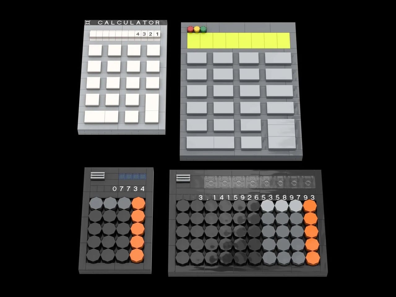
The thing is, Apple’s calculator designs are a pretty great way to see the company’s design journey. Things went from strictly functional to visually contemporary to goddamn gorgeous (without ever compromising usability of course), and this LEGO set captures that journey perfectly. Put together with just 821 pieces, this fan-made build shows Apple’s transition through 4 stages – going all the way from the b/w 1984 calculator to the modern scientific calculator.
Designer: The Art Of Knowledge
The first calculator design was put together by Espinosa at the young age of 22 while under the leadership of Jobs. Famously a pedantic, Jobs ripped apart almost every design that Espinosa shared with him. After multiple iterations, Espinosa went to him with what we now look at as the final design. It was accepted, but not without a strong dose of criticism from Jobs, who said “Well, it’s a start but basically, it stinks. The background color is too dark, some lines are the wrong thickness, and the buttons are too big.”
The calculator was finally tweaked on the UI and semantics front by Andy Hertzfeld and Donn Derman, who retained this Jobs-approved graphical version. This remained a standard on Macs all the way up until the end of OS 9. The following OS X, again led by Jobs’ vision to break past old and usher in the new, saw a more skeuomorphic approach.
In 2001, Apple transitioned away from its classic Mac OS 9 calculator, known for its simple, functional design (influenced by Steve Jobs and Dieter Rams’ Braun aesthetic), to the new Mac OS X, featuring a refreshed look that emphasized minimalism, better integration, and user-friendly details like larger zero buttons, reflecting Jobs’ philosophy of simplicity and intuitive interaction.
The final calculator design we see today wasn’t always like this. Apple loyalists will remember a phase in 2007 when the iPhone did have a calculator app with the familiar black and orange colorway, but with rectangular buttons instead of orange ones. The circles only made their way into the UI as late as 2024, although design-nerds will remember the Braun ET55 calculator which heavily inspired Apple’s design efforts. Braun’s entire design philosophy, crafted by legend Dieter Rams himself, helped craft Apple’s approach to industrial (and even interface) design. Shown below are two versions of the same iOS18 calculator design – in basic as well as scientific formats.
“This model utilizes interlocking plates, tiles, and inverted tiles for a smooth, tactile finish. It is designed as a modular desk display, perfect for students, engineers, and tech historians alike. With roughly 821 pieces, it offers a rewarding build experience that fits perfectly alongside other LEGO office or technology sets. Attention is paid to the scale of the model to match as closely as possible to the apps,” says designer The Art Of Knowledge, who put this MOC together for LEGO lovers on the LEGO Ideas forum. It currently exists as just a fan-made concept, although you can vote the build into reality by heading down to the LEGO Ideas website and casting your vote for the design. It’s free!
The post LEGO Pays Tribute To The 40+ Year Journey Of Apple Calculator Designs first appeared on Yanko Design.