What is more familiar than the shapes making up our alphabet? We learn to decipher these early in life, swapping in symbols for the sounds of spoken language and recognizing words as carriers of thought and meaning. A recent frontier in typeface development pushes into exciting new territory: what if we viewed the alphabet as a container for countless graphic design systems, conceptual ideas, and endless play?
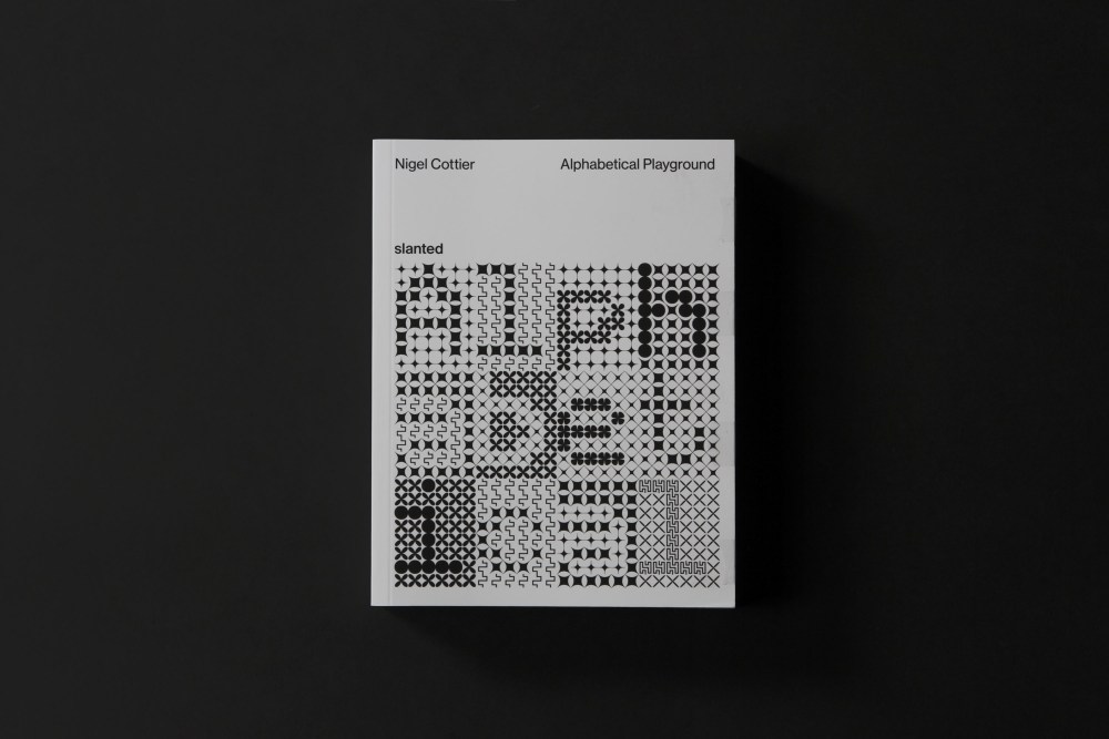
Alphabetical Playground (Slanted Publishers, September 2025), written by graphic designer Nigel Cottier with a foreword by Hamish Muir, does just that. Cottier, formerly of London design firm Accept&Proceed, joined Pentagram as a design director in December 2025. His book explores the richness of letterforms divorced from meaning, leading them to cross over into the lands where they represent only pattern, texture, movement, and shape. The 698-page volume, a follow-up to Cottier’s first book, Letterform Variations (Slanted Publishers, November 2021), is printed in stark black and white on matte paper.
The book collects a range of investigative type ideas into a structure categorized from A to Z, with notes explaining how each character set was created and describing its design methodology. Each chapter takes a design premise and blows it up in spectacular fashion, applying a few of the usual parameters of type design (Cursive, Matrix, and Ultra) and far more unusual ones as well (Recontextualised, Letters-within-Letters, and Phonetic). The designer uses the NATO phonetic alphabet—Alpha, Bravo, Charlie, and so on—in captions to help readers puzzle out pages composed of more abstract letters.
I’ve always kept a magic folder of ideas saved for another day, and this particular source provided the different categories of experimentation for Alphabetical Playground.
Nigel Cottier
The work illuminates the creative virtues of iterative experimentation paired with the practical, results-oriented value of play for designers. Cottier’s approach is both additive and reductive to the point of system collapse, and the vital relationship of positive and negative space in typeface design plays a key part in shifting the perception of familiar letters into something entirely new.
The designer’s process was far from random. Nevertheless, his methodically generated letterforms venture into the unknown, bending customary rules of type to see where it might lead. For example, in the Shifting Pattern section, he generates letterforms through disruption, distortion, and irregularity. A core structural element is split, shifted, mirrored, fragmented, or partially eliminated to reveal the underlying character structure. Legibility requires a reader to figure out the pattern disruption or achieve an understanding of the overall system.
Throughout the book, combinations of simple geometric dots, lines, and forms, alongside more organic shapes, create multiple varieties of visual movement: wandering, dancing, meandering, pulsing, vibrating. A viewer’s brain, searching for the recognizable in the patterns and shapes, finds echoes of the Snellen Eye Chart, isometric furniture drawings, the 1960s Op Art of Bridget Riley, complex mazes, brick walls, semaphore flags, needlepoint samplers, textiles, and more. The letterforms in the F/Frameworks section are more reminiscent of Braille or Morse code than standard letter shapes. The chapter’s end note explains succinctly, “Systems that encode linguistic information without being shackled to conventional legibility, this section presents three alternative writing systems in which encryption functions as the driving logic.”
Most sections deploy Latin-based characters as the starting point for experimentation. However, the Recontextualised section presents three alphabets that draw freely from a range of world and historic scripts, including Arabic, Armenian, Burmese, Chinese, Coptic, Ethiopic, Greek, Hebrew, Hiragana, Javanese, Katakana, Malayalam, Runic, Tamil, Thai and Tibetan. Every character, symbol, and sign reappropriates an original source glyph, offering a new perspective on familiar writing systems and examining how changing the cultural context of letterforms can reshape their relationships and meanings.
Cottier’s interest in creating alphabets using geometric units began in childhood, doodling letters in the back of notebooks using a square grid as his starting point. He says, “I’ve always kept a magic folder of ideas saved for another day, and this particular source provided the different categories of experimentation for Alphabetical Playground. I started with letterforms as skeletons, and kept the design in black and white to reveal the essentials of form.”
Artists across genres have always experimented with technology and repurposing older tech or using unexpected everyday objects as tools in their work. In the 2008 documentary It Might Get Loud, musician Jack White builds an electric guitar out of wood, a few nails, a Coke bottle, a single string, and a pickup. (He plays it, too!) In the same spirit, Cottier is interested in type drawn with the wrong tools just to see what might happen, such as digital lettering hand-drawn with custom software, and a Sony videogame controller for the restaurant Funky Mr. Salvador created by Frankfurt-based design studio Schultzschultz.
Cottier’s experimental letters have a broad conceptual connection to asemic writing (wordless, unreadable scripts resembling text but lacking a specific semantic meaning). Based on automatic writing and calligraphy, asemic writing tends to be more handwritten and freeform in appearance, expressing the feeling behind the act of writing, and is open to individual interpretation. However, Cottier generated the characters found in Alphabetical Playground through a meticulous, systemic process using Glyphs, the same digital software used to create commercially available alphabets.
Designers Paul McNeil and Hamish Muir provided a great deal of support for Alphabetical Playground, writing its foreword and offering critique and feedback during development. Their book System Process Form: Type as Algorithm (Thames & Hudson, 2024) mathematically interpolates MuirMcNeil’s Two Type System (a core database of 23 type systems and 198 individual fonts) to generate millions of hybrid letterforms reproduced both in black and white and brilliant, overlapping spot colors. “Letters are both messengers and messages. They aren’t just empty vehicles for language — in wrapping it in solid form, they take on powers and values of their own. Every stroke and every sign is a vessel for human thought, emotion and intention,” McNeil says, continuing, “As John Berger said, ‘Seeing comes before words. The child looks and recognizes before it can speak. But there is also another sense in which seeing comes before words. It is seeing which establishes our place in the surrounding world; we explain that world with words, but words can never undo the fact that we are surrounded by it. The relation between what we see and what we know is never settled. Each evening we see the sun set. We know that the Earth is turning away from it. Yet the knowledge, the explanation, never quite fits the sight.’”
Cottier is not done exploring yet. He says his next evolution of letterforms may include one color plus black in the book design; as he works within design parameters that are not strictly algorithmic and introduce variables of their own (using just horizontal or vertical blocks within a grid to generate letters, for example), the end result will benefit from a more gradual approach to adding color into the mix.
In the introduction, he writes, “Although it may not always be immediately apparent — everything on these pages is language. This work demonstrates how text allows us to embed our thoughts, beliefs and systems within it: a code within a code, a game within a game, a system within a system. It serves as a reminder of the alphabet’s enormous potential to transcend its fundamental purpose as a tool for communication and instead become a limitless space for creative expression.”
All photography © Nigel Cottier
The post Letterforms Are Containers for Ideas in ‘Alphabetical Playground’ appeared first on PRINT Magazine.