The Northern Block has spent the last 18 months updating its popular Lintel typeface (2012). The evolution of Lintel is part of the indie UK foundry’s broader ‘Next’ project, which aims to reimagine some of the foundry’s core typefaces, including Nuber, Loew, and Nurom.
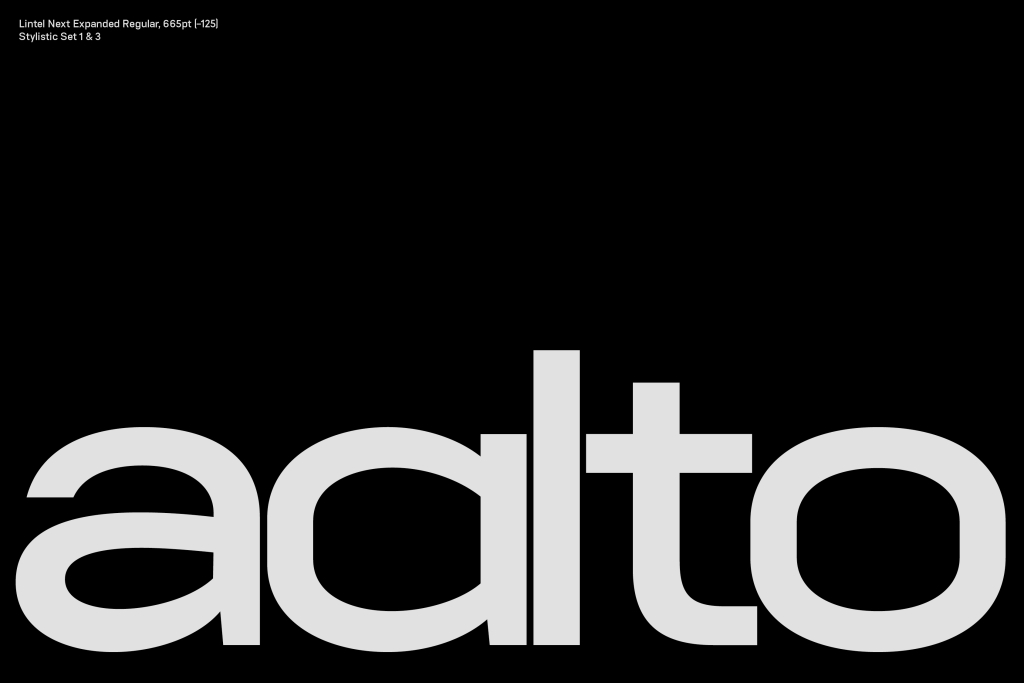
While the original Lintel’s clean lines found notoriety in the video game Mafia III, Lintel Next gets its unique character from the style of Finnish designer and architect Alvar Aalto. Known for his multidisciplinary practice, embracing both Nordic classicism and modernism, Aalto’s buildings are functionally geometric, organic, and human-centric.
Think of Lintel Next as its namesake’s curvier, free-flowing cousin. The redux offers the precision you’d expect from a geometric sans-serif typeface; however, Tasos Varipatis, who led the TNB team, brought his hand-drawn approach to reconsider every character.
At the heavier weights, Lintel Next leads with bold structure. We’re partial to the oversized typographical symbols and punctuation marks. The distinct pill-shaped curves and refined, hand-drawn origins reveal themselves in the thinner weights. Lintel Next’s geometric clarity and organic forms make it highly legible and friendly for projects spanning editorial to UI.
The Northern Block team developed six new widths, reworked the Cyrillic script, and added Vietnamese language support. The Lintel Next superfamily has an impressive 96 distinct styles and offers an extensive array of OpenType features.
The Northern Block has been featured in the Type Tuesday column for Hubsch, inspired by childhood scribblings with a chisel tip marker and, more recently, Scriber, a modern take on stencil graffiti.
The post Lintel Next is an Evolution of the Original, With Finnish Architect Alvar Aalto as Muse appeared first on PRINT Magazine.

