When we find ourselves in a new place, especially in urban environments, we seek out signage to help us orient and find our way. A city’s signage also helps us get a sense of the particular aesthetics of that place. When designer Federico Parra Barrios relocated from Bogotá to Berlin in early 2024, he became particularly enamored with the embossed metal plaques that are ever-present in Berlin’s public spaces.
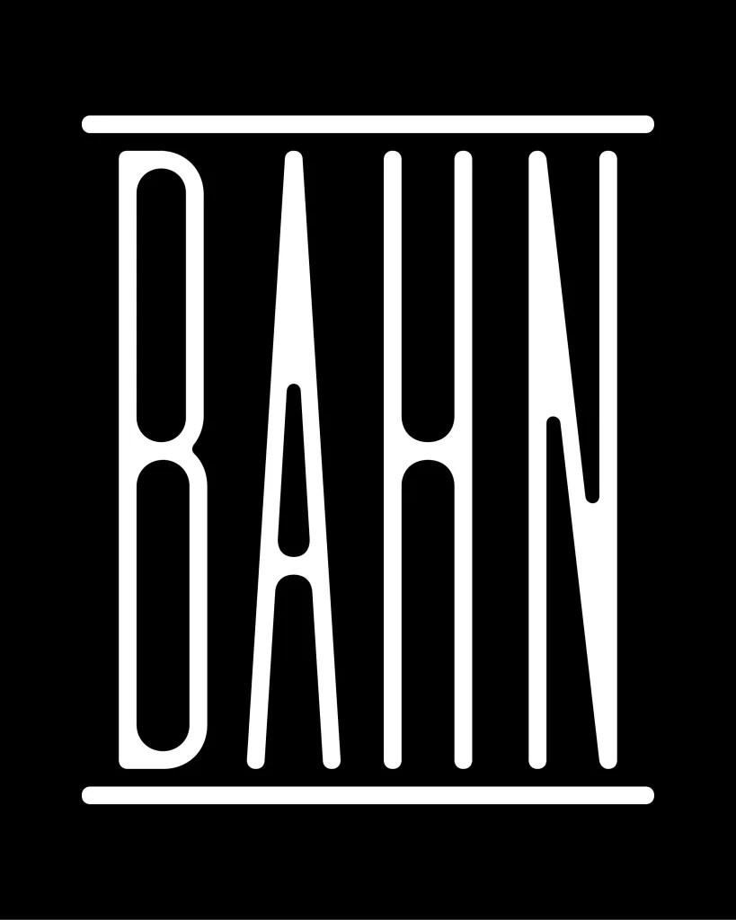
Distortion was the inspiration and starting point for Barrios’ research, both in the embossing (which contorts both the underlying material and the applied forms) and the use of horizontal space (the compression of extra-long words). So, he began exploring what happens when you force a standard-width typeface into a highly condensed version.
Out of this experimentation comes Lost, a variable-width font, from the Normal style (standard width), to the Compressed style (super condensed). Amidst the narrowing, you can see the forms evolve: stems become thinner, while some connection points get thicker and rounder. Barrios also created a system of frames (round, straight, or pointed terminals, accessed in Stylistic Sets) that create a vintage cartouche effect around words.
Learn more and try Lost. View more of Barrios’ work on Instagram.
The post Lost is a Typeface Inspired by Wayfinding in Berlin appeared first on PRINT Magazine.