As we hurdle into the thick of the Winter Olympics in Italy, we’re digging deeper into the design of the Games and their coverage. All of us sitting at home watching in the States are mostly doing so through NBC, meaning we’re experiencing the games very much through the lens of their production. NBC’s branding of these Olympics is inextricably linked to how we’re engaging with them as viewers, whether we’re conscious of it or not.
We recently chatted with one of the designers behind the brand system created for NBC’s coverage of Milan Cortina 2026, Mitch Monson. As the Executive Director of Creative and Partnerships at the creative studio Sibling Rivalry, Monson has been a part of designing NBC’s Olympic logos for the past decade (including Paris 2024, Tokyo 2020, Pyeong Chang 2018, and Rio 2016). Below, he elaborates on the specifics of creating a brand system for NBC’s coverage of the Olympics, and provides insight into what he and his team created for these Games in particular.
What are the most important considerations you have to make when designing for an event of this magnitude?
Scale is the first thing you have to internalize when you’re designing for the Olympics. This work will be seen by hundreds of millions of people, across cultures, platforms, and contexts. It has to perform just as well on a phone screen at two in the morning as it does wrapping a broadcast studio set or animating across a primetime open.
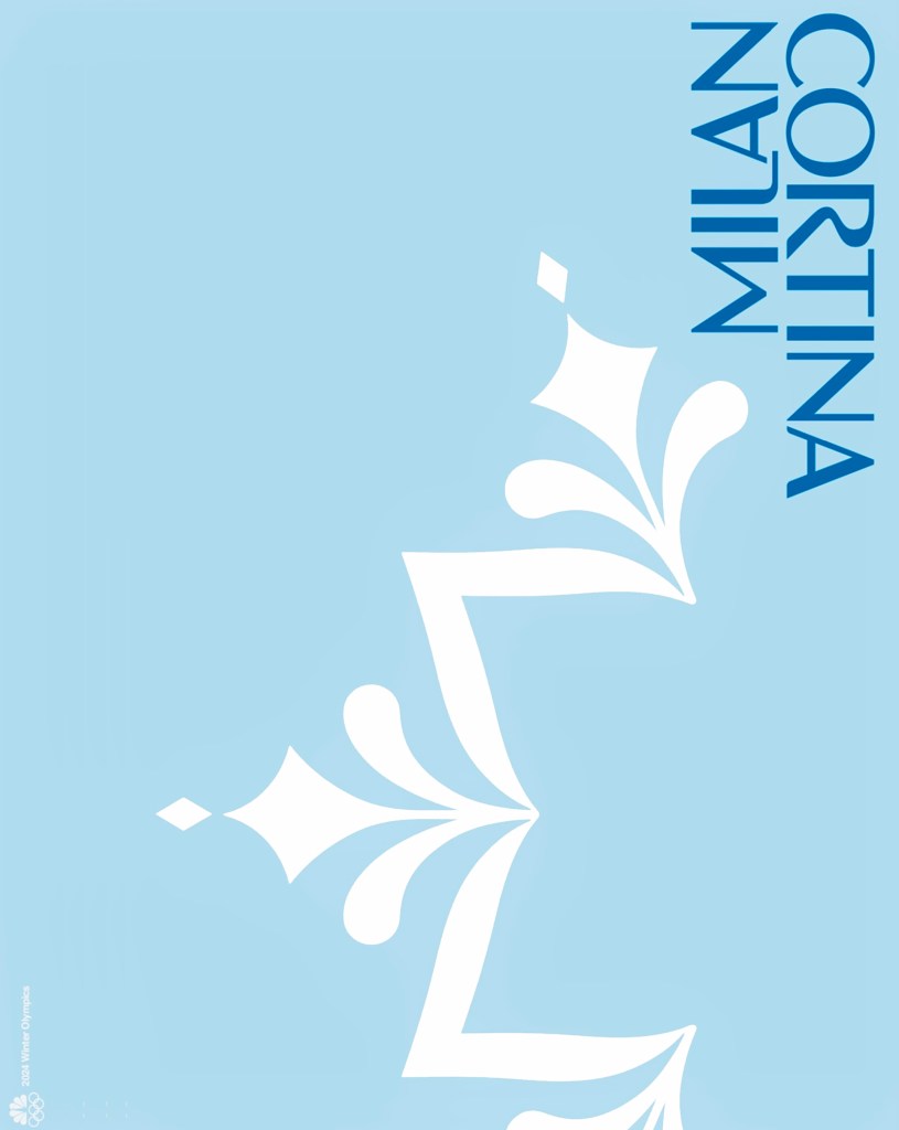
Clarity is paramount at that scale. But clarity alone isn’t enough. A strong emotional connection has to be created. The Olympics are profoundly human and historic at the same time. That’s where the snowflake became such a meaningful idea for us. Every snowflake is built on a clear structure, yet no two are exactly alike. That balance between order and individuality felt deeply aligned with the games.
The identity needs to immediately connect to the host city and, more importantly, to a real or imagined experience the audience has had there. You’re designing for athletes’ life‑defining moments, but also for the audience’s emotional memory of the Games. The challenge is balancing rigor and restraint with poetry— creating a system that’s flexible and durable, but still capable of wonder.
What are the biggest challenges you’ve faced when designing NBC’s Olympic logos over the past decade? What are you proudest of?
Continuity is one of the biggest challenges. Each Games needs its own voice, rooted in place and time, but NBC’s coverage needs to feel unmistakably NBC Olympics. Having designed for multiple games for over a decade, we’re not just designing logos— we’re building a visual language that has to evolve without losing its DNA.
That evolution is what we are proudest of. We’ve created identities that feel specific to their host cities but still belong to a coherent family. In a way, that mirrors the snowflake idea again; a consistent underlying structure that allows for endless variation.
There’s a lot of invisible work in making that happen—typography systems, motion rules, proportions—that viewers may not consciously notice, but they feel it. When the brand disappears and the storytelling takes over, that’s success.
When it comes to what you designed for Milan Cortina 2026, how did your personal background influence the logo you created?
One of my personal passions is backcountry snowboarding. So that passion, fueled by my love for winter, the mountains and extreme adventure, are all important threads for me in this particular design process for the Milan Cortina 2026 Olympic Winter Games.
Throughout my career, I’ve always been drawn to structure— the idea that emotion can live inside the discipline of systems and grids. Milan Cortina really rewarded that mindset because of the inherent tension there; Milan as a global fashion and design capital, and Cortina as a dramatic, almost mythic alpine environment.
The duality of these two locations felt very natural to our team at Sibling Rivalry. The experience from our past five Olympic identity collaborations with NBC Sports, starting in 2016 with the Rio 2016 Olympic Games, pushed us to look for a solution that wasn’t decorative, but architectural— something that felt designed rather than styled. The snowflake emerged as a way to hold that balance. It’s precise and geometric, but also organic and expressive. The logo became about balance; refinement and strength, elegance and performance.
Screenshot
How did Milan’s art, graphic design, and architecture inspire the identity? What sort of research went into doing this correctly and thoughtfully?
Milan has an extraordinary design legacy, from modernist masters to contemporary fashion and industrial design. It doesn’t shout. It’s understated, intentional, and immaculately crafted. We studied Italian modernist typography, wayfinding systems, architectural details, fashion graphics, and how restraint operates culturally as a form of confidence. The goal wasn’t to quote any one reference, but to absorb a mindset.
The snowflake isn’t a literal reference to any single source— it’s a synthesis of those values: structure, precision, craft, and confidence. Good research isn’t about pastiche. It’s about understanding why things look the way they do, and translating that understanding into something new and human.
How do you create a brand for channel coverage that’s distinct, yet still feels cohesive with the spirit of the Olympic Games’ branding?
I think of NBC’s Olympic identity as a lens. The Olympic brand is universal and ceremonial. NBC Sports’ role is to bring it closer— to make it human, emotional, and immediate. The snowflake system works well in that context because it’s inherently flexible. It can scale, animate, fragment, and reassemble across platforms while always remaining recognizable. That flexibility allows NBC’s voice—its pacing, tone, and storytelling—to live inside the system without overpowering the Games. When it works, you don’t feel the seams between “Olympic” and “NBC.” It feels like the Games unfolding naturally on screen.
What aspect of what you created for Milan Cortina 2026 are you proudest of?
The restraint. Milan Cortina didn’t need excess— it needed confidence. We trusted the idea, trusted the system, and trusted that clarity could carry the emotion.
If the Milan Cortina identity feels timeless, grounded in place, and capable of supporting thousands of moments—each one unique, like a snowflake—without ever becoming the moment itself, that’s the win. The best compliment is when the work feels inevitable, like it could only have come from Milan Cortina, and nowhere else.
The post NBC’s Milan Cortina 2026 Branding Taps into the Complexity and Uniqueness of Snowflakes appeared first on PRINT Magazine.