Twenty years after launching the Planet Ocean, OMEGA just made the boldest design move in luxury dive watches: bringing back orange ceramic at full production scale. Not as a limited edition. Not as a boutique exclusive. As a core offering that positions this collection directly alongside Rolex’s Submariner in the everyday luxury category.
Designer: OMEGA
This is the design story of how OMEGA spent years perfecting a single color, reworked an entire case architecture, and created three distinct visual personalities that finally give the Planet Ocean the design refinement it always deserved.
The Orange Ceramic Challenge
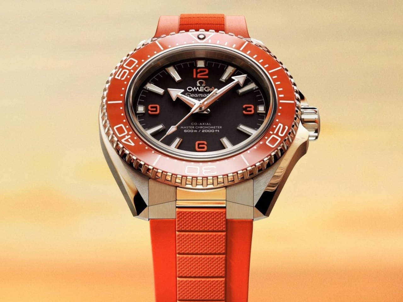
Let’s address the headline design achievement first. OMEGA’s new orange ceramic bezel represents years of Swiss atelier development to perfect a hue that most brands avoid entirely. The reason? Orange ceramic is notoriously difficult to execute without looking like cheap plastic film.
The chemistry of ceramic materials resists certain wavelengths. Getting that specific orange tone, the one that references the 1957 Seamaster 300 heritage pieces, requires precise control over sintering temperatures and material composition. OMEGA clearly cracked the formula. The result hits like a flare on the wrist: bold, bright, and unmistakably intentional.
The orange accents aren’t arbitrary nostalgia. The 1957 Seamaster 300 pieces carried orange through the hands, indices, and bezel. Those cues resurfaced in the very first Planet Ocean models in 2005, giving the watch its early cult status. Twenty years later, OMEGA had the confidence to bring that color back at impressive scale.
This represents thoughtful heritage integration. Rather than creating a vintage reissue or limited anniversary piece, OMEGA wove that 1957 DNA into a thoroughly modern design. The matte dial finish, the arrowhead hands, the white enamel bezel scales: these are pure Planet Ocean signatures, simply executed with contemporary precision.
What makes this move significant isn’t just the technical achievement. It’s the scale. Bringing this level of material complexity to a core production model, not a limited run, signals confidence in the design direction. OMEGA is betting that luxury watch buyers want personality and heritage, not just another black bezel diver.
Three Personalities, One Refined Architecture
The collection splits into three distinct visual identities, each serving different aesthetic preferences while sharing the same dramatically reworked case.
The black variant is the purist’s pick. Matte black dial, rhodium-plated numerals, white enamel bezel scale. This feels closest to the original professional dive watch brief, the option for someone who thinks color belongs in galleries rather than on expensive timepieces. It’s the no-nonsense tool watch executed with Swiss precision.
The blue edition becomes the everyday option, what I’d call The Bond Watch. That ceramic bezel catches light differently than the matte black version, creating visual interest that works equally well at Bondi brunch or a business dinner. Paired with the steel bracelet, it has that elevated everyday look. Swap to the blue rubber strap, and it transforms into something more pragmatic yet still effortlessly appealing.
Then there’s the orange variant, designed for people who want their Planet Ocean to make a statement while keeping it classy. This is where that years-long ceramic development pays off aesthetically. The bezel doesn’t just add color; it fundamentally changes the watch’s visual weight and presence. Doxa pioneered orange bezels in the 20th century for pure underwater legibility. OMEGA’s move here is for aesthetics, and it’s paid off completely.
The Case Evolution
Beneath those three color personalities sits a more subtle but equally important design refinement: the case architecture itself.
The new Planet Ocean case is sharper and more angular than the outgoing generation. You can see it in the lug transitions and the crown guard geometry. But here’s where OMEGA’s design team showed restraint: they made the watch sit flatter on the wrist by reworking the sapphire crystal profile.
That’s a crucial detail. Dive watches often suffer from excessive height, creating awkward wrist presence and limited shirt-cuff clearance. By addressing the crystal geometry, OMEGA created the most refined Planet Ocean silhouette to date. The 42mm diameter stays manageable, but the flatter profile changes how the watch wears entirely.
The Grade 5 titanium caseback contributes to this refinement. Titanium is NASA’s preferred material for a reason: exceptional strength-to-weight ratio and resistance to environmental extremes. For a watch rated to 600 meters, that caseback choice represents functional design thinking, not just material showcase.
Why This Design Matters
Glen Powell wearing the orange variant and Aaron Taylor-Johnson stepping into the blue and black references signals OMEGA’s positioning strategy. These aren’t just ambassador choices; they’re design communication. Powell can sell a high-visibility ceramic bezel with charm. Taylor-Johnson, as a 007 frontrunner, anchors the collection with leading-man polish.
The message? This Planet Ocean generation positions directly against Rolex’s Submariner in design sophistication, material innovation, and everyday luxury appeal. Not through imitation, but through distinct visual personality. Where the Submariner trades on timeless restraint, the Planet Ocean offers choice. Three distinct design directions, bold material decisions, and heritage integration that feels earned rather than borrowed.
For a brand of OMEGA’s scale to bring back orange ceramic as a core offering, not a boutique exclusive or limited run, reveals where luxury dive watch design is heading. Buyers want options beyond black and blue. They want material innovation that’s visible and meaningful. They want heritage that informs design rather than constraining it.
This Planet Ocean looks tougher. It wears better. It feels more resolved. The sharper case, the flatter profile, the perfected orange ceramic: these represent two decades of learning what worked and what needed refinement.
OMEGA didn’t just update the Planet Ocean. They gave it three distinct personalities, perfected a notoriously difficult material, and created the design refinement this collection always deserved. Twenty years after launch, this is the Planet Ocean that challenges Rolex’s design dominance with confidence and craft.
The post OMEGA’s Ceramic Gambit: How the Seamaster Planet Ocean Challenges Rolex’s Design Dominance first appeared on Yanko Design.