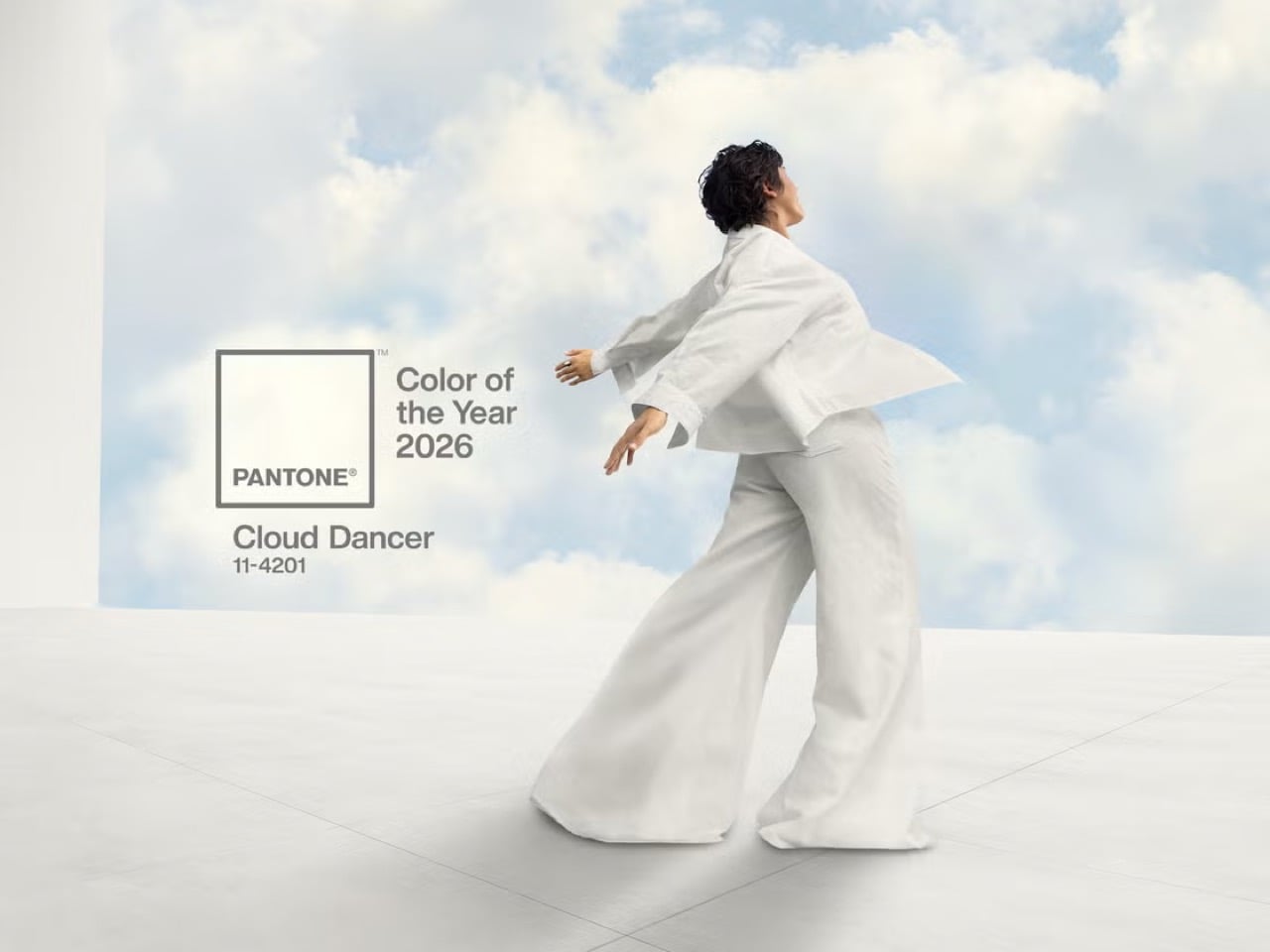
Pantone has officially called it: the prevailing mood for 2026 is exhaustion. This marks a sharp departure from recent years, when the annual announcement felt like a conversation happening in a different room. The world was navigating a pandemic hangover and digital burnout, while Pantone was prescribing electric purples for creativity and defiant magentas for bravery. Each choice, while commercially friendly, felt like a wellness influencer telling a tired person to simply manifest more energy.
This year, however, their choice of Cloud Dancer, a soft, billowy white, functions less like a statement and more like a surrender. It is the color of a blank page, an empty inbox, a quiet sky, a white flag, if you will. By choosing a hue defined by its peaceful lack of saturation, Pantone is finally acknowledging the dominant cultural mood – burnout. They are admitting that the most aspirational feeling right now is not vigor or joy, but rest.
Designer: Pantone
To understand why this feels so significant, you have to look at the recent track record. The disconnect between Pantone’s narrative and the world’s reality has been the core of the critique, which I made back in 2022, calling Pantone’s Very Peri an exercise in blind futility. The argument was that Pantone was no longer reading culture but trying to write it, pushing a top-down color prophecy that served its own marketing ecosystem more than it reflected any genuine grassroots sentiment. This critique felt especially potent with the last two selections, Peach Fuzz and Mocha Mousse.
Peach Fuzz, the choice for 2024, was sold with a story of tenderness, community, and tactile comfort. It was a lovely, gentle shade, but it landed in a year defined by rising inflation, geopolitical instability, and a pervasive anxiety about the acceleration of artificial intelligence. The narrative felt like a beautifully packaged lie of omission. Then came Mocha Mousse for 2025, a comforting brown meant to evoke groundedness and stability. It was a safe, aesthetically pleasing choice that aligned perfectly with coffee-shop interior trends, but it felt more like an algorithmic pick from a Pinterest board labeled “cozy” than a meaningful cultural statement. It was a color for a lifestyle, not for a life.
Which brings us to Cloud Dancer. On the surface, choosing white seems like the ultimate cop-out. It is the absence, the default, the non-choice. But Pantone’s justification is, for the first time in a long while, deeply resonant. Leatrice Eiseman, the executive director of the Pantone Color Institute, describes it as a “conscious statement of simplification” meant to provide “release from the distraction of external influences.” Laurie Pressman, the vice president, is even more direct, stating, “We’re looking for respite, looking for relief… we just want to step back.”
This is not the language of aspirational marketing; it is the language of burnout. Pantone is explicitly naming the problem: overstimulation, digital noise, and the overwhelming “cacophony that surrounds us.” Cloud Dancer is positioned as the visual antidote, a quiet space in a world that refuses to shut up. It is a breath of fresh air, a lofty vantage point above the chaos. By framing the color as a tool for focus and a symbol of a much-needed pause, Pantone has shifted from prescribing an emotion to validating one. It feels less like they are telling us how to feel and more like they are saying, “We hear you. You’re tired.”
Of course, we should not mistake this newfound self-awareness for a complete abandonment of the marketing machine. The Color of the Year is, and always will be, a commercial enterprise. But the choice of Cloud Dancer is a savvier, more sophisticated move. Choosing white cleverly sidesteps the pressure to project forced optimism. It aligns perfectly with existing design trends like soft minimalism and quiet luxury, making it an easy sell to brands. Most importantly, it allows Pantone to craft a story about retreat and renewal, a narrative that feels both authentic and highly marketable in a wellness-obsessed culture.
So, is the ‘marketing fluff’ gone? Not entirely. But it has been supplemented with something much more compelling. Instead of a tone-deaf declaration, we have a confession that feels a little more aware of a global sentiment. Cloud Dancer works because it is an admission of defeat. It is a white flag, a symbol of surrender to the relentless pace of modern life. In a world saturated with color, demanding our attention at every turn, the most radical and desired hue might just be the one that asks for nothing. Pantone did not just pick a color for 2026; it picked a feeling, and for the first time in a long time, it feels like our own.
The post Pantone’s 2026 Color of the Year Finally Admits We’re All Exhausted first appeared on Yanko Design.

