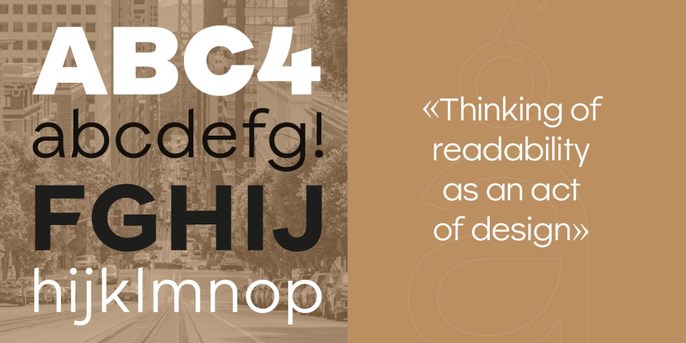
Olivier Gourvat, founder of French foundry Mostardesign, has released Parisco, his newest typeface. Parisco offers the precision and control of a geometric sans-serif family that flows harmoniously with humanist character. It gets its name from the two places that inspire its duality: Paris, for elegance and meticulous craft, and San Francisco, for creative energy and modernity. Parisco overflows with versatility and adaptability, with eight weights and companion italics. A unique variable axis gives designers an impressive degree of control (weight, italic, rhythm, spacing, accessibility).
Gourvat has a reputation for designing highly usable, friendly, and conscientious typefaces—Sofia Pro is an internet darling. With Parisco, Gourvat added accessibility to his starting brief. His goal was broad: “to imagine a typeface that would offer optimal reading comfort while still having enough personality to appeal to designers and make them want to use it.”
Typographic accessibility is a collective effort.
Olivier Gourvat
During Parisco’s year-long development process, Gourvat immersed himself in research about readability. While sans serifs dominate the digital landscape, he found no accessibility studies supporting this preference. The spacing between letterforms and words makes a greater impact on readability.
Gourvat mentioned three startling statistics that stood out from his research: 67% of accessibility issues originate in design (a 2020 study by Deque), and 40% of professionals admit to lacking accessibility skills (a 2021 WebAIM study). It’s heartening to know how much design matters, on one hand. However, many well-meaning creatives lack accessibility knowledge that hinders design decision-making. The third statistic reflects this latter point: barely half of designers rank typographic clarity as their top priority when choosing a typeface, in a recent Design Rush survey. We can all think of a project in which we elevated the visual impact of the composition over clarity, ease of navigation, and the reading experience of the type. Our decisions can leave a big chunk of our audience behind; our clients’ messages failing to reach them.
Gourvat admits that no “magic” typeface will make reading 100% comfortable for all users at all times. But the vast majority of fonts have not been developed with accessibility as a core intention—Atkinson Hyperlegible and Zed are two that we’re aware of. In Parisco, Gourvat wanted to design for an accessibility that “pleased both the reader’s eye and the creative’s.”
Space to breathe was paramount. Each letter had to have its own identity, while also working in concert within a body of text. For readability, Gourvat slightly increased the x-height and the length of the descenders, and balanced letterform heights to better differentiate between capitals and lowercase. He also angled stroke endings to create more open terminals and played with asymmetry in some letterforms (especially in the N and Z) for contrast and easy recognition. Parisco also offers OpenType features that enable designers to fine-tune the type for a variety of contexts and use cases.
“Typographic accessibility is a collective effort,” said Gourvat in a blog about the process and thinking behind Parisco. “It depends as much on the type designer who shapes the letters as on the graphic designer who stages them on the page. From the shape of a single letter to the composition of a page, each decision contributes to a reading experience that is smoother, fairer, and more human.”
Learn more about Parisco and Mostardesign Type Foundry.
The post Parisco Makes Readability an Act of Design appeared first on PRINT Magazine.