Experimental Typeset, Trash, and No Star: Creating Type Culture in the Flat Era
Typography isn’t rock ‘n’ roll. Unlike Sonic Youth’s 1994 “art core” album, you’re not cutting it live in the studio. You labor over polishing characters and setting the type precisely. There’s little time for relaxed experimenting. This is someone else’s song.
Brands fall flat without a distinct voice. Clients want custom fonts, and other defining elements—iconography, glyphs, sounds, and motion behaviors to compose a whole world of expression.
To avoid being washed down the culture drain, designers are turning to firsthand evidence: archives, nature, books, objects of antiquity, and the vernacular lettered landscape of city signs. Storytelling drivers, sure. What’s more, original sources anchor a brand’s visual elements in a shared experience.
The evidence of human engineering will be a critical marker of type in 2026, colliding with unbridled AI slop. What endures from this clash will have the stamp of observation fused with ingenuity.
Our physical world is dulling. Artificial intelligence, generative pre-trained transformers, and bots replicate people. The Atlantic reported on the psychological flattening of friendships as we socialize more through our phones, and Kyle Chayka’s Filterworld: How Algorithms Flattened Culture suggests we aren’t even shaping our own culture anymore.
How will typography emerge in this flat era? It will have to be self-willed, distinct and clear, and speak to the future while mining the past. Designers will be outpaced by credibility, not clout.
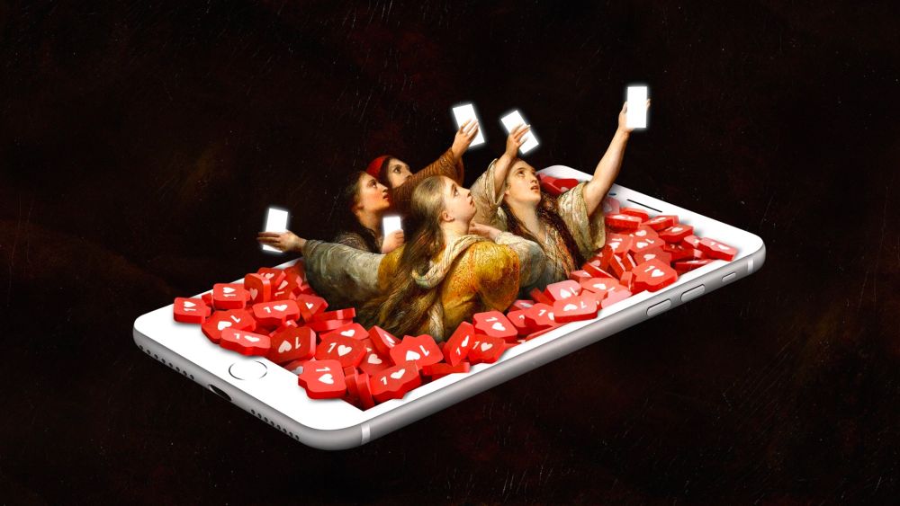
Illustration by Juanjo Gasull, The Atlantic, October 16, 2025
Integrity + Experimental Edge
Los Angeles based studio Mouthwash Studio is reprogramming the neural network architecture of the design studio. Founding Partner and Strategy Director Alex Tan explains, “We’re not a company that’s restricted by the medium, what we technically know how to do, or what we were trained to do in school. We follow a philosophy.”
From jump, they’ve had a prescient sense of what design-conscious minds want. That’s evident in their Chinatown space, which feels like an Architectural Digest feature and was designed in collaboration with Aunt Studio.
Six years back, Tan, joined close friends Mackenzie Tan, Abraham Campillo, and Ben Mingo, forming a podcast series, which led the group to publish a creative glossy called Mouthwash, launching in epic fashion to a crowd of 600 spilling into the street. Since then, this high and rising studio continues to be a breath of fresh air.
“Creative currency is the most valuable currency,” says Tan. The Studio’s Findings and Mouthwash Research Center (MWRC) keeps its original spirit of offbeat experimentation liquid and alive.
Their projects are flyers for the world they want to live in. They have revived tastemaking that drove the 1980s NYC art scene and applied it less recklessly to branding, making big universes that serve culture, not themselves.
For us, even though the campaign is the delivery method, what can we do to make it feel like a whole universe that people step inside of?
Mackenzie Tan
Mouthwash designs for brands like Seed and Brand.ai with clarity and resonance. The studio’s fingerprints come through in how people experience brands anew, ultimately creating more space for story and voice without deprioritizing design aesthetics.
Take Seed. The brand’s position challenge? Showing their humanity. “Instead of using Neue Haas Unica, which is very Swiss and very precise, how do we incorporate some level of expression to the typeset?” Tan remarks.
Mouthwash’s Creative Technology Director, Daniel Wenzel, was up for the charge. “He’s just a genius,” says Tan. Wenzel is a new breed who blends type design with coding to create generative design systems. German-born and based in New York, Wenzel tests how type design can evolve outside of traditional typesetting structures.
“I would argue that I’m specialized in systems thinking,” Wenzel says. Continuing, “that can be brand systems or motion systems. Creative coding is a system, and typefaces are systems as well. You’re not designing individual letters, you’re designing a shape language that is spread throughout the typeface or font family.”
He designed an outcome for Seed that was both groundbreaking and approachable. Working with Dinamo, the team began with the Oracle family, an elegant sans serif with friendly, smooth contours and subtle contrasts. It’s also super customizable, with alternates and stylistic sets.
Mouthwash Studio (Daniel Wenzel), Seed Sans, 2025
Wenzel’s approach is Socratic. He asks, “Why would we want to make a font from scratch? What they want is features and specific characters that can change the overall flow of a typeface drastically enough to feel unique.” Proving custom type and customizing brand language work hand in hand.
Seed Sans moves fluidly between scientific precision and human expression. With built-in ingenuity, the client gets a simple type tool that enables them to implement their brand optimally. Wenzel notes, “Things can be communicated in line versus trying to figure out that tricky tension point of merging graphic design with typography.”
The team developed a custom character set to express the Seed brand and scientific processes within text, including the capsule, dot, and other sub-brand symbols. This is a big shift from past decades, where static logos dominated.
I want all brands to be flexible identity systems and not static brands. That’s the way it was done in the 80s. Now, it’s way more about, What system do you build around?
Daniel Wenzel
Mouthwash took the same approach with Brand.ai, an identity system punctuated by a flexible logomark that is at once infinite and consistent. The aim was to create a living brand, where the brand mark can engage with the content around it with ease.
Mouthwash Moodboard for Brand.ai
Wenzel used the font editor program Glyphs to design 8 unique logo marks with a variable optical axis that could be assigned to keyboard letters. This vaults from delivering countless static logo files and offers streamlined use. Building systems for a world of behavior is the new wave of generative design thinking.
Mouthwash Studio (Daniel Wenzel), Brand.ai, 2025.
Raw Materials + Primary Sources
One October Saturday, an LCD panel display caught designer Emily Sneddon’s eye. The material undoneness of the static destination display on San Francisco Muni’s Breda Light Rail inspired Fran Sans. It’s a monospaced, display font available in three variations: solid, tile, and panel.
Emily Sneddon, Fran Sans, 2025
The following Spring, Sneddon left her role at Collins, and found herself with a designer’s most rare resource: time. She read in the park, took walks, and had leisurely brunches. As she slowed down, the display letters came back to her: squares, quarter circles, little triangles stacked to make diagonals. She saw beyond the utility and charm of their awkward forms. She observed poetry.
“I have been craving a way to engage more meaningfully in the world, design, and more deeply with my own craft.” Her curiosity became the custom Fran Sans font and, unintentionally, a preservation study, as the Breda trains were phased out altogether just as Sneddon’s project went live. Now this decommissioned train display remains a living font in our world.
Sneddon made Fran Sans her own, though she didn’t feel that way initially. Dave Foster mentored her throughout the process saying, “The very first point that you go from the road that you were on into ‘I’ve got to make this one decision,’ it becomes your own.” She loved the optimism and celebration of history. Placing her personal voice on this project was something she was missing in brand work.
She wrote an illuminating essay on the project, along with an elegant case study, which features a poem that brings unexpected sentimentality to this utilitarian font. “When I’m working, I’m always trying to play with contrasts,” Sneddon says. “You find interesting collisions and tension. It was far more interesting when I set it in dreamy language.”
Throughout the process, Sneddon spoke with sources, visited archives and workshops, and studied original drawings of display mechanisms, eventually connecting with Gary Wallberg, the original senior engineer at Tans-Lite who designed the displays back in 1999. She notes, “If any one of the people didn’t get involved, I wouldn’t have the knowledge or the story that I have now.”
Citing the work Greek graphic designer Vasilis Marmatakis did for Yorgos Lanthimos’ film, Bugonia, Sneddon emphasizes how critical it is to collaborate with originators when reimagining a font. In developing the graphics and posters, Marmatakis, who also created the designs for The Lobster and Poor Things, collaborated with the family of Samoan graphic designer Joseph Churchward to digitize his 2002 Churchward Roundsquare font. Marmatakis found the perfect font : it was futuristic, monumental, DIY, threatening, and very brutalist.
The Bugonia typeface, Churchward Roundsquare. Originally designed by Samoan designer Joseph Churchward in 2002
Film Poster, Vasilis Marmatakis for Yorgos Lanthimos’ Bugonia, featuring on set photography by Yorgos Lanthimos and Atsushi ‘Jima” Nishhijima.
(Image credit: Courtesy Vasilis Marmatakis)
Fran Sans is Sneddon’s first font and most meaningful project. ”I’m far more interested in the meandering journey of a designer,” she confesses, recalling Rick Rubin’s philosophy on how ideas attach to us. There is a duty to bring ideas into the world. Otherwise, that idea will go and find someone else.
She wonders, “What else is staring us in the face that we don’t even realize have stories attached to them?”
Anti-Commercialism
Wael Morcos of Morcos Key doesn’t wait to join the conversation. When something moves him like a political moment, he designs. His custom Arabic signature for Zohran Mamdani’s campaign began as a personal gesture, not a brief. The lettering, which he posted to Instagram days before the election, translated the candidate’s name into Arabic with the visual immediacy of a city sign. The blazing orange letterforms stacked against a hard, electric blue ground are borrowed from the campaign’s original identity created by Forge. The name seems to hum, vibrating with the hand-painted spontaneity of New York’s vernacular: bodegas, metro cards, halal carts.
Branding for Zohran Mamdani Campaign, by Forge, 2025. Designer Aneesh Bhoopathy drew heavily from vernacular New York visuals: “Taxicab yellow, MetroCard primary colors, bodega awnings — stuff people are familiar with in the New York street.”
“I love seeing Arabic in public spaces in New York City,” Morcos says. “It’s a marker of people who speak Arabic, who are from these places in the world that exist here.” His design does more than adorn—it situates. In re‑lettering Mamdani’s first name, Morcos introduces a new typography into the civic landscape, merging identity with visibility.
The construction itself sits between two worlds: “It’s not classical proportions of Arabic calligraphy, and it’s not pure handwriting,” he explains. “It’s almost Latin, because Latin itself is not handwriting, it’s structured lettering.”
The piece isn’t a cursive flow but a drawn, illustrated form. A drop shadow gives it a sculptural energy, a hint of movement borrowed from street lettering traditions. “It sits in the middle of non‑calligraphic Arabic letterforms,” Morcos says, “but is still heavily inspired by the roots of Arabic calligraphy; drawn with the affectations of a drop shadow and a clear construction, but still expressive with these pointy ends.”
Weal Morcos (Morcos Key), custom Arabic signature made in support of Zohran Mamdani during election week, 2025. Morcos followed the original campaign branding to seamlessly create his addition.
Beneath its immediacy lies deep typographic discipline. Morcos warns that without understanding how letters flow, “you could see awkward results.” Customization isn’t decoration, it’s anatomy. It’s about drawing with understanding rather than editing for style.
That philosophy threads through Morcos Key’s earlier work for Hammer & Hope, a magazine built on the themes of labor, activism, and communal strength. Its custom typeface has a mechanical roughness—part functional tool, part rallying cry.
Morcos Key, Hammer & Hope, custom typeface, characterized by a monospaced alphabet and precisely crafted half-spaced gaps. It imparts a resolute rhythm, while maintaining an earnest and authentic expression.
There’s a kinship here with Gretel’s Philadelphia Museum of Art revival, which unearthed Sol Hess’s Hess Neobold font from the archives. Customized in collaboration with Ryan Bugden, Fairmount Serif merges the museum’s origins as the Pennsylvania Museum & School of Industrial Arts and the city’s working-class heritage with serif details drawn from the museum’s original seal and engraved walls. Both projects look back to move forward, harvesting form from history and hand.
Hess Neobold font, 1933. An American typeface combining industrial and classical qualities, cut by typeface designer and art director Sol Hess (1886-1953). Hess was a lifelong resident of Philly, and studied at the PMSIA for three years and became Frederic Goudy’s successor at Lanston Monotype.
Gretel NY, custom type for Philadelphia Art Museum, 2025. Fairmount Serif is the museum’s new custom institutional typeface, which Gretel designed in collaboration with Ryan Bugden. It merges the museum’s origins as the Pennsylvania Museum & School of Industrial Arts (PMSIA) and Philadelphia’s working-class heritage with serif details inspired by the museum’s original seal and engraved walls. It takes cues from Hess Neobold with signatures from contemporary industrial sans-serifs.
What connects them is their resistance to gloss. They echo the living surfaces of the world—painted letters fading on brick, sun‑bleached vinyl, the utility of type over the luxury of perfection. In an era when design tools can counterfeit anything, each curve insists on presence. Born of place, belief, and grit, the result is resolutely human. Raw, anti‑commercial, and beautifully unrepeatable.
No Stars
TypeTogether has been collaborating with designers all over the world for nearly two decades. Founded in 2006 by Veronika Burian and José Scaglione, the independent foundry grew from a shared respect for typographic structure and storytelling. The two met at the University of Reading in the UK, where both completed Master’s degrees in type design and began developing what would become a cosmopolitan, research-driven practice. Today, TypeTogether operates as a distributed collective, partnering with designers and language experts across continents to build type systems for the most demanding editorial and digital settings.
So when the foundry decided to reexamine Paul Renner’s 1927 classic, Futura, with Bauer Types close collaboration, the challenge was never about nostalgia. It was about translation—how to carry an ideology into the present. “Futura is produced by a very special framework,” says José Scaglione, “the situation art was in during those years in Germany and Austria. The modernist movement was in itself a reaction and a very important one to the rather ornate or even Baroque style.” Futura didn’t just clean the slate; it redrew the grammar of modernity. “It was revolutionary,” Scaglione continues, “the mother of all geometrics—it really coined the genre.”
Futura’s archives are spread across various institutions, including Bauer Types (official rights holder for original designs), Bauhaus-related archives, German typographic museums, Letterform Archive, and university collections like McGill University.
Now, a century later, TypeTogether’s Futura®100 extends that legacy across a world that Renner couldn’t have imagined. The project currently spans twelve scripts (with eleven more to come) covering more than ninety percent of the world’s population. Each script has been designed with native consultants, typographers, and proofreaders to ensure accuracy and cultural fluency. Burian notes, “For every script, given the importance of this project, we had additional consultants for each script. So it’s not just a designer, but also another pair of eyes who is native in the language. It’s a check and balance.”
Type Together, Futura®100, 2025
That humility defines the project’s ethics. It’s an exercise in empathy—mapping Renner’s principles of simplicity, economy, and proportion into typographic systems with entirely different rules.
We’re not trying to impose purist design into other scripts, rather, we try for these other scripts to appropriate the conceptual framework that would make their shapes work.
Veronika Burian
The result is quiet innovation alchemized from hours of archive visits. Where most centennial projects lead with branding, Futura®100 leads with listening. It recovers the design’s underlying humanity rather than its myth. In Scaglione’s words, the original Futura was born as “an engine of that clearing‑out process,” a reduction to essentials. That same spirit now guides its rebirth—not as a celebrity font, but as a connective tissue for written and visual culture worldwide.
Type Together, archival visits to research Paul Renner’s original Futura font. Futura’s archives are spread across various institutions, including Bauer Types (official rights holder for original designs), Bauhaus-related archives, German typographic museums, Letterform Archive, and university collections like McGill University. Each location has varied samples of Renner’s drawings, metal letters, and other original type setting materials.
What makes the work radical is its invisibility. TypeTogether’s update isn’t out to make Futura famous again; it’s out to make it useful everywhere. To return the modernist idea of clarity as dignity for readers in every language. No branding fireworks, no stylistic remix. Just a century‑long conversation renewed in dozens of alphabets. No stars, just type.
Universal, Ancient Truths
Typography that imprints on the year ahead will broadcast universal, ancient truths. Exponentially, designers will push type towards more generative behavior, rooted in human ingenuity not artificial slush.
This isn’t a shift, it’s an ascension. As Tan of Mouthwash articulates, “our main mission is to influence culture, and the only way to do that is to pay attention to what stories, behaviors, or ways of interacting are both ancient and true.”
2026 will not just redefine how type is set but propel brand language farther with customizable systems, signaling an anti-pop, art-focused direction, countering archaic agency methods in favor of authentic experimentation. Depth over stardom. Considered not contrived. Less plucking, more diving. Tastemaking not trendsetting. Ingenuity over artificiality.
Typography traces our shared humanity, which is miraculous and mundane. Falling in love. Riding public transport. New ideas are born from old ideas.
Everything we make comes from things that have existed prior to us. We all come out of the womb a potato. Everything we know has been given to us.
Emily Sneddon
Tonal shifts from one brand touchpoint to another are evidence of a brand’s emotional agility. Designers have a choice: create a million dollar typographic expression that shapes culture or a ten cent font that imitates it.
The post PRINT Type Report 2026 appeared first on PRINT Magazine.